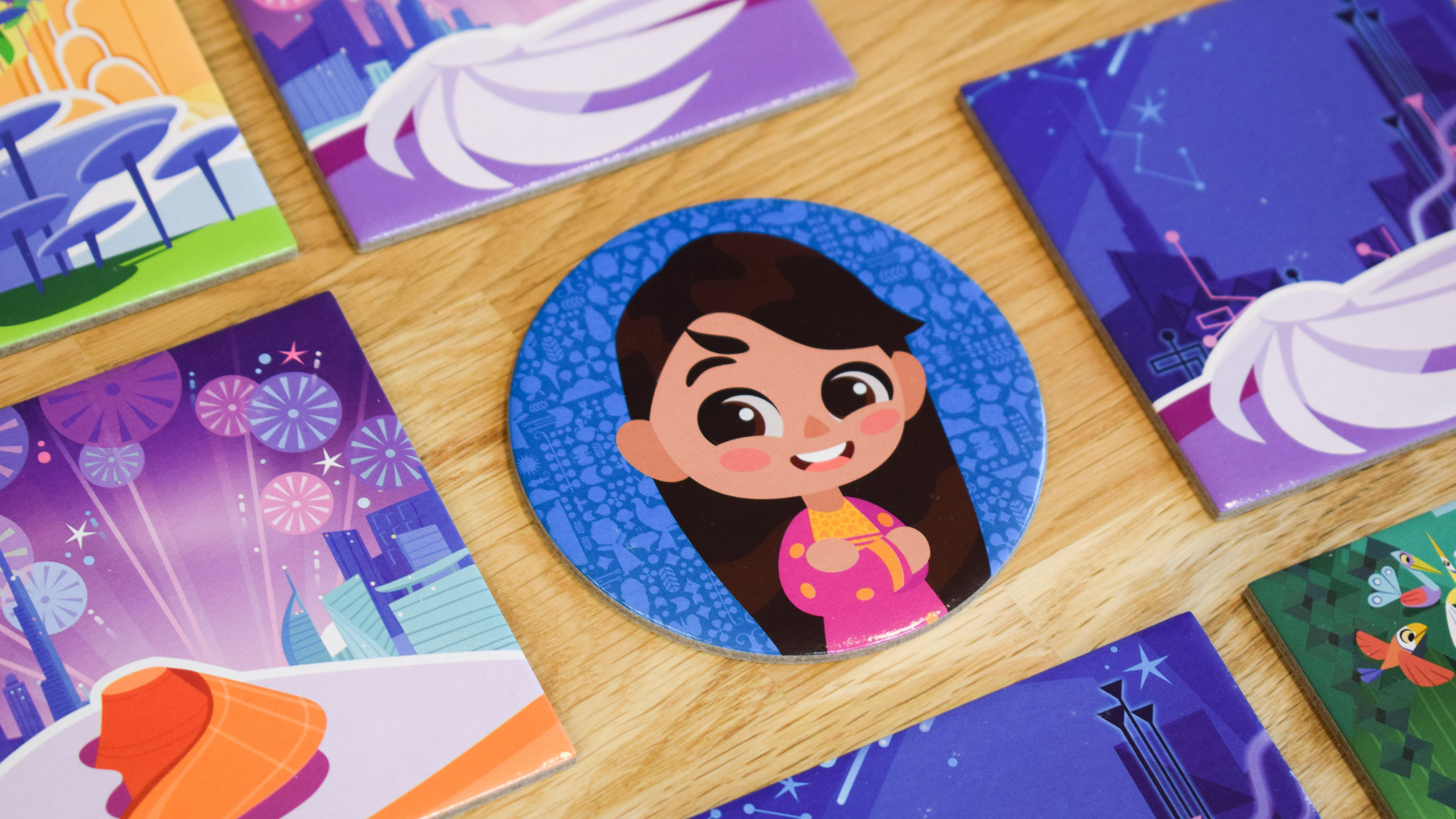
In Dixit Kids, the Head Mailrabbit's birthday is coming soon, but the invitations still haven't been sent! Together, play as the Head Mailrabbit and the Trainee Mailbunnies to deliver the precious letters before the end of the week.
Dixit Kids is a game by Élodie Clément, Théo Rivière and Jean-Louis Roubira, illustrated by Seppyo (Mélanie Bardin), Lucie Dessertine, Emily (Seung Eun) Paik and Lemonjuiceday (Iris Winker). Initially developed by Libellud, the project evolved during a restructuring to become an Asmodee Kids production, carried out jointly by Libellud and Space Cow studios.
For this new game in the Dixit Universe, I led the art direction and worked on many aspects: concept art, prototyping, UX design, product design, accessibility, and visual research. Here are all these stages of the project i managed.
UX, Product Design and Concept Art
The Characters - The meeples
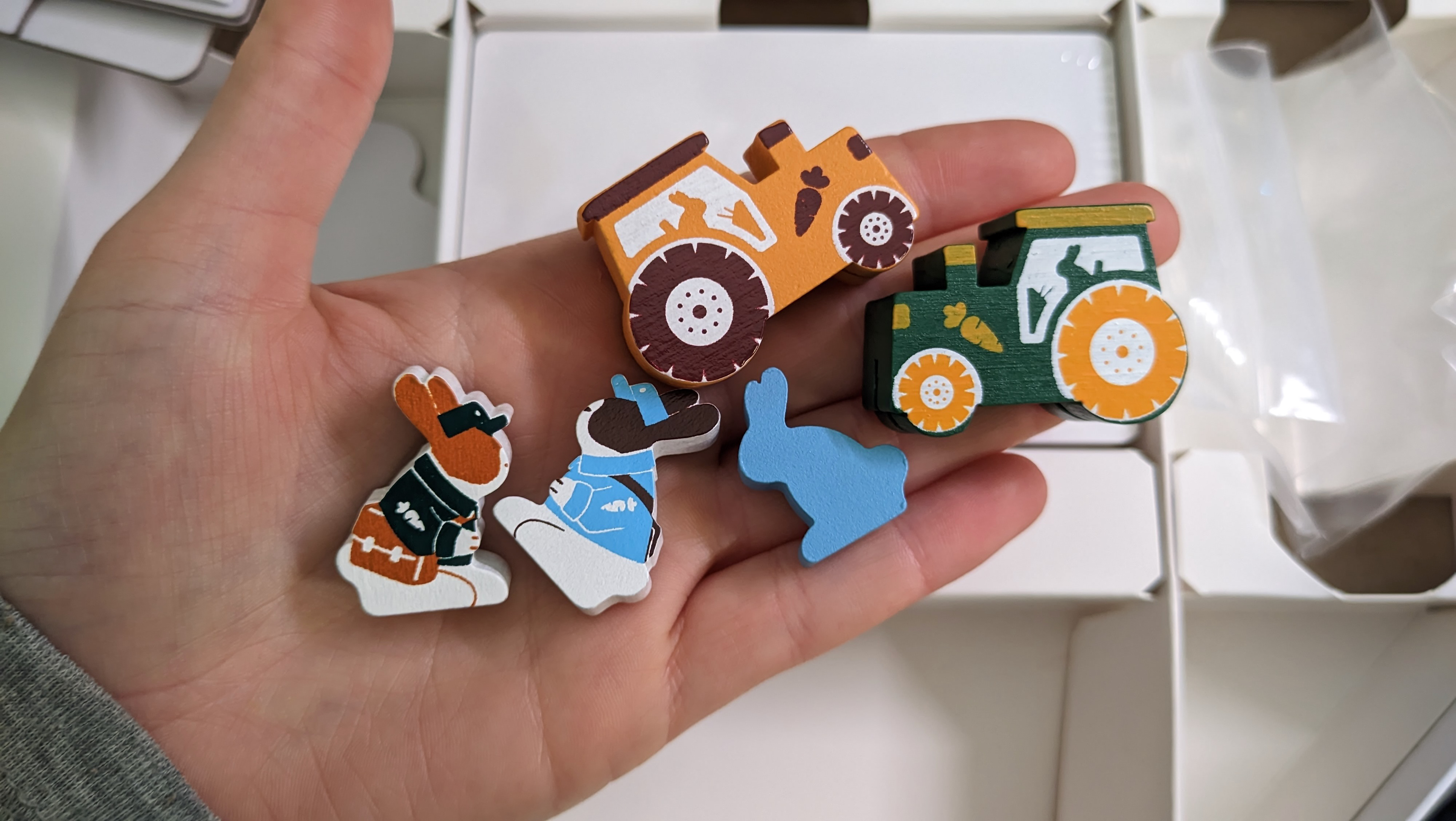
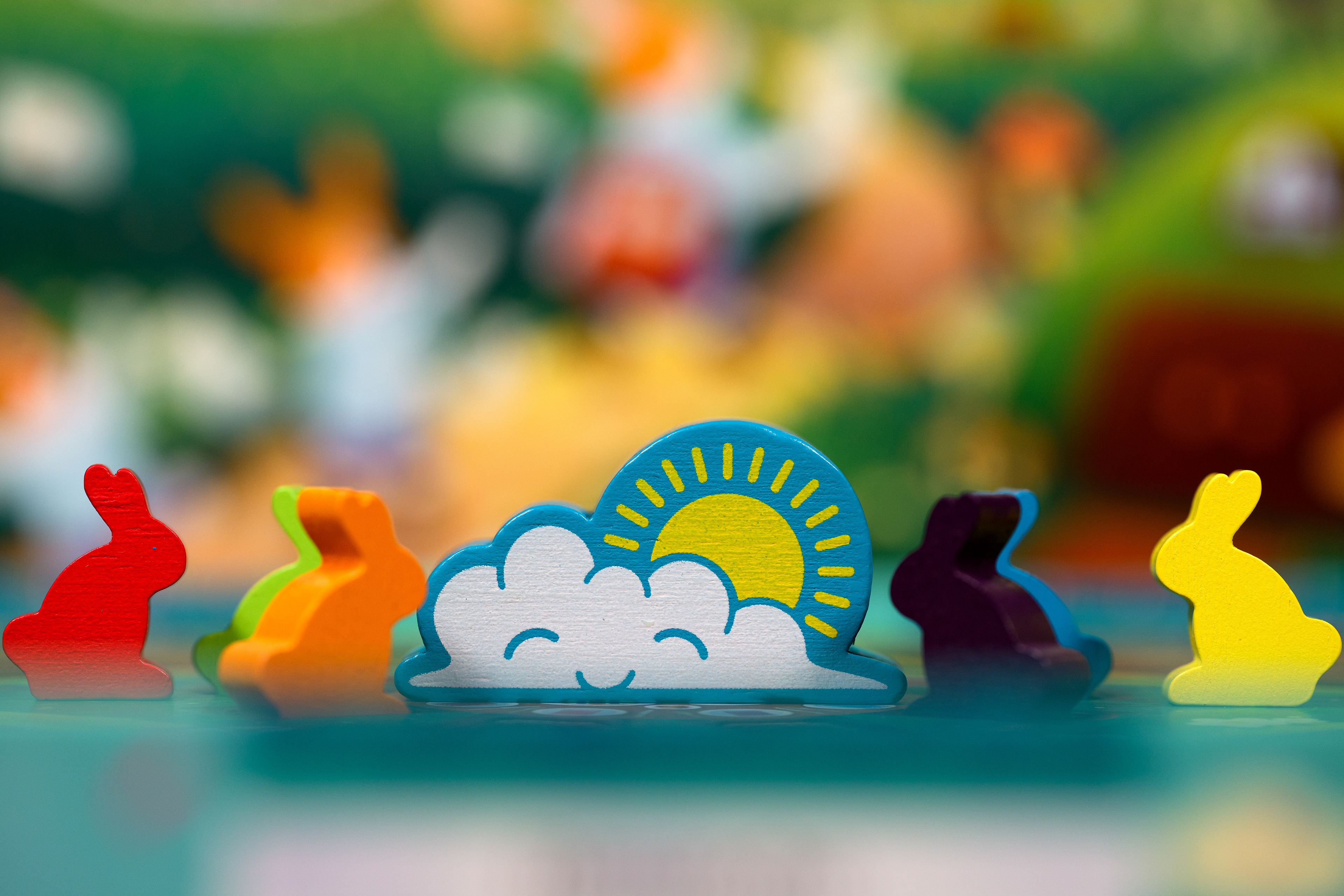
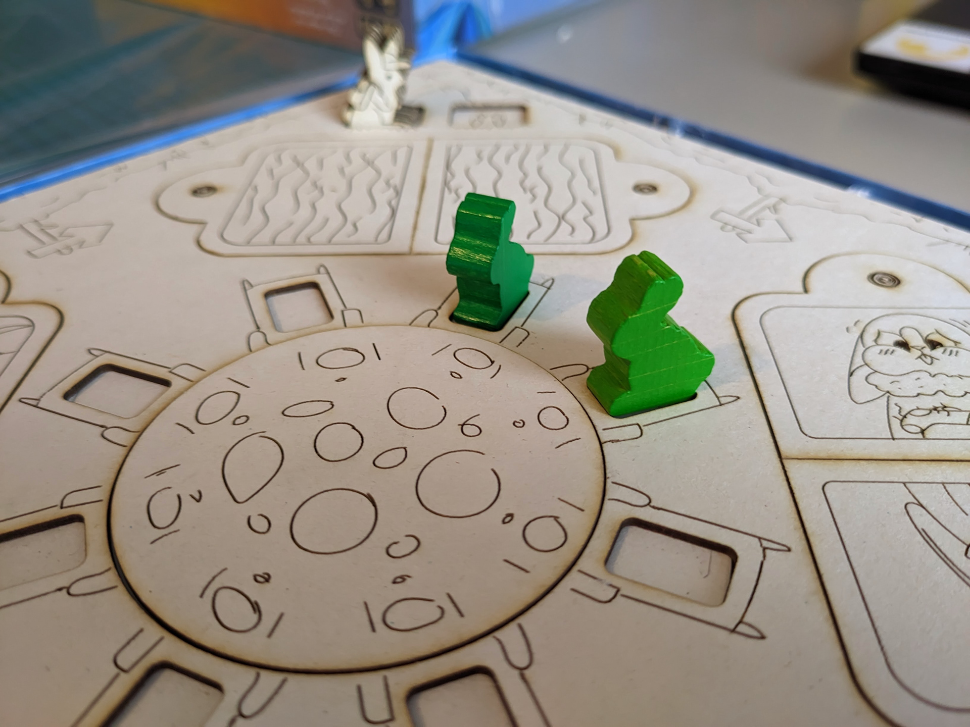
Three types of meeples are present in the Dixit Kids box: the rabbits, the Head Mailrabbit and the Sun.
The Rabbits
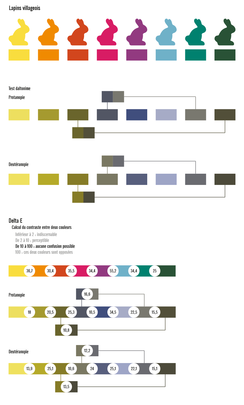
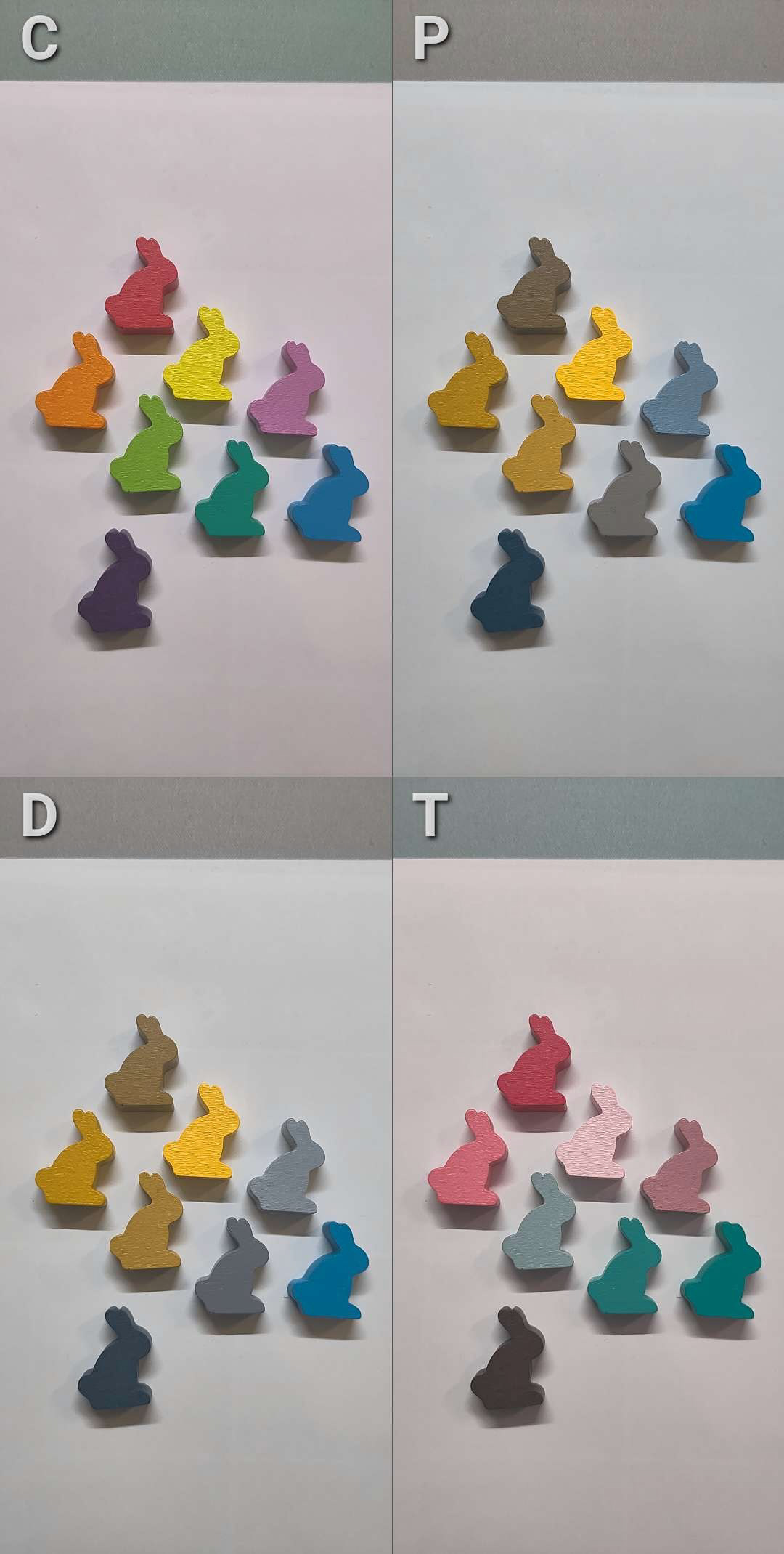
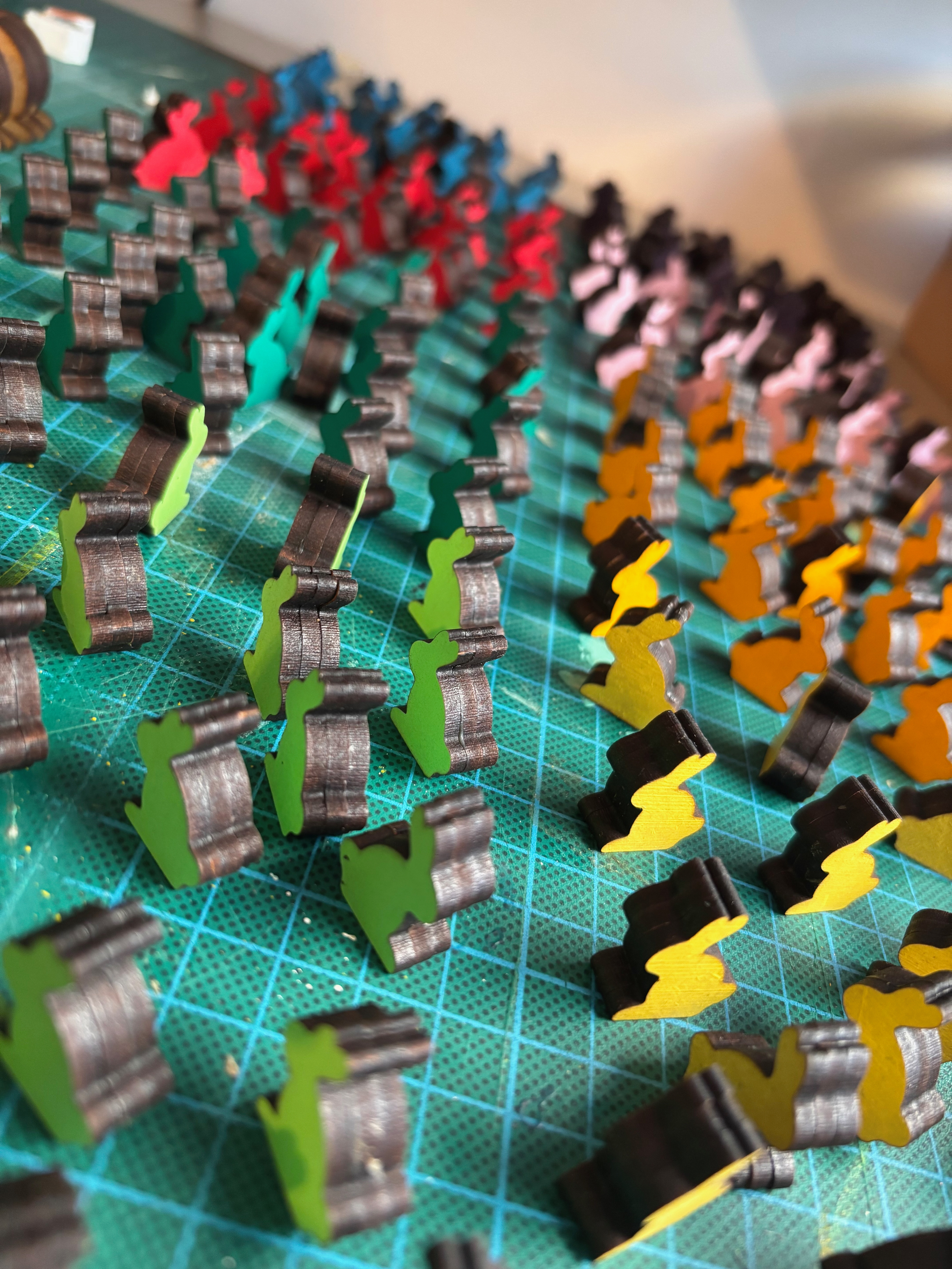
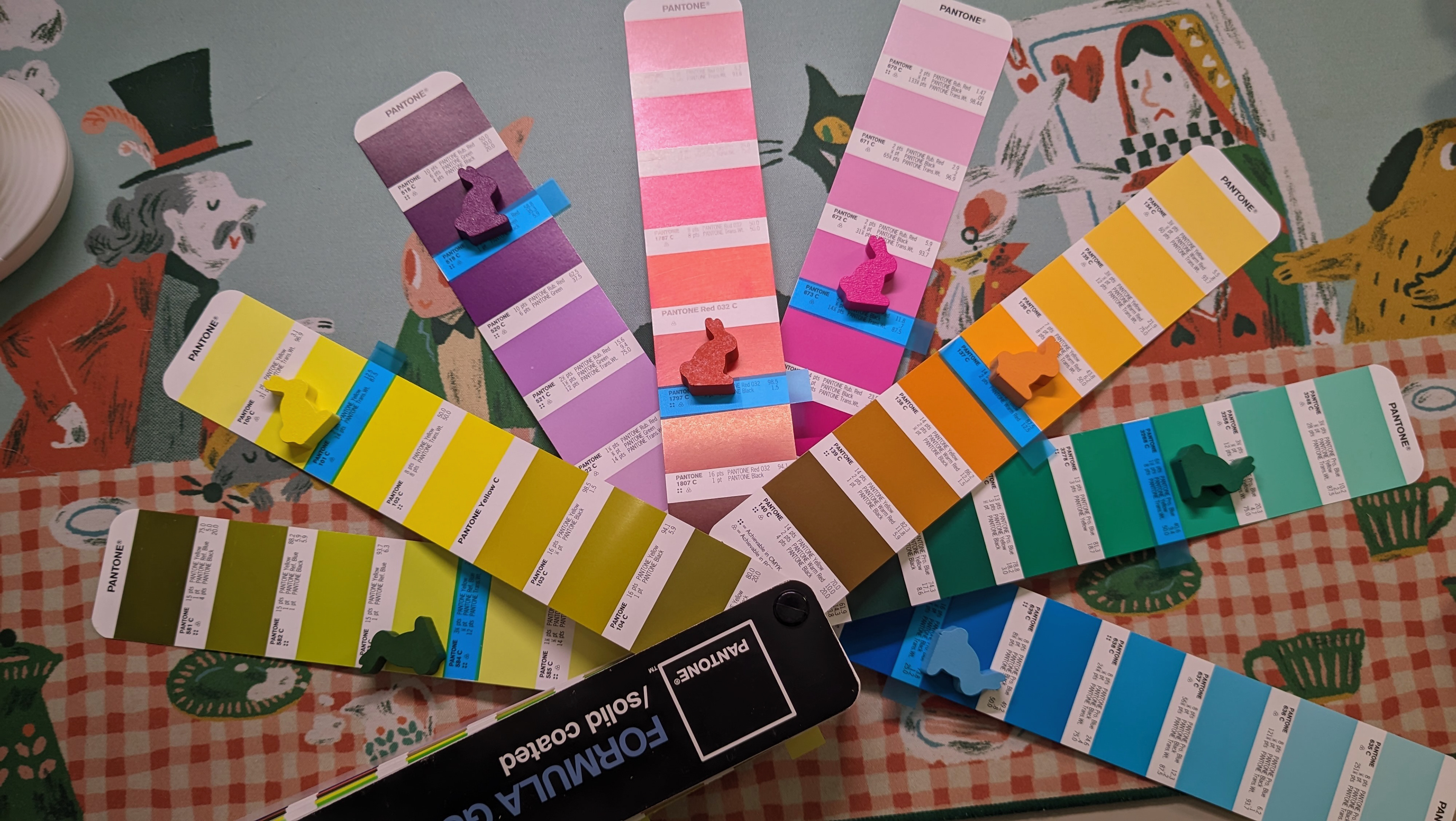
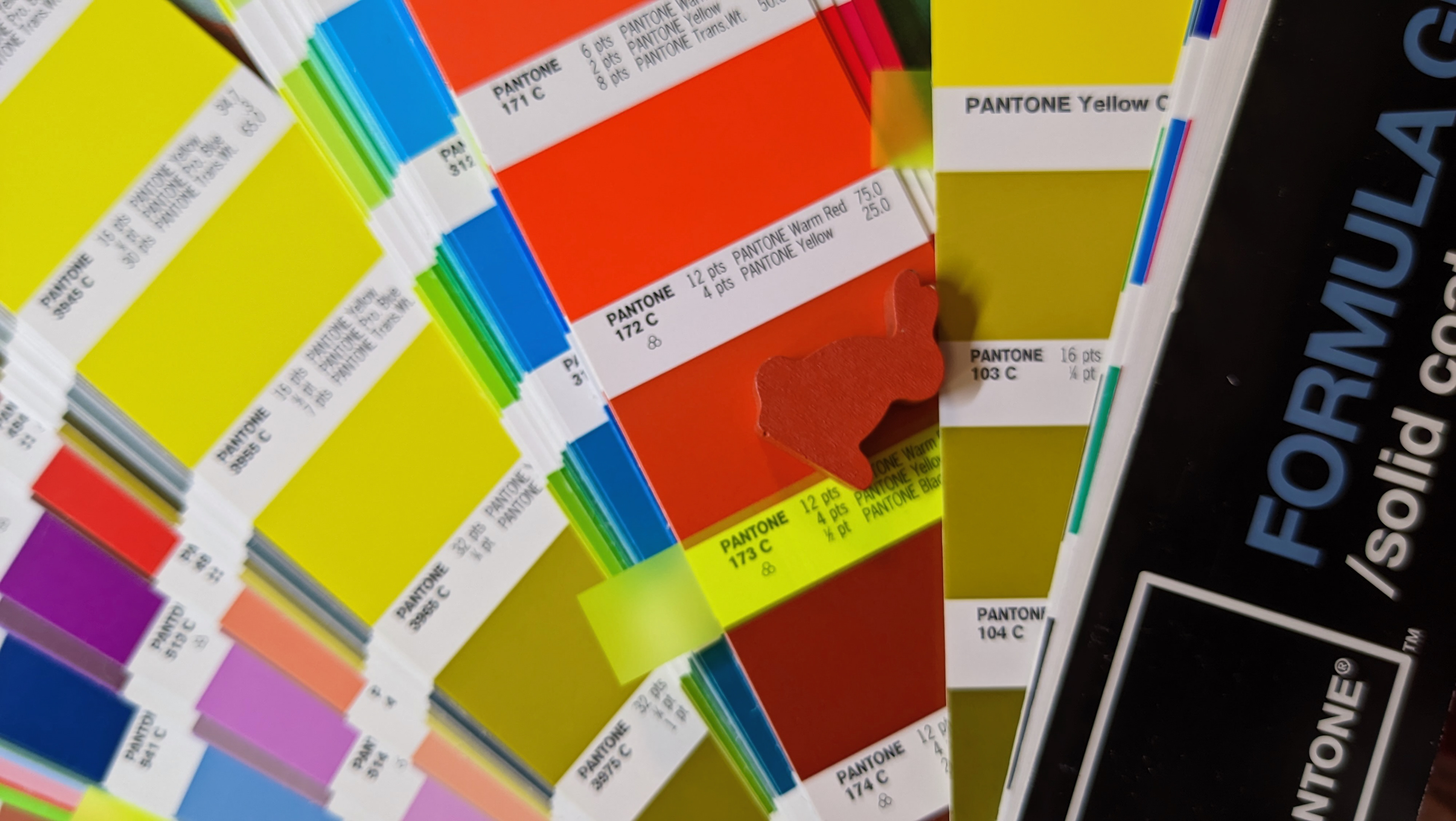
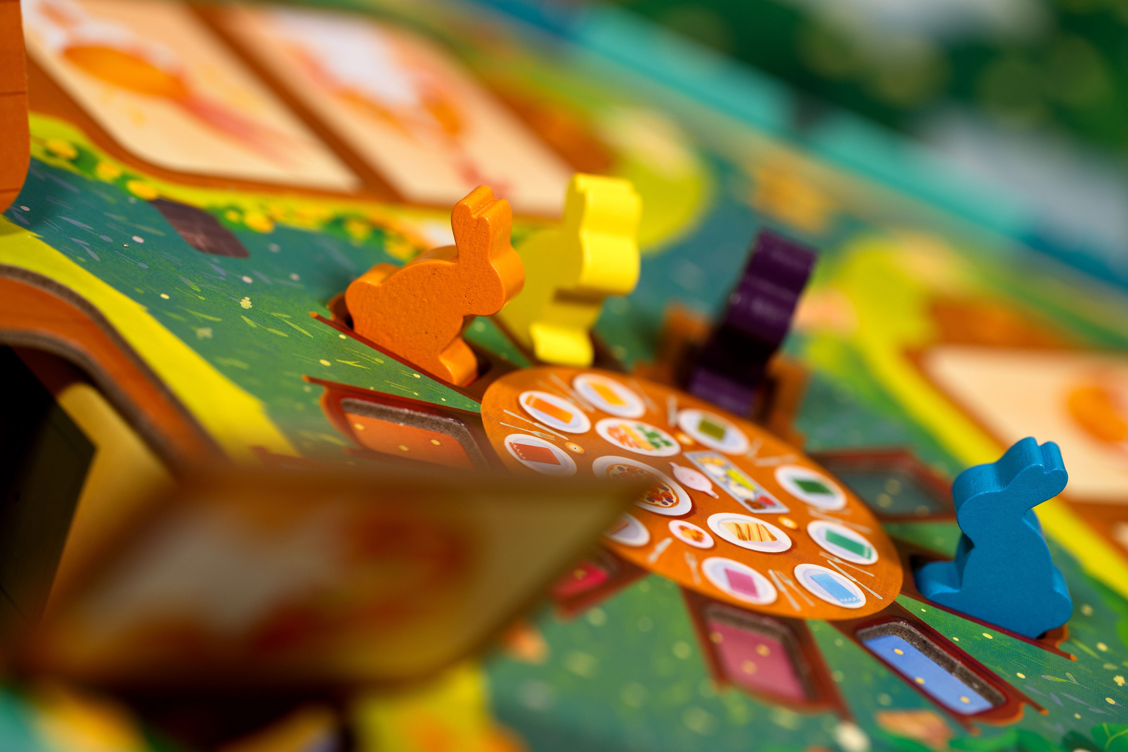
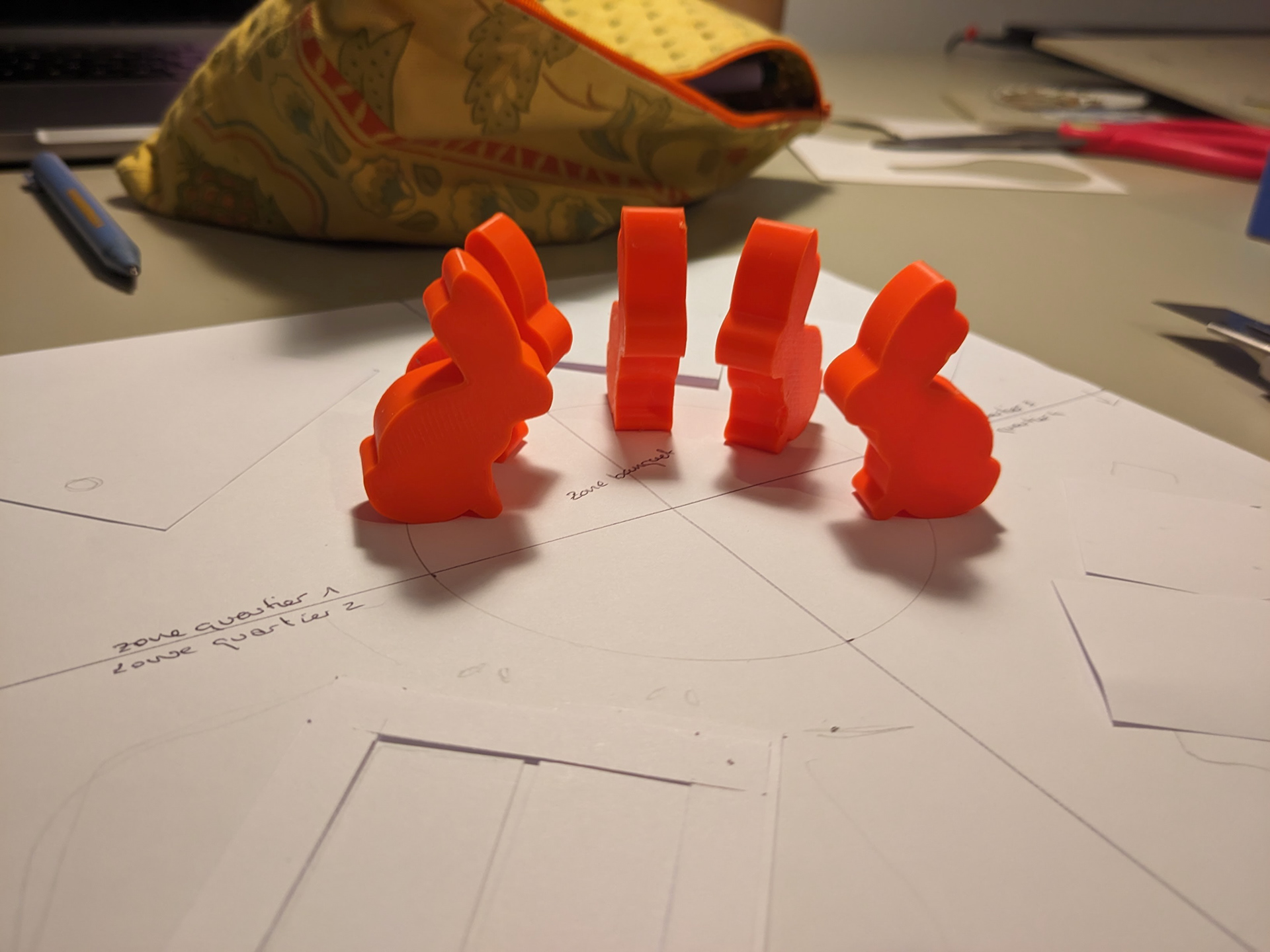
The rabbits have the same silhouette as the rest of the Dixit range. However, I carefully chose their colours. New shades for a new game, which blend perfectly with the colourful world of Dixit Kids, whilst offering strong enough contrasts so that as many people with colour blindness as possible can differentiate the meeples from each other. This isn't an essential aspect of the game mechanics, but for children, simply being able to clearly identify the rabbits can make the game experience smoother.
The Head Mailrabbit
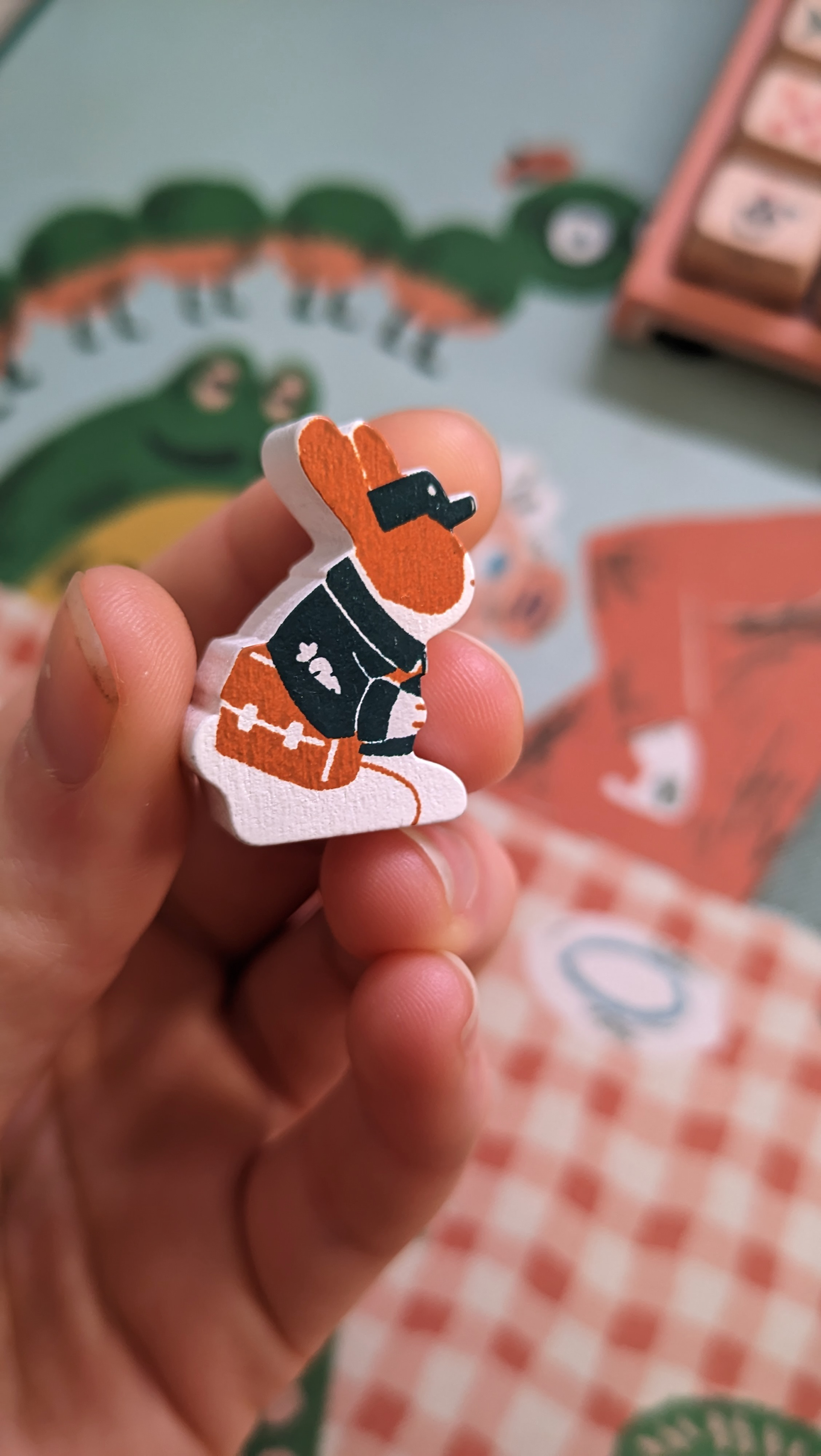
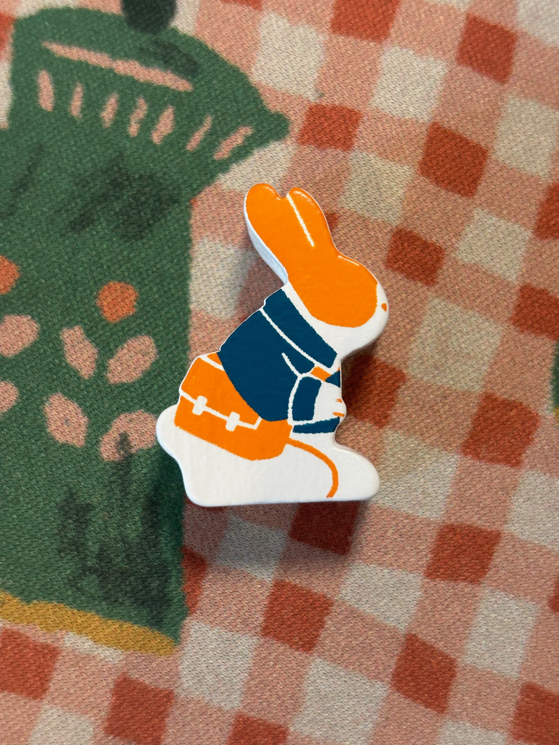
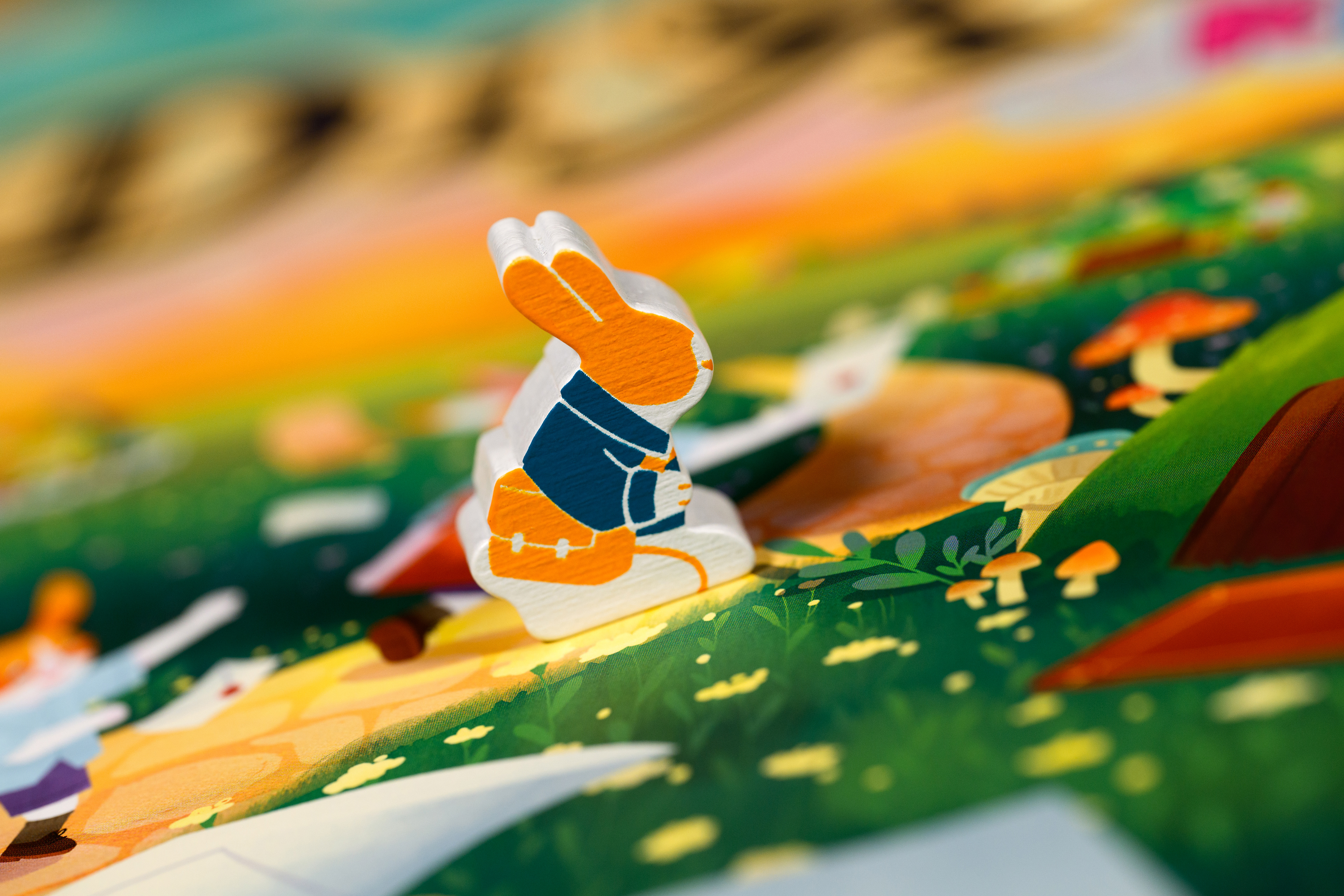
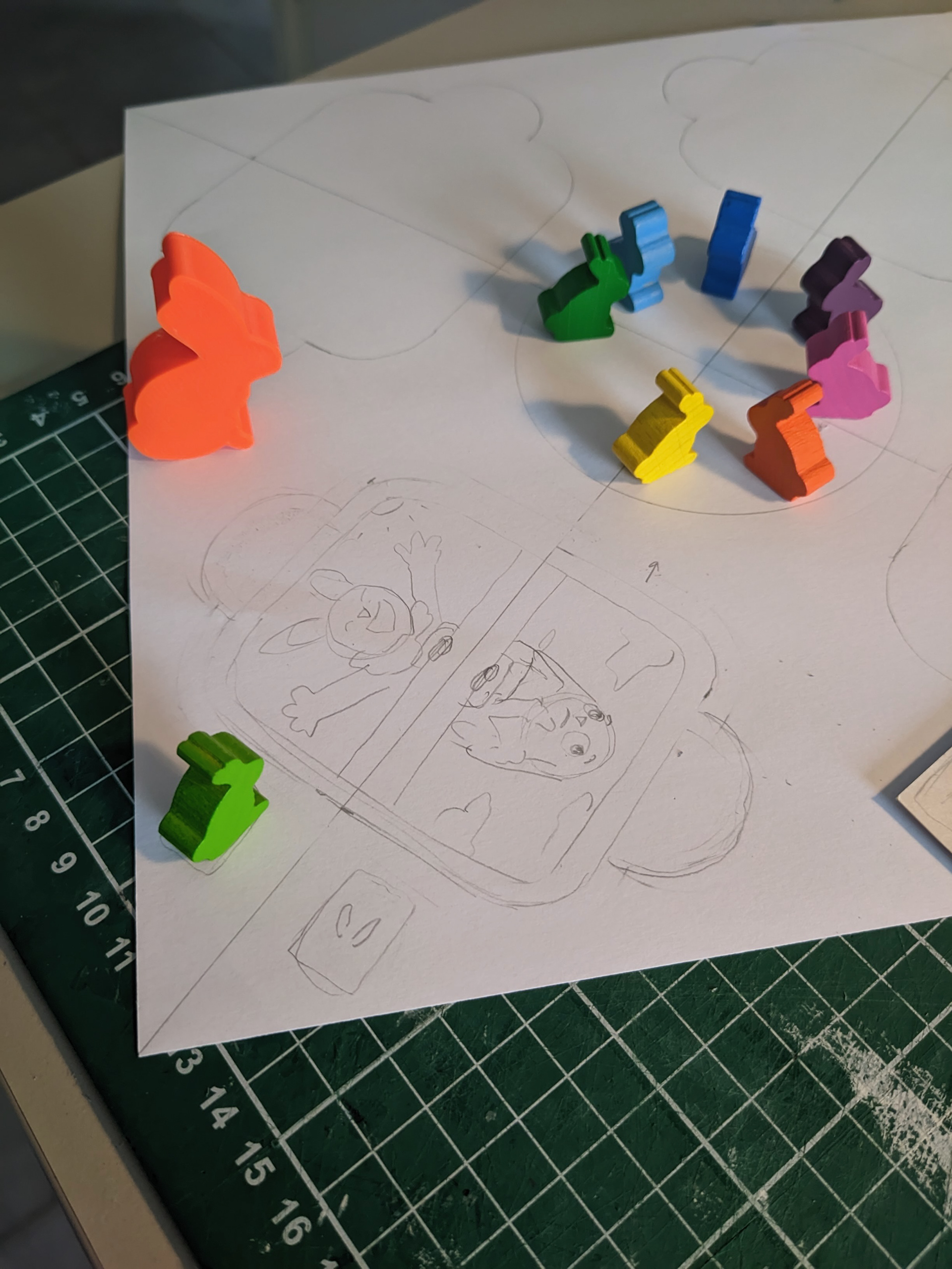
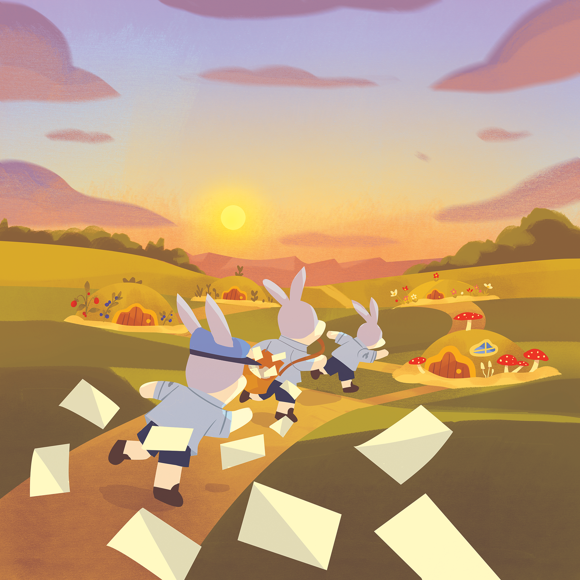
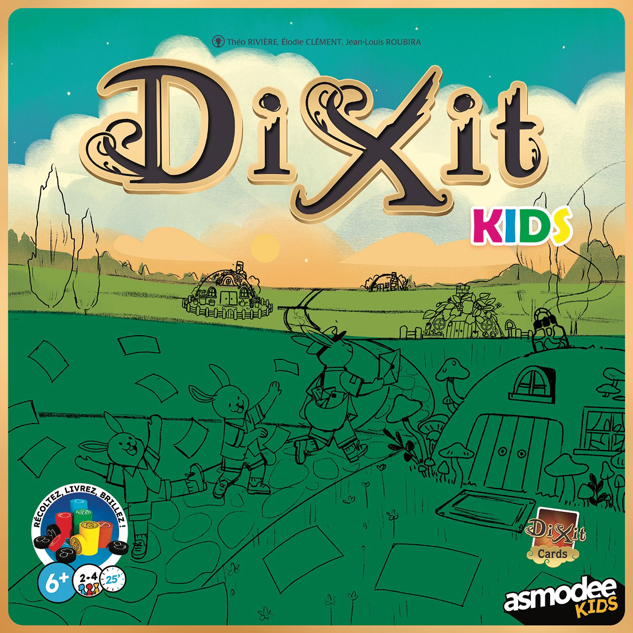
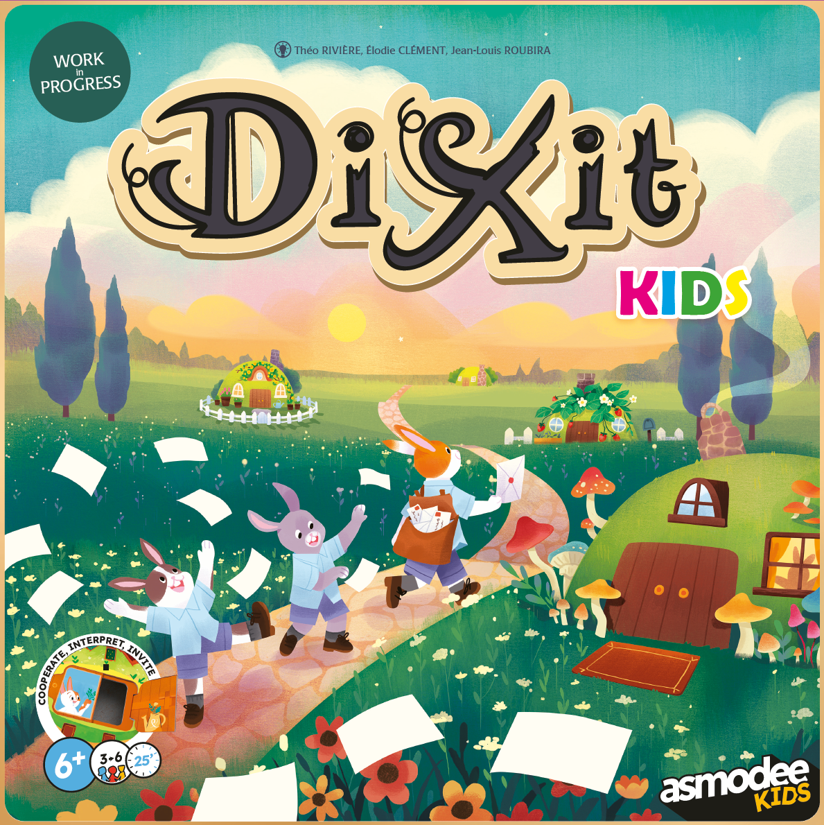
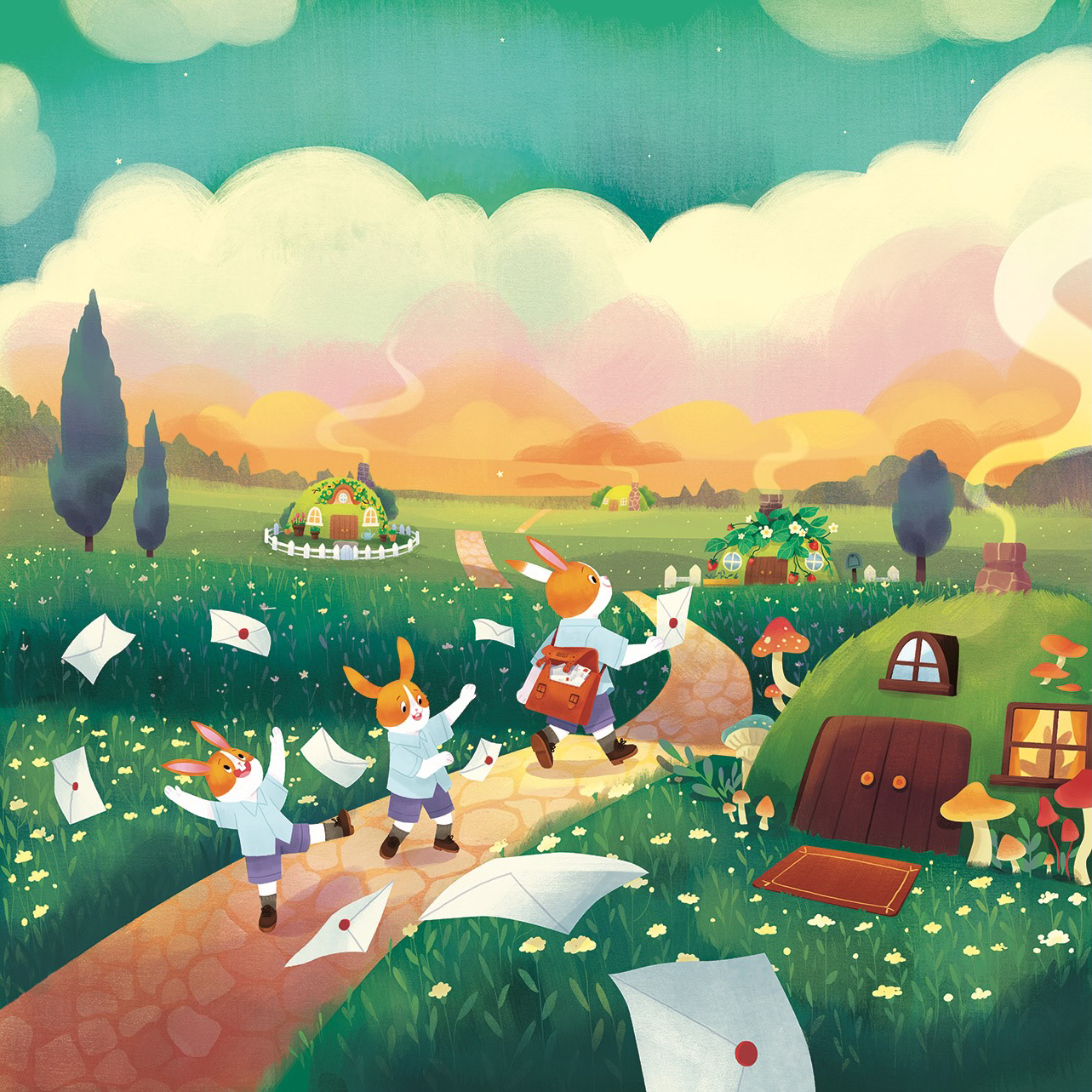
The Head Mailrabbit keeps the same silhouette as the iconic rabbits of the Dixit Universe, but to differentiate her, I made her larger and wearing a lovely postwoman's uniform. This uniform, also present on the game's cover, had to resonate with people around the world. It was fascinating work to do with Emily, who illustrated the cover: a French postwoman and a Korean postwoman have completely different equipment!
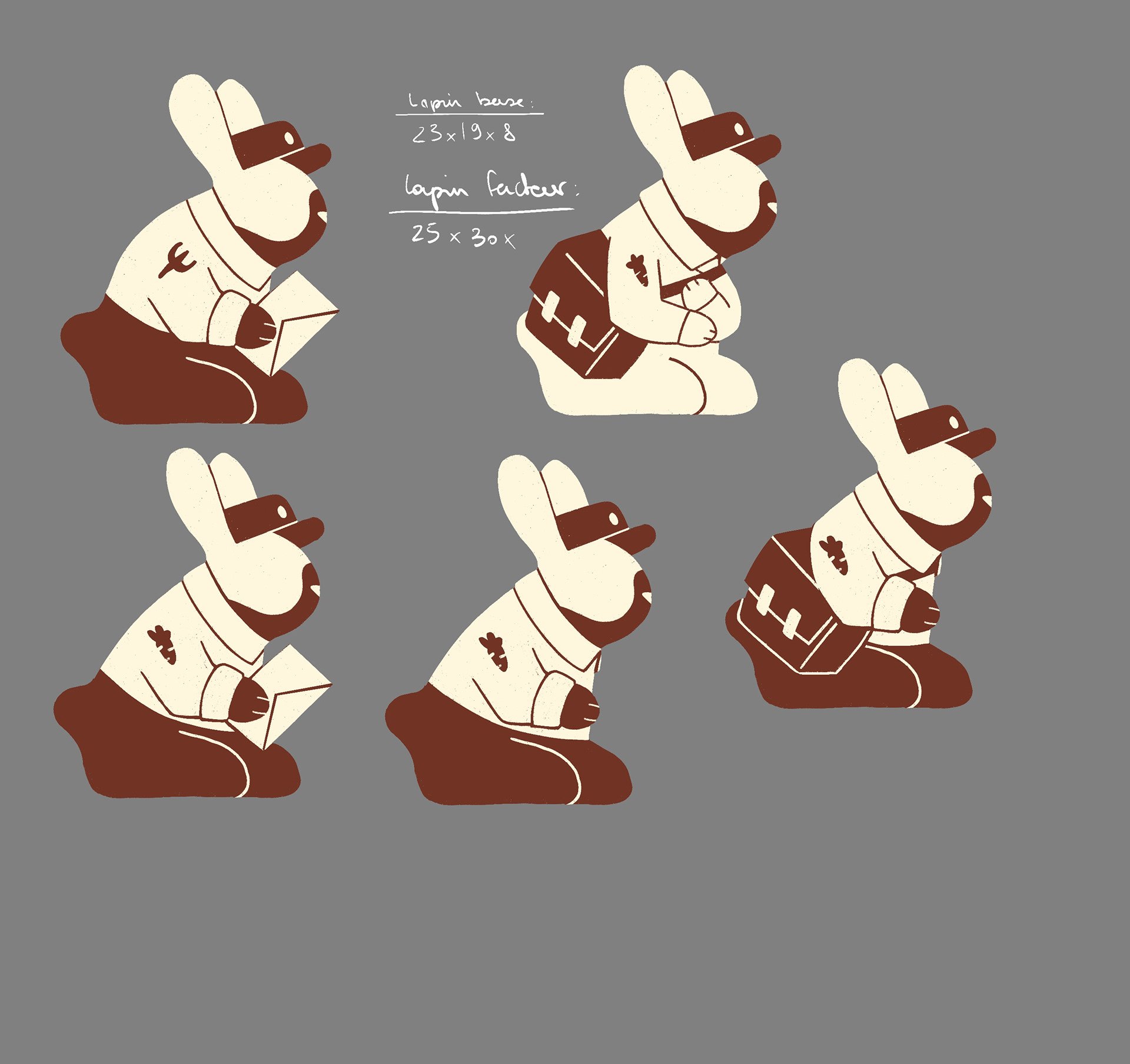
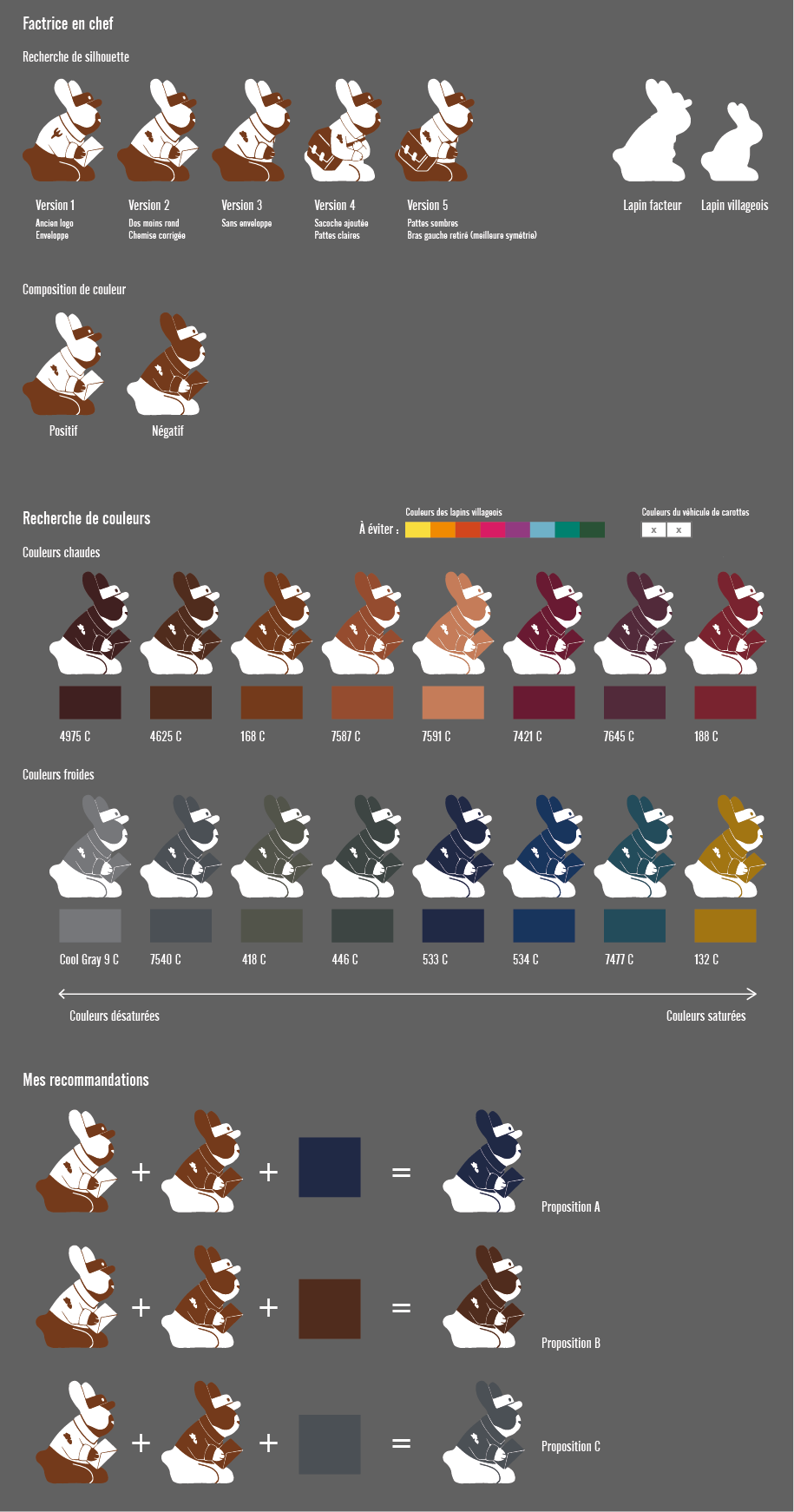
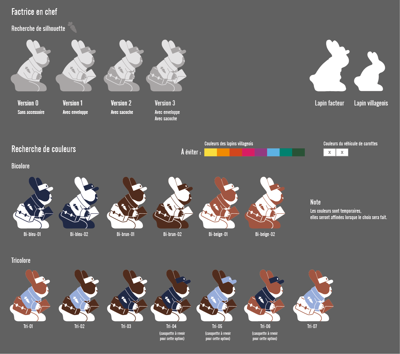
The Sun
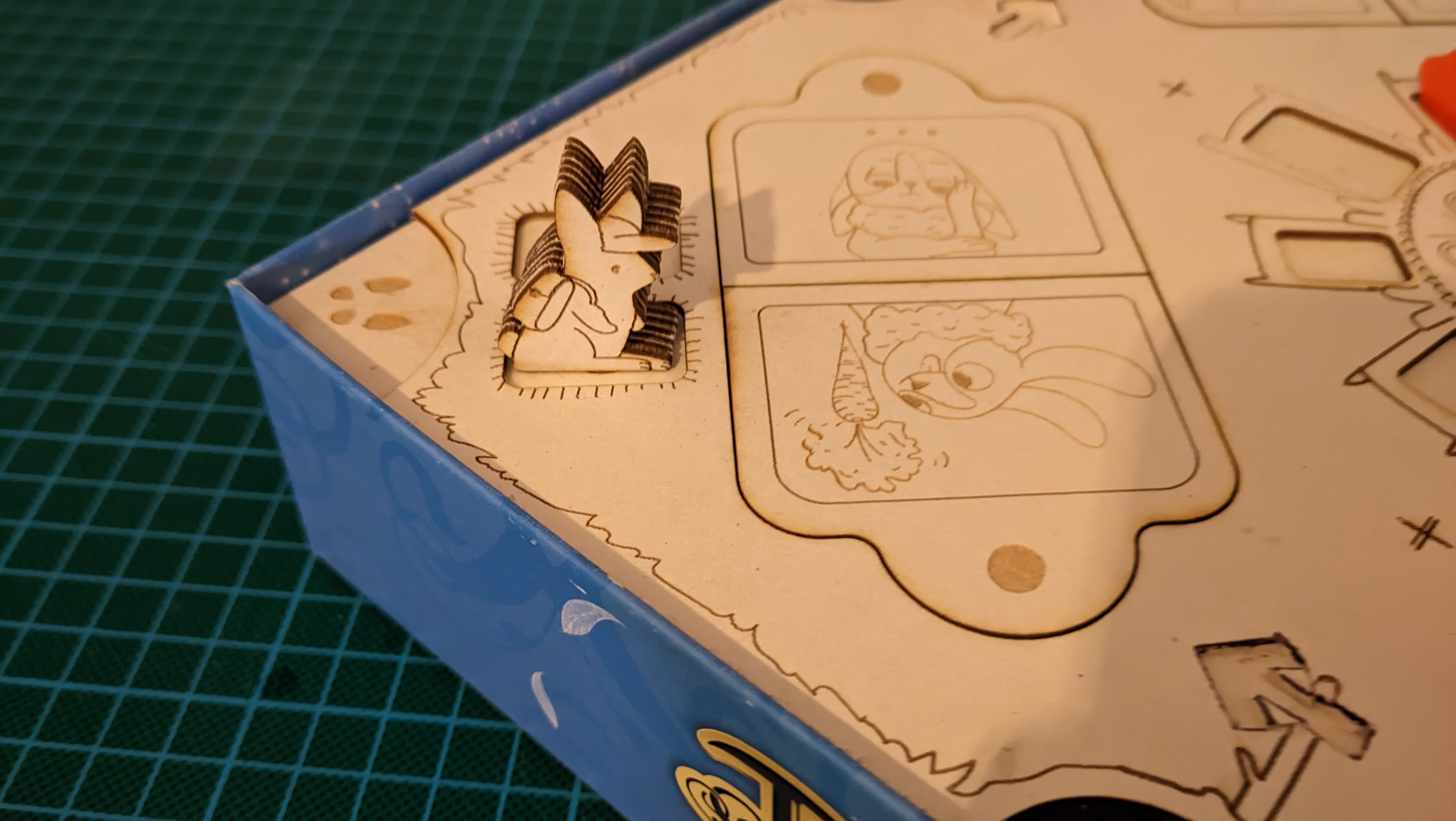
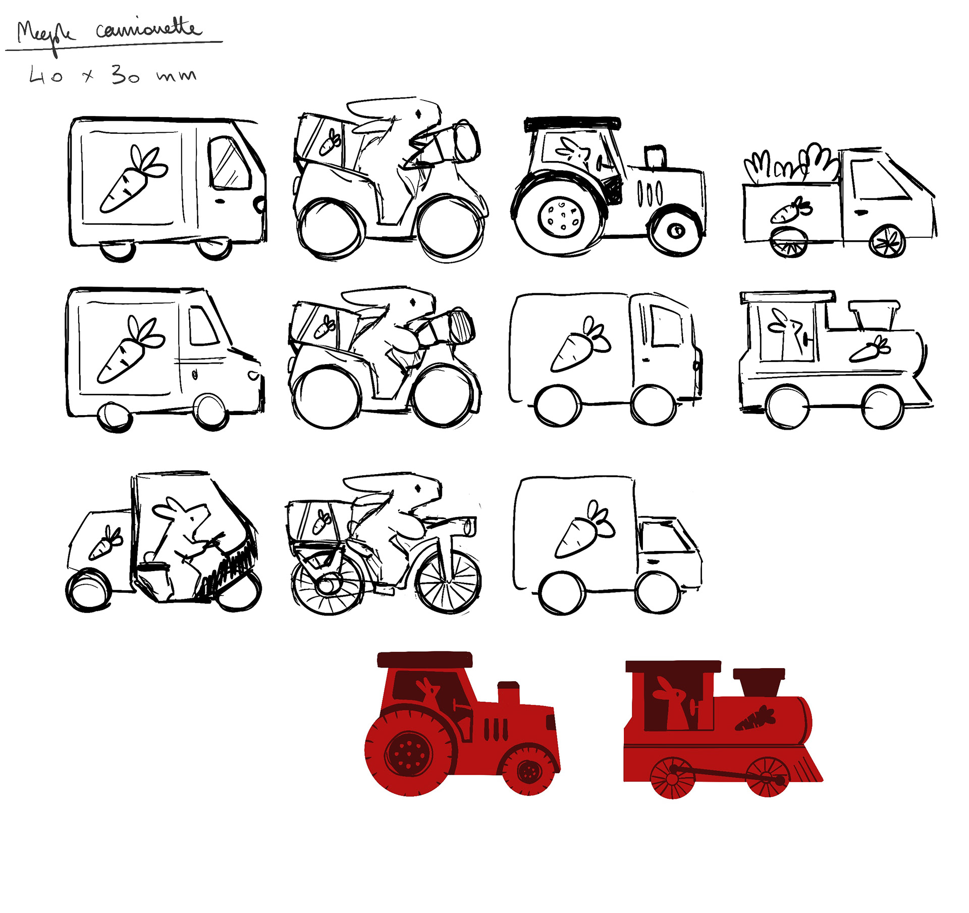
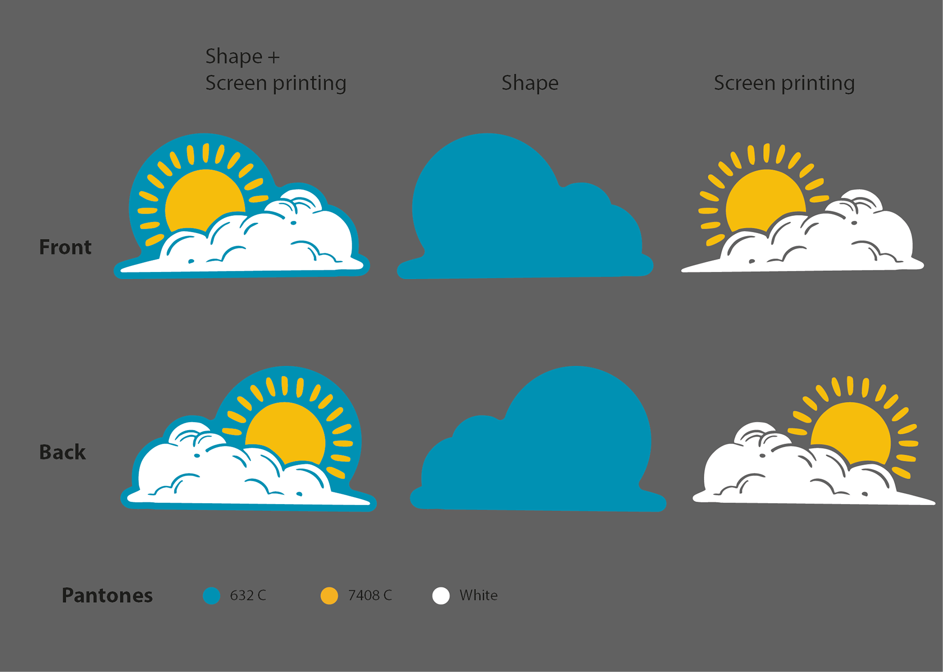
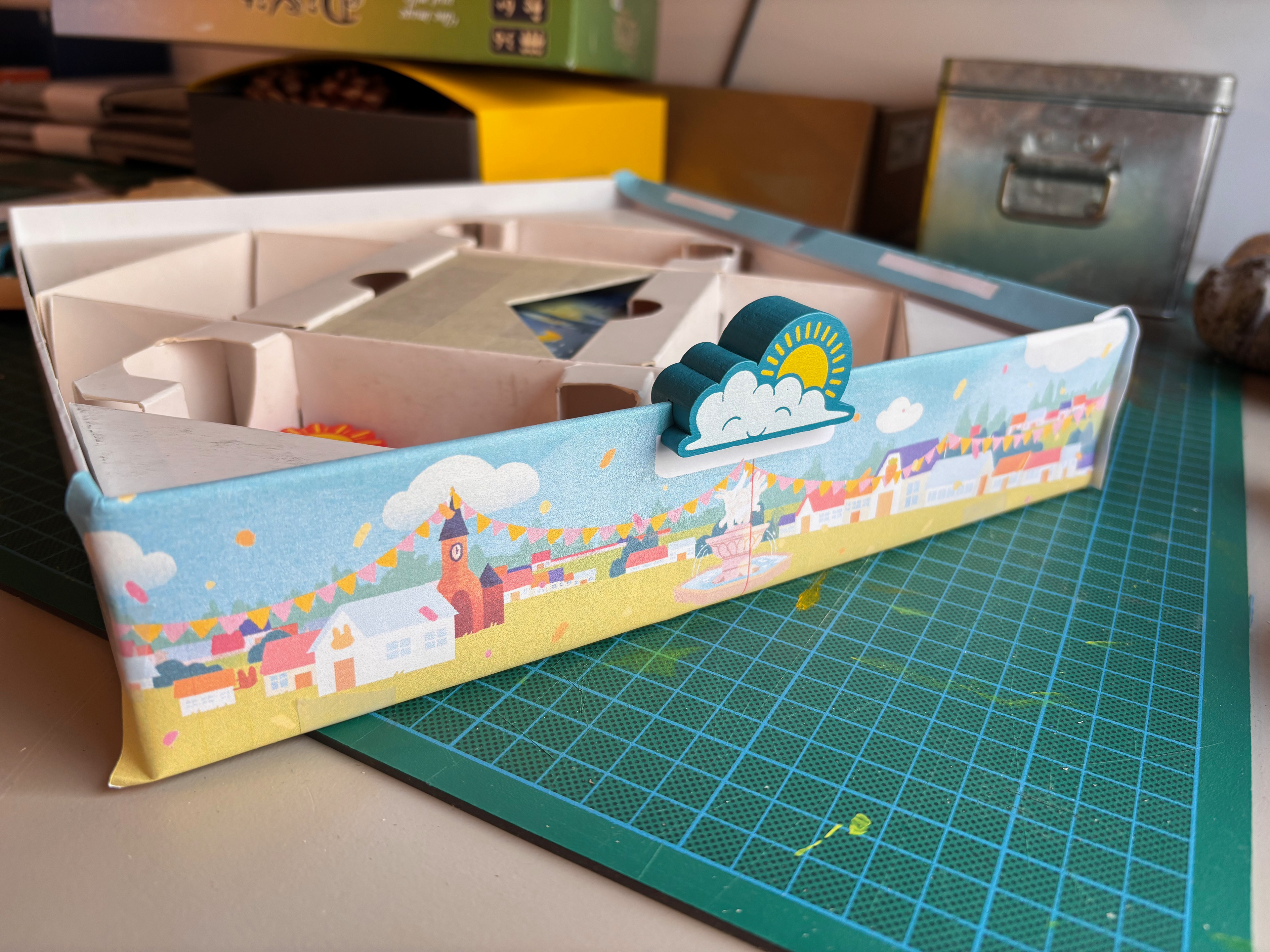
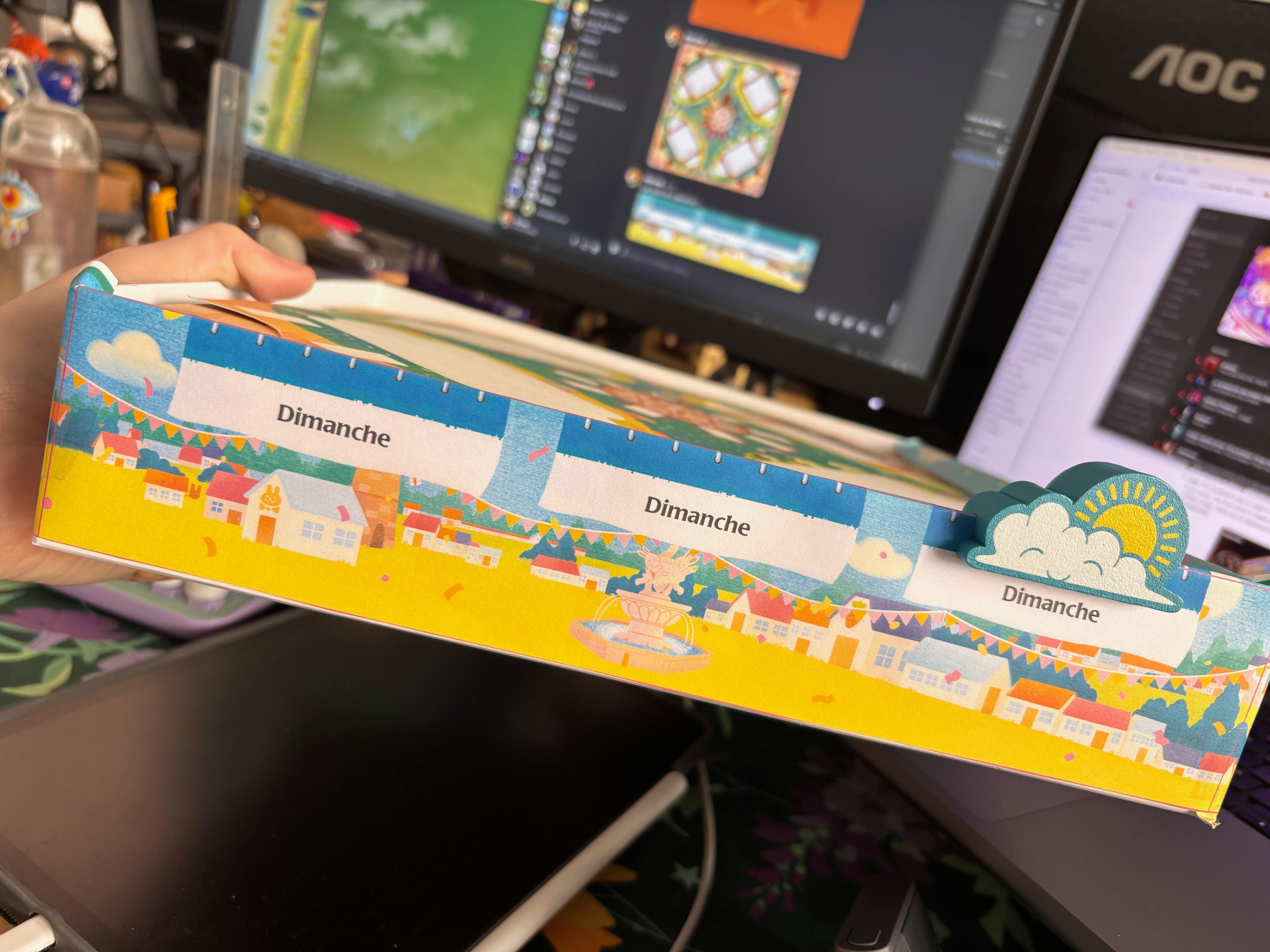
The Sun is the last meeple I worked on for the game. The mechanics constantly evolved, particularly the way to end the game or count turns. It was late in development that a 7-turn maximum rule was established, which created a new design challenge.
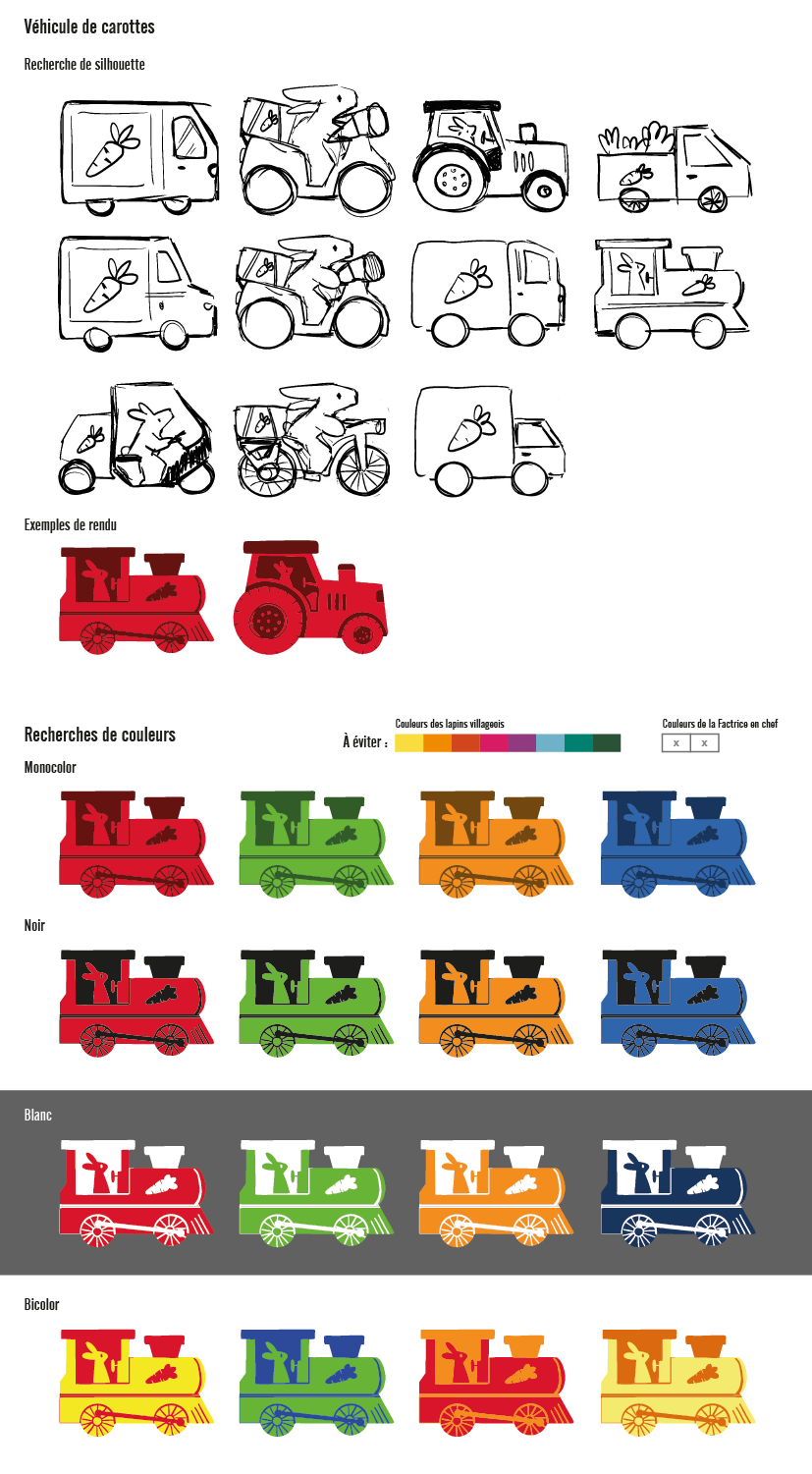
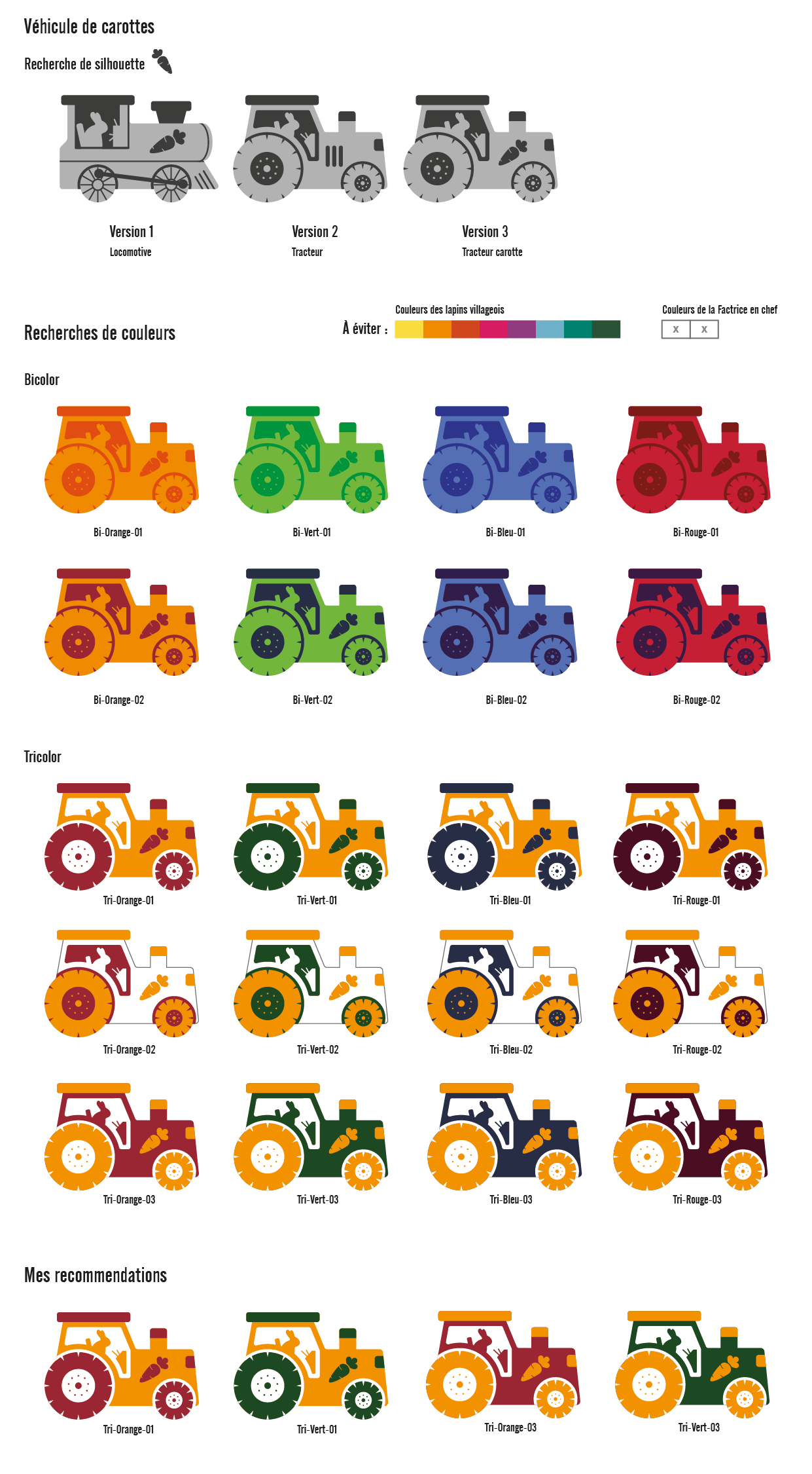
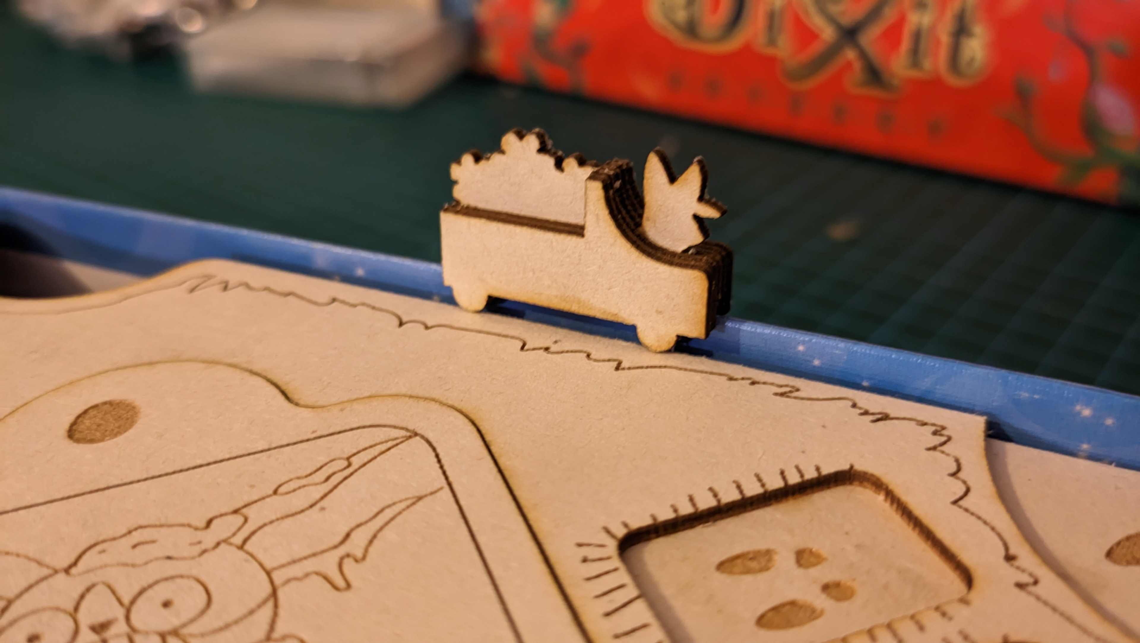
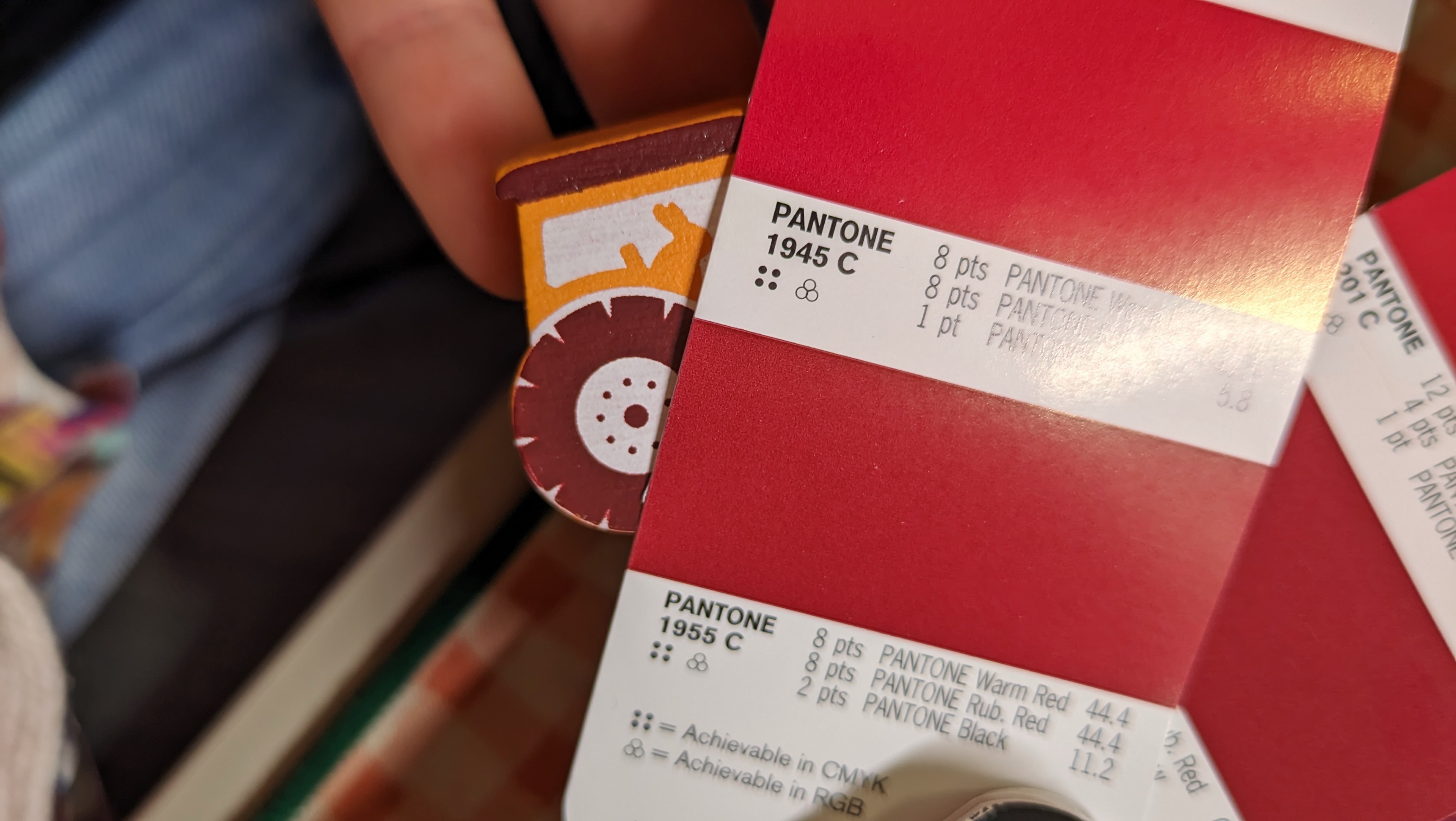
We play directly in the box, it's the central element on the table... but its edges weren't being used at all! It was a small technical challenge to create a slot in the meeple that would be the right width to stand upright without being too tight. A little train, then a tractor, and finally this Sun came to life in this final version!
The rabbit village - the game board
This game board is the central element of the game. How do you create a game that tells its own story whilst fitting into the Dixit Universe?
Door system
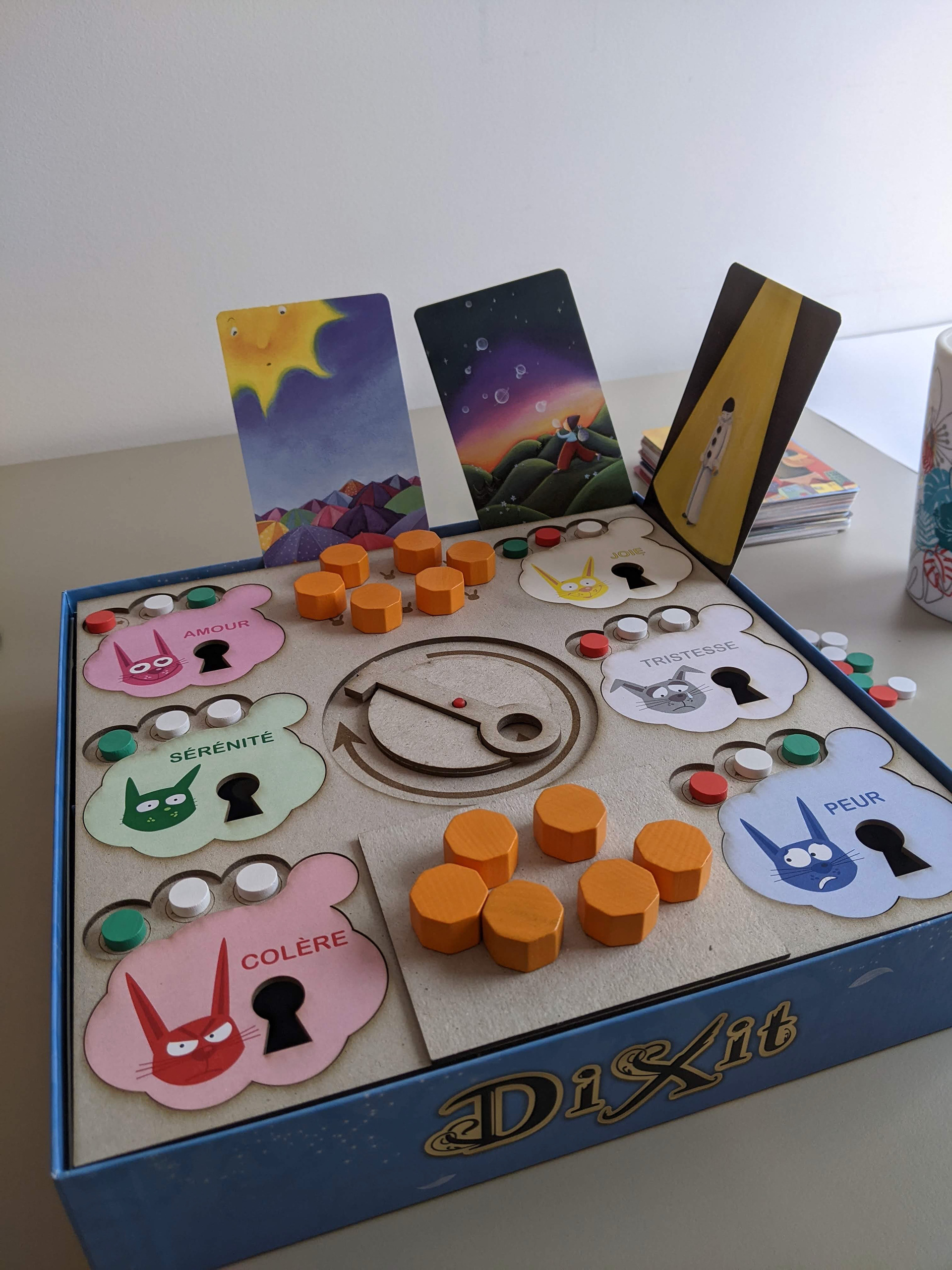
When I was entrusted with the project, we were already playing in the box with the game board placed on top, with wedges glued inside. The key you see in the centre of the game board was used to lift the doors via the padlock hole. You had to discard a certain number of tokens to successfully free the emotion rabbit.
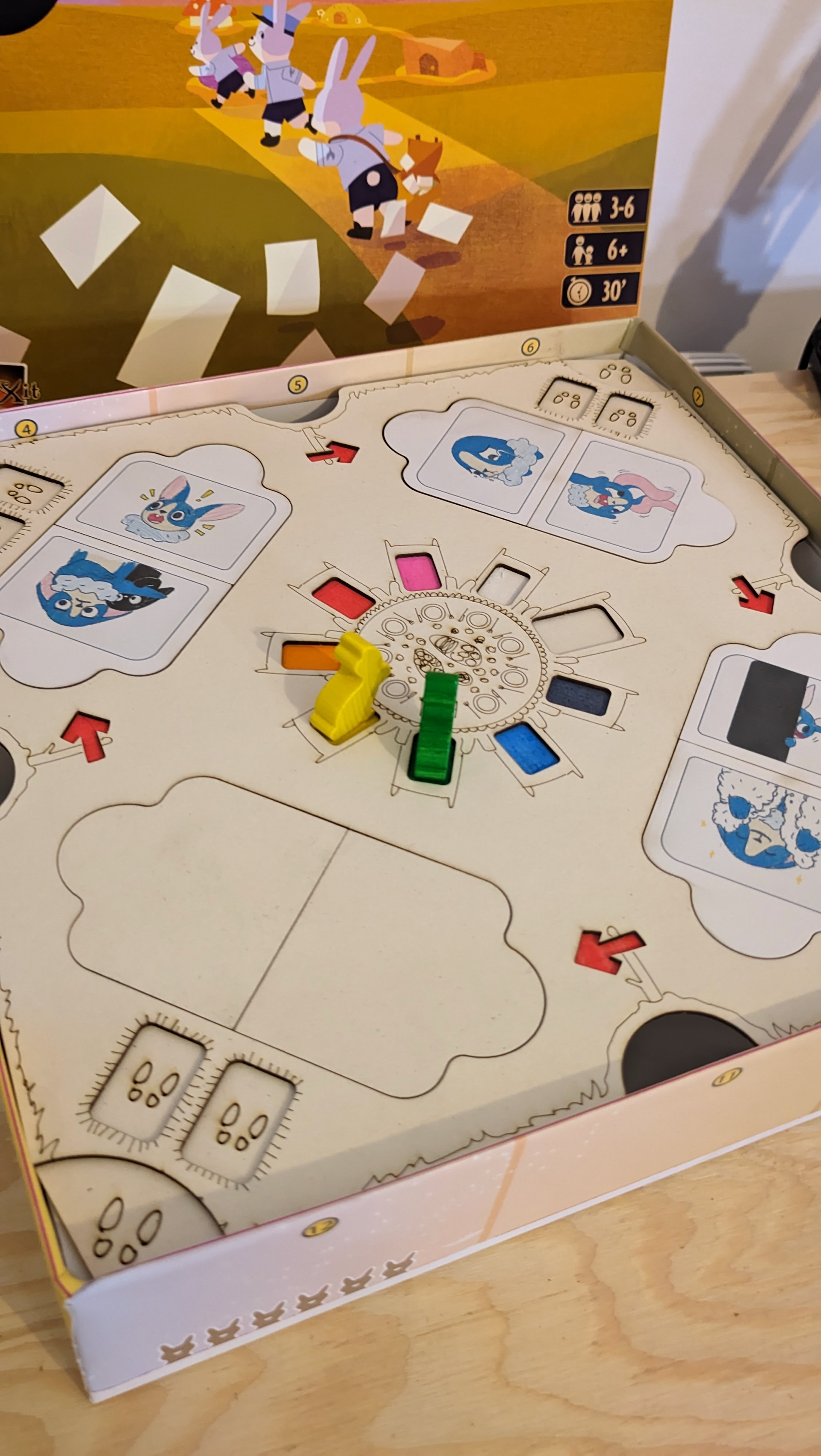
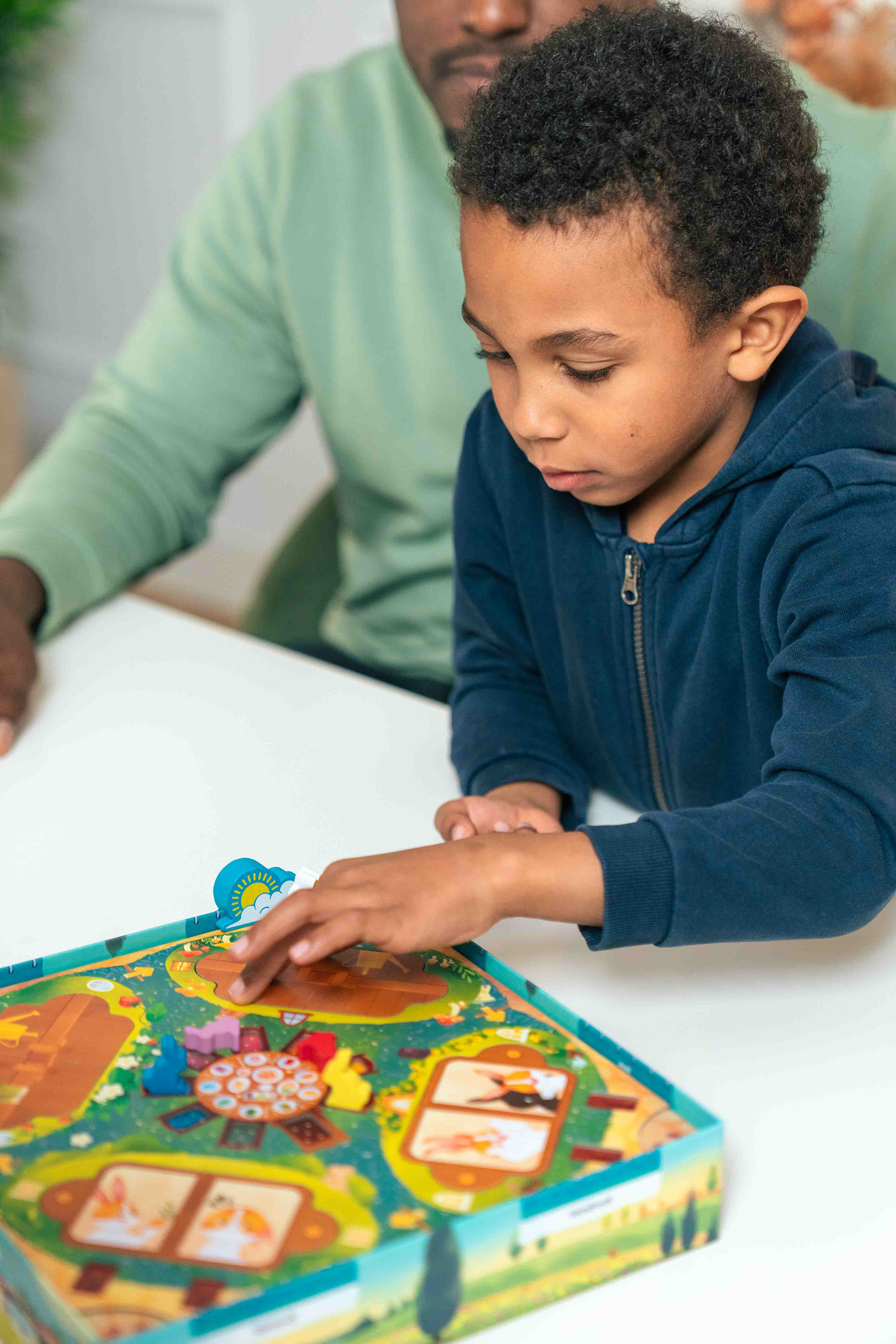
With the new proposed theme and the mechanics that were being refined, I completely redesigned the door opening system. Opening the doors to invite the rabbits to the party is one of children's favourite moments! It's very easy to handle, you know where to press without thinking, and it always creates a lovely effect.
What you don't see when you pay are all the research I made to find the tilting mechanism idea that works, the dozens of prototypes that didn't work, the change from 1 to 2 rabbits per burrow, the millimetre-precise adjustments to make it open properly... This is what I love about UX design work: finding solutions that seem simple, that can be picked up instantly, and that leave room for stars in the eyes.
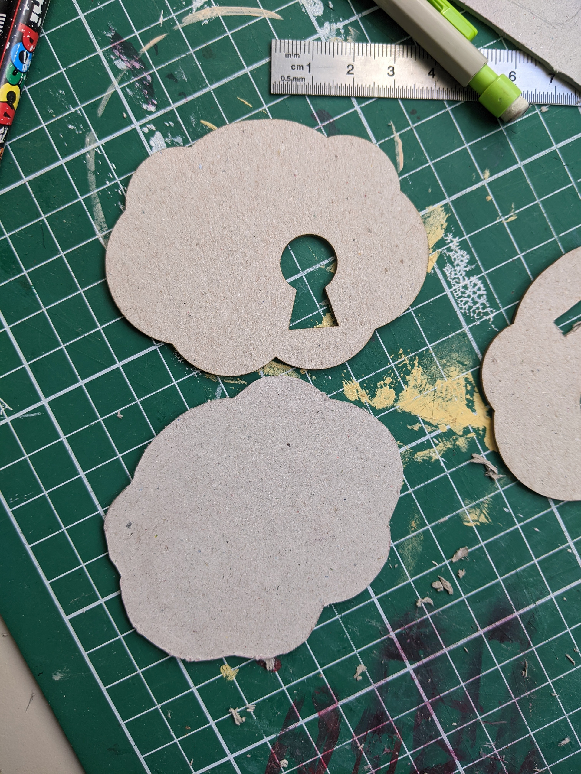
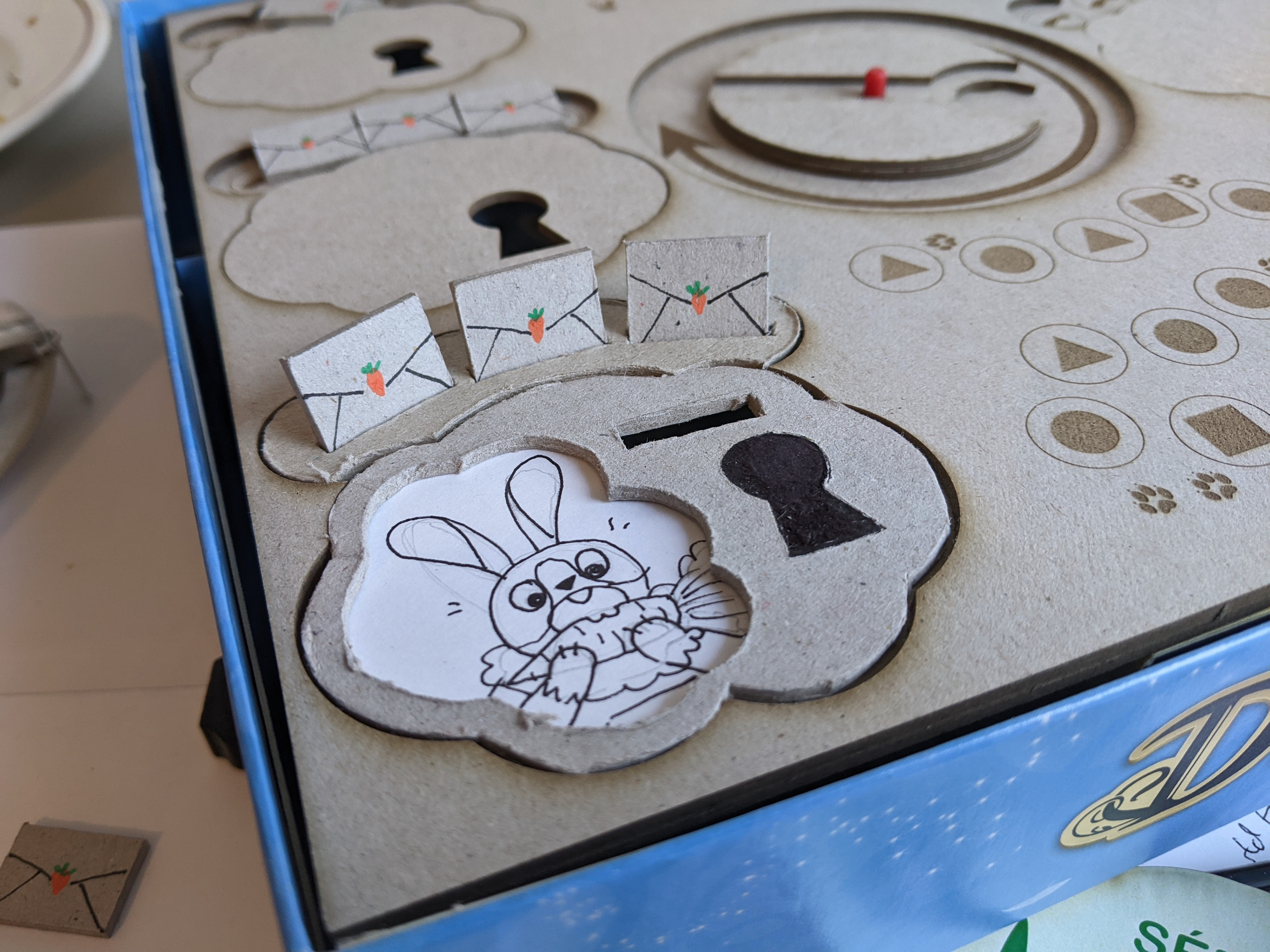
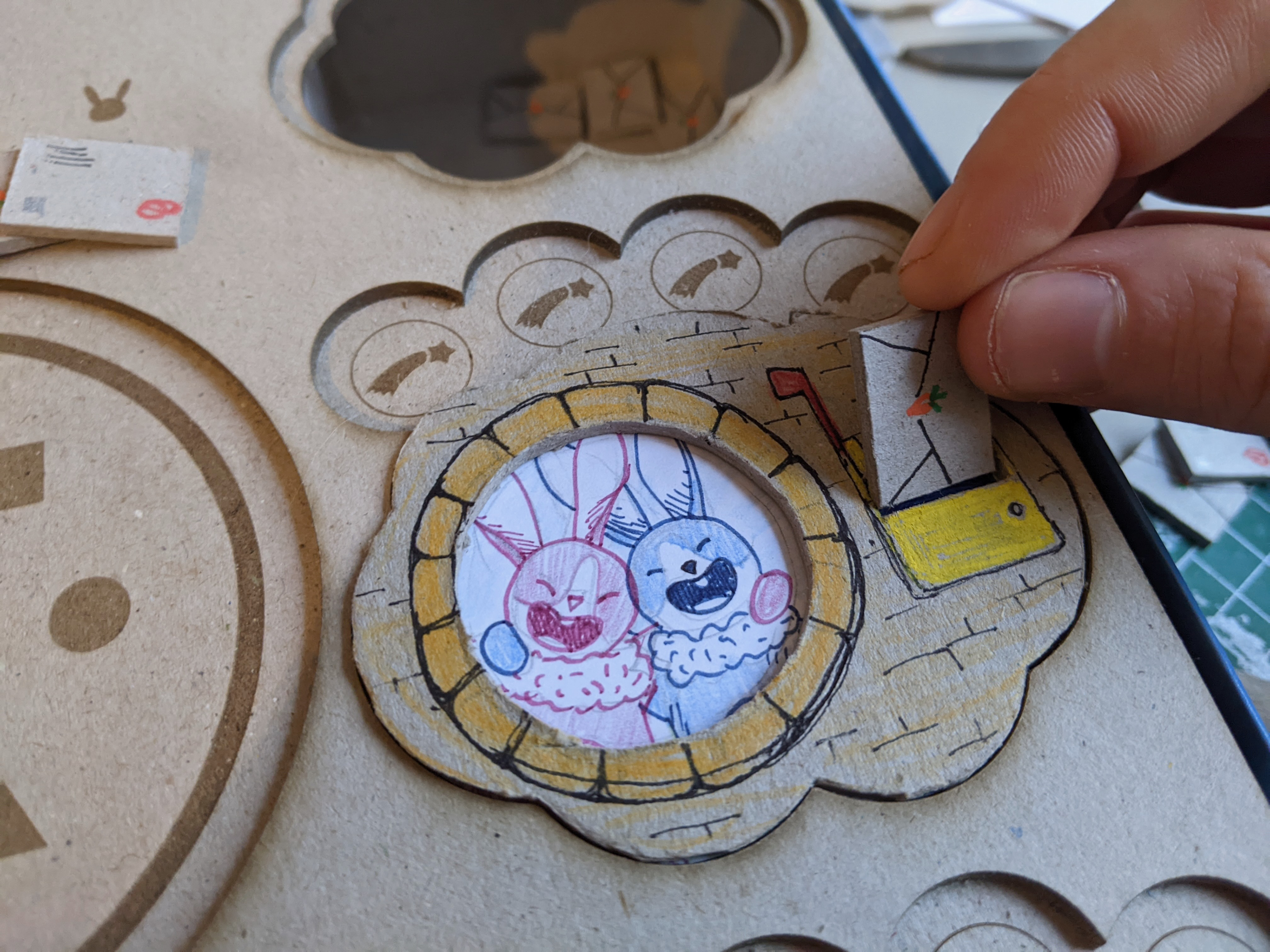
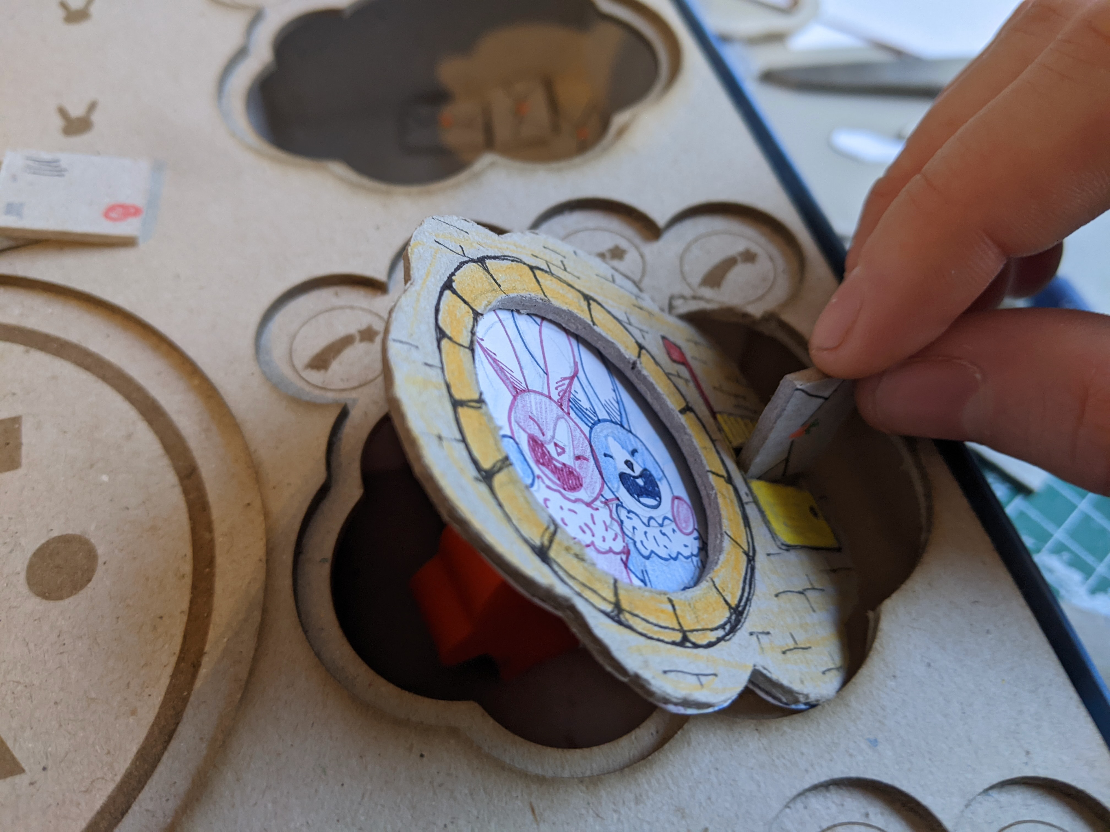
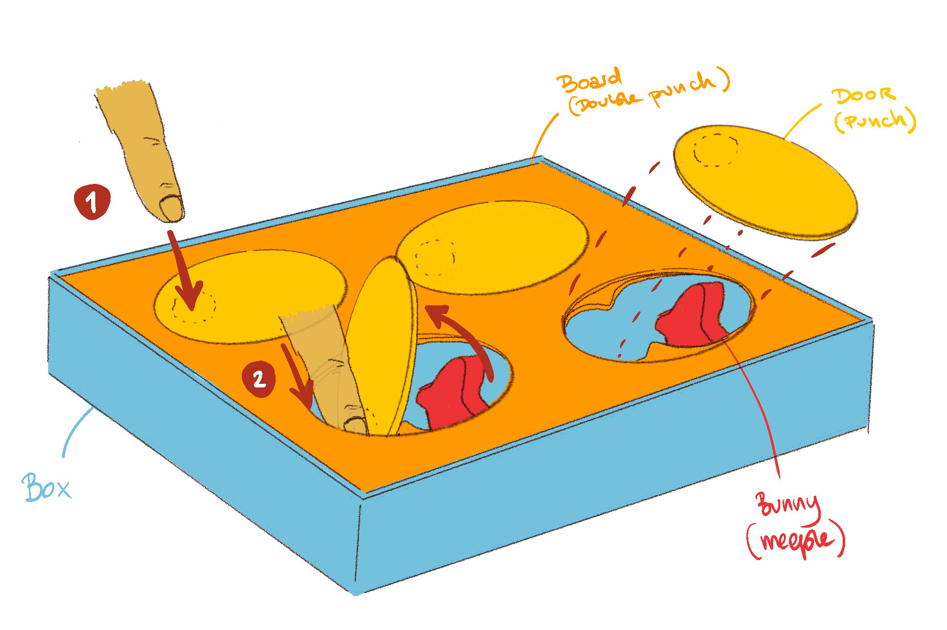
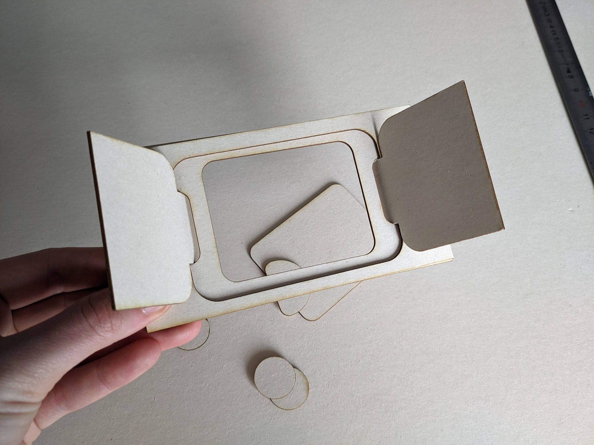
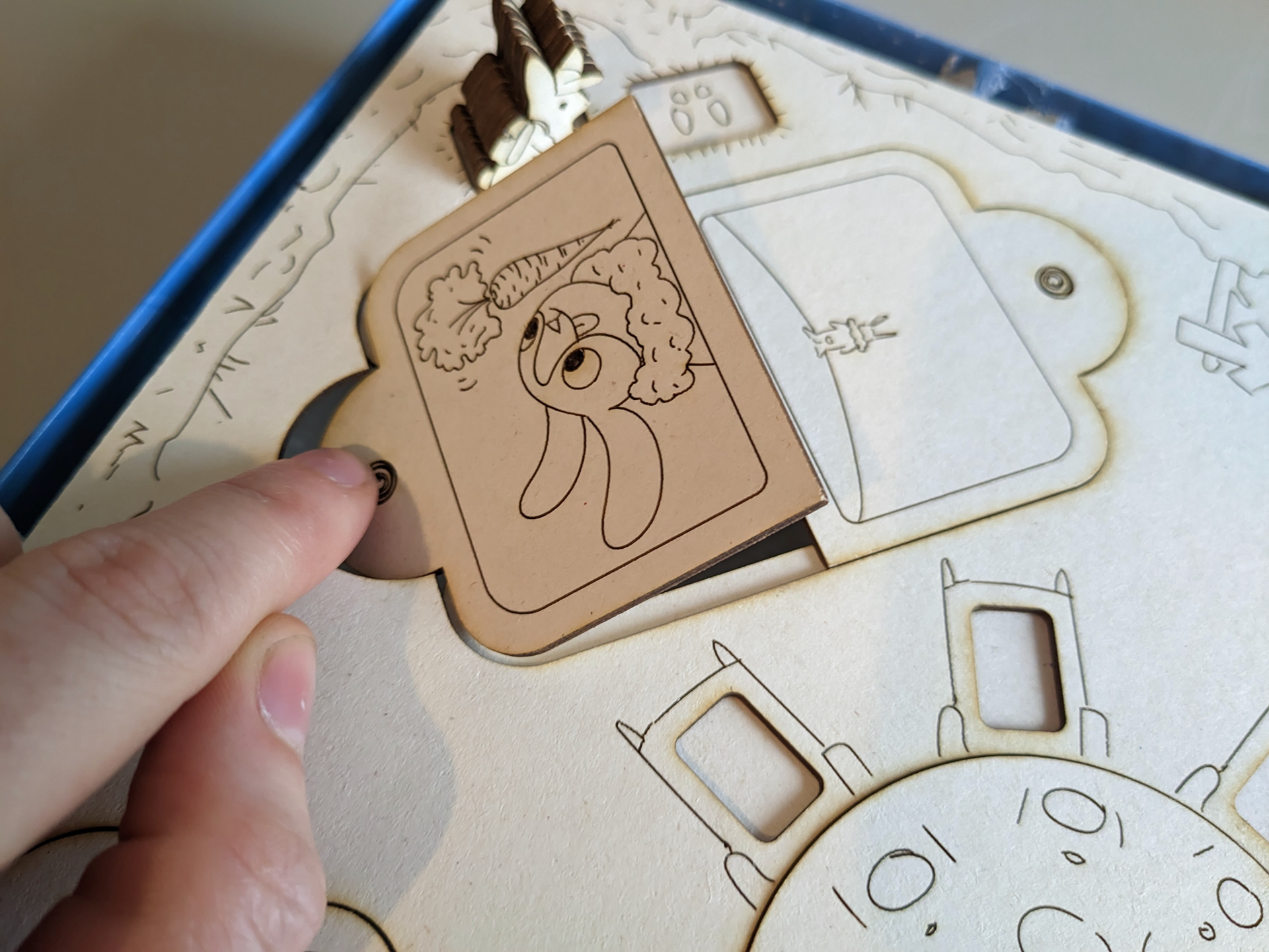
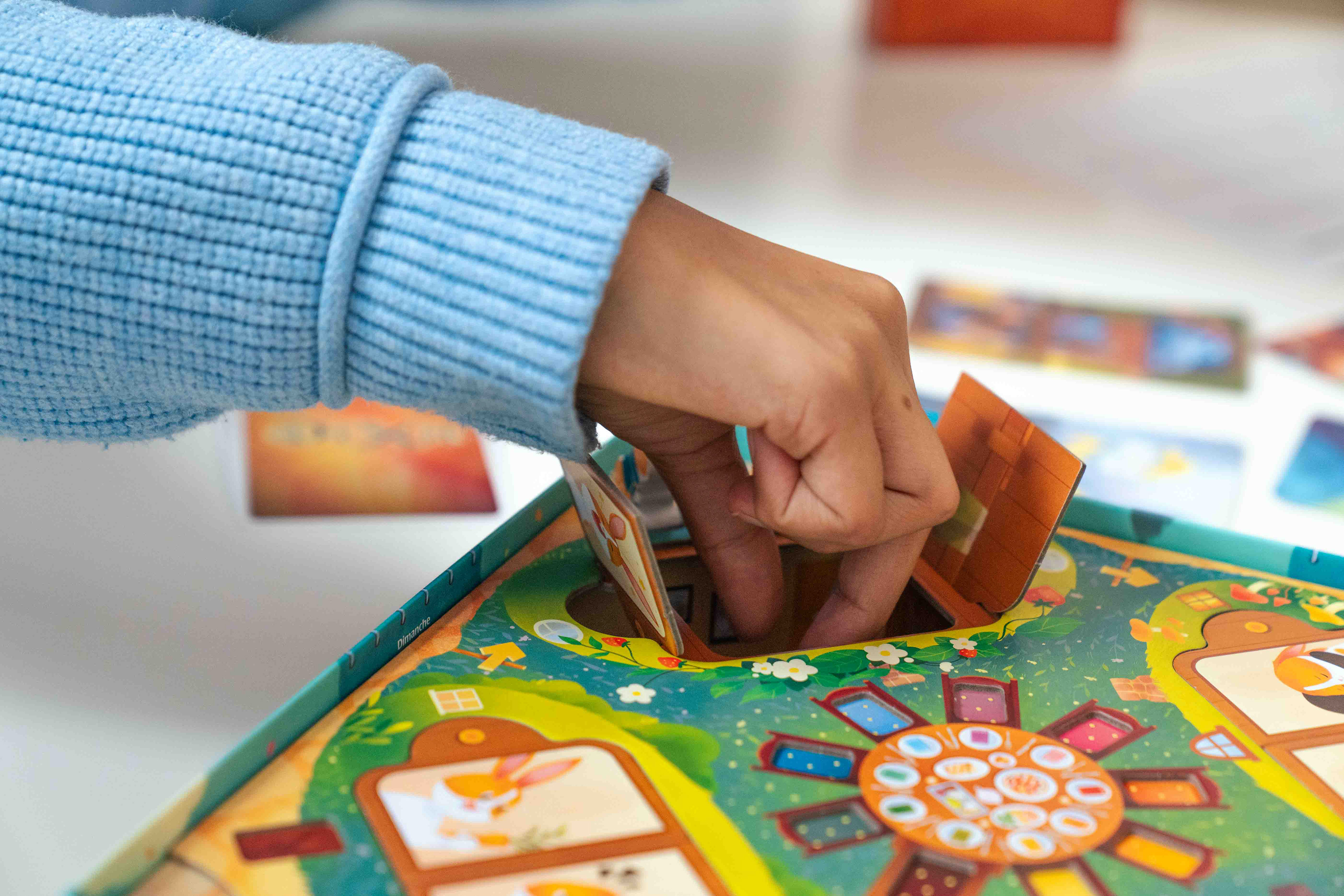
Game board (ground)
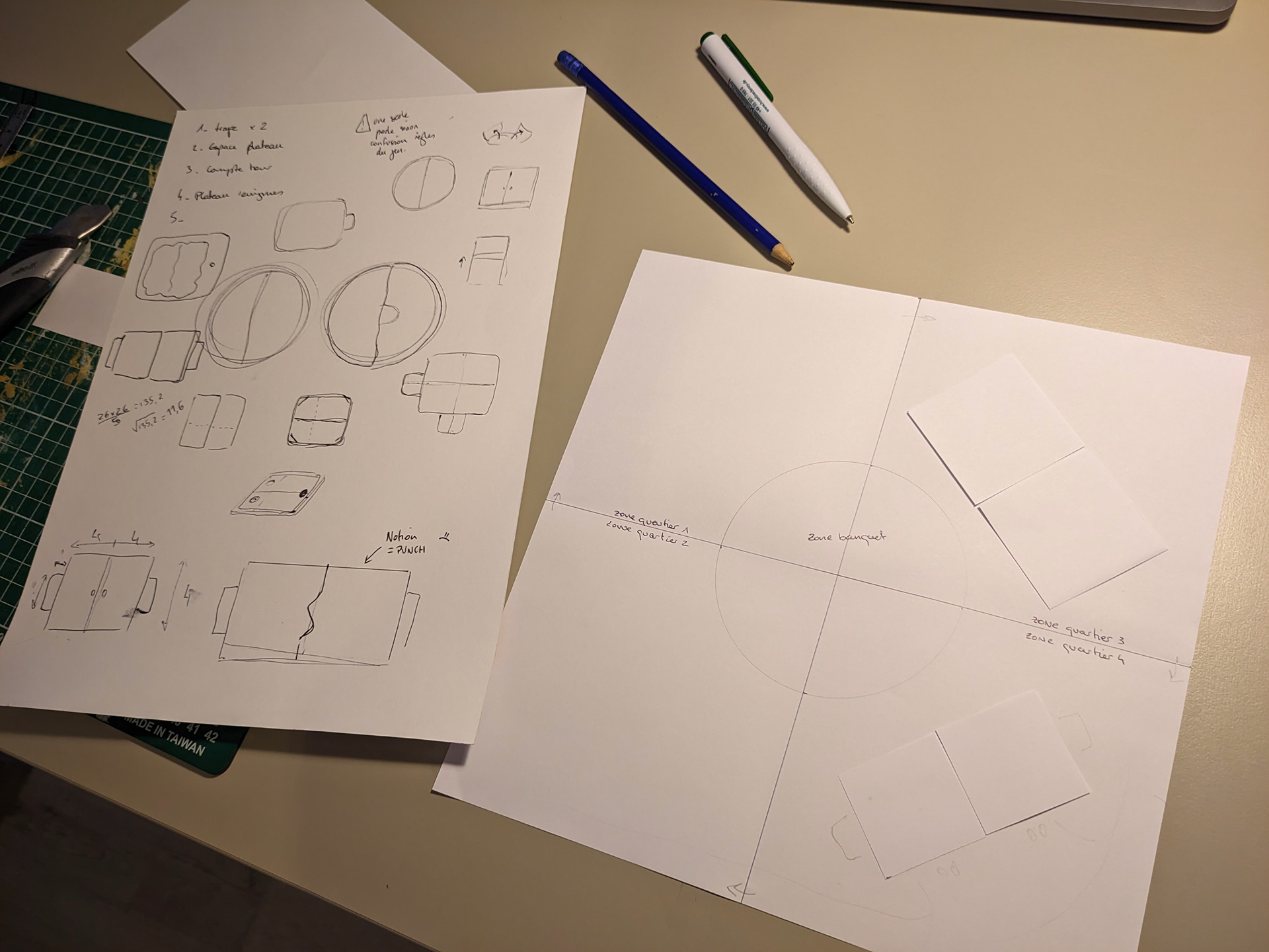
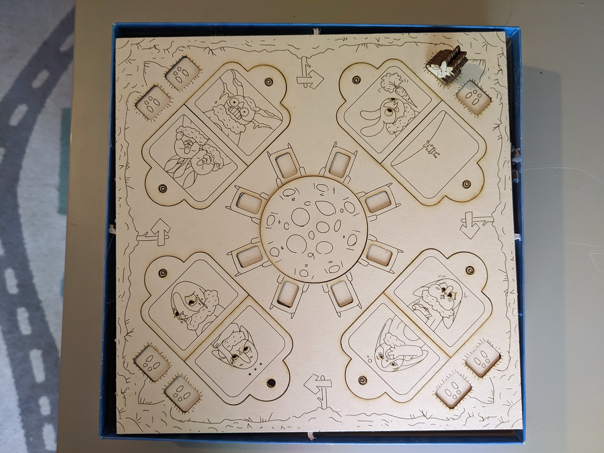
Once I validated, the door system, I had to make everything to fit on the game board. This game board must tell the story, inspire wonder... whilst integrating all the necessary functional elements! The four double-burrows, each with two doormats and a starting space. In the central area, the idea of creating a table where invited rabbits are placed came very quickly and very naturally.
Concepts
The last important aspect of this game board is the burrow doors. On each door, you can see a window or a portrait of the rabbit who lives there. The choice of the 32 concepts was real game design, concept art and art direction work: three skills necessary to balance the game. I worked as a duo with Lucas on this balancing, him on the distribution and balance of concepts, me on the visual aspect.
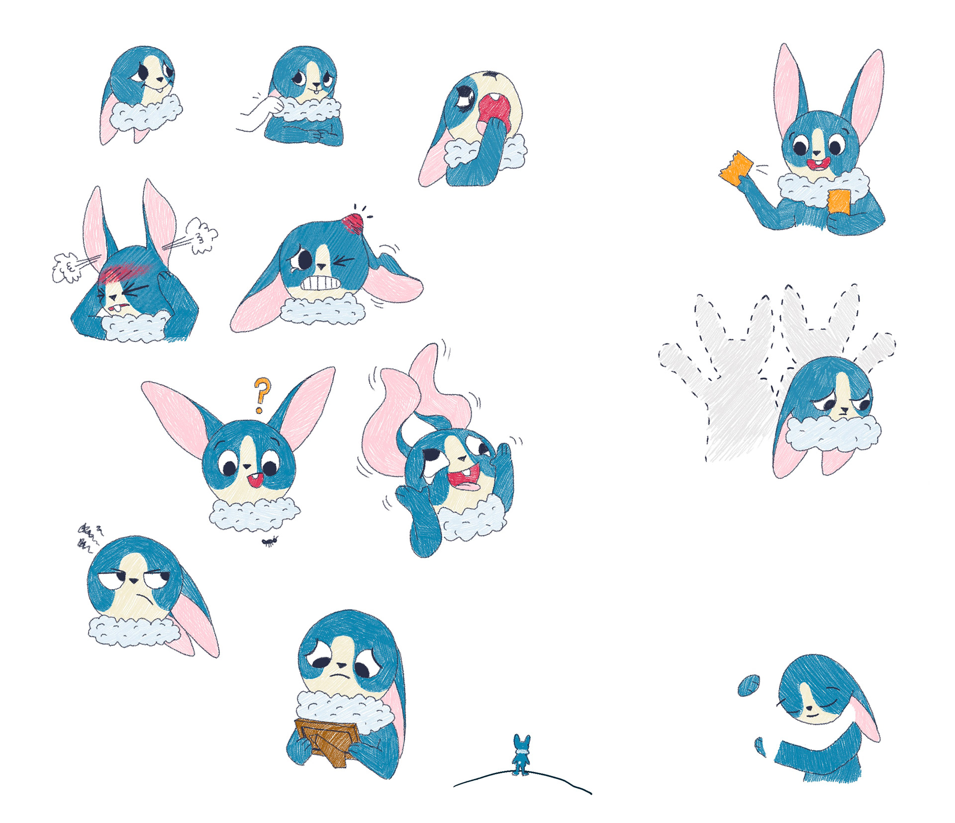
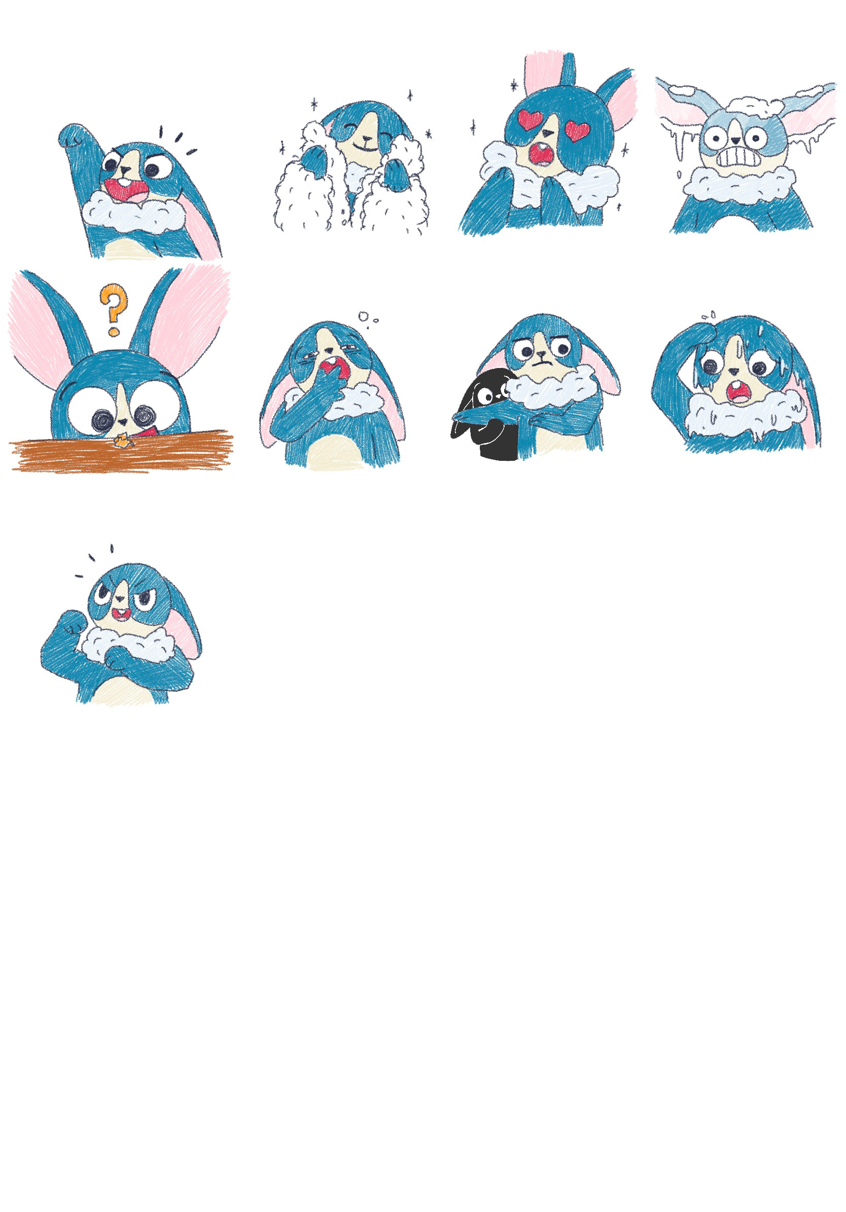
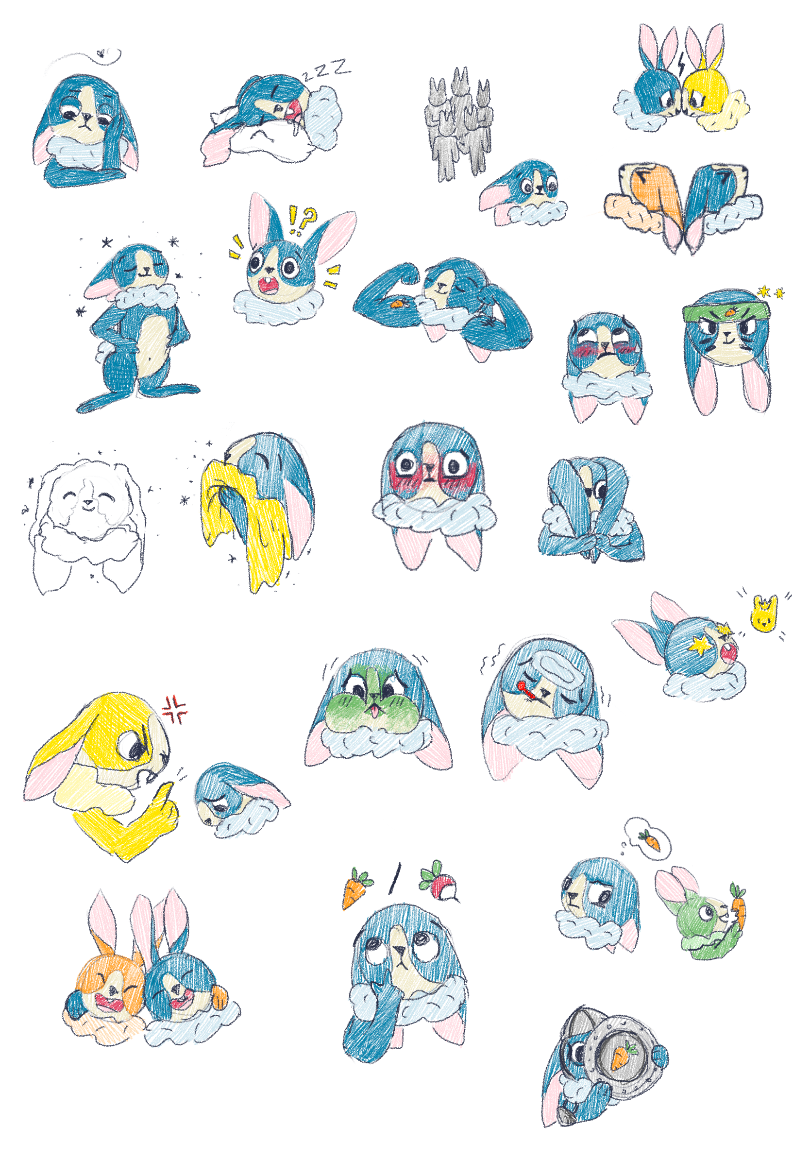
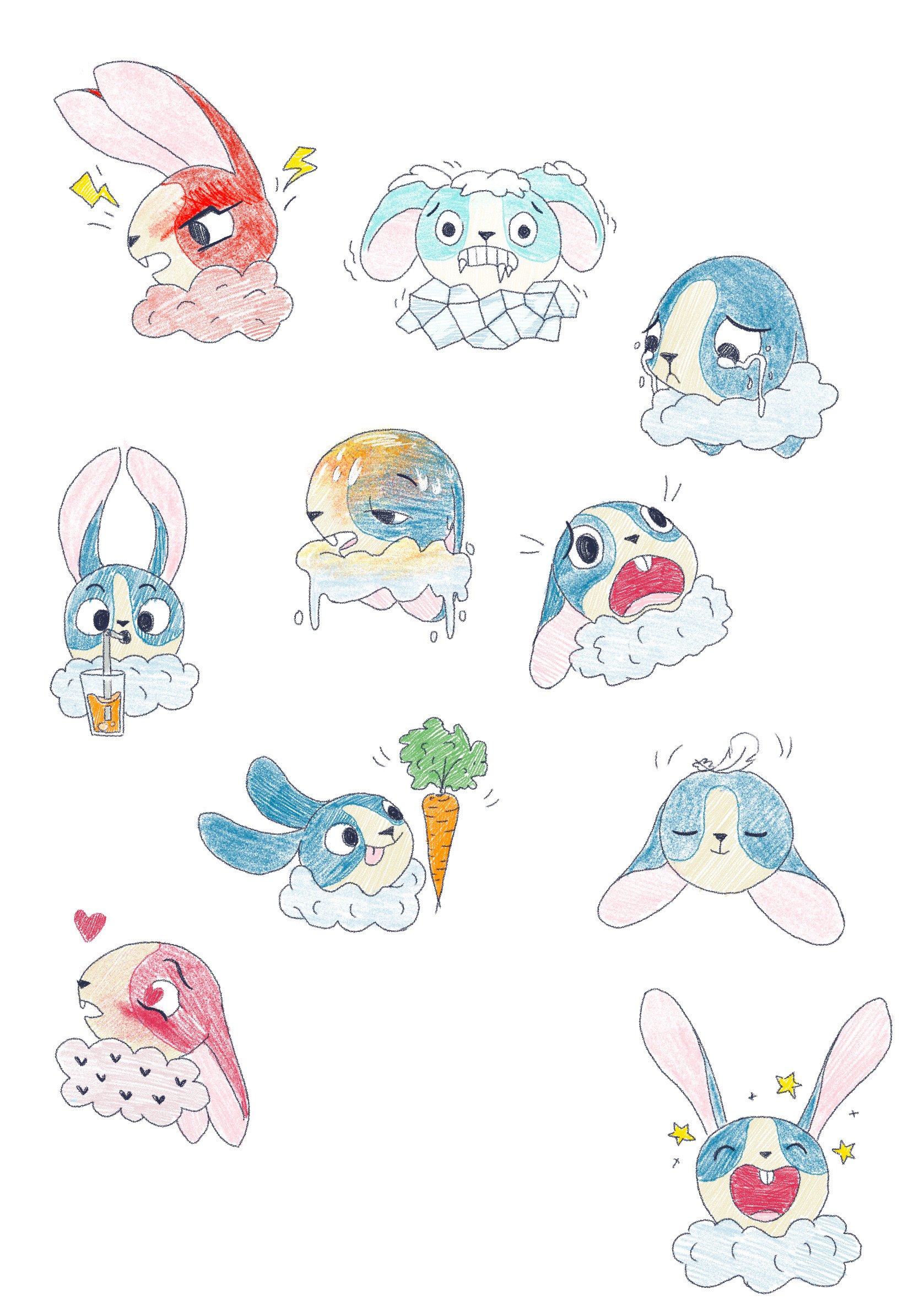
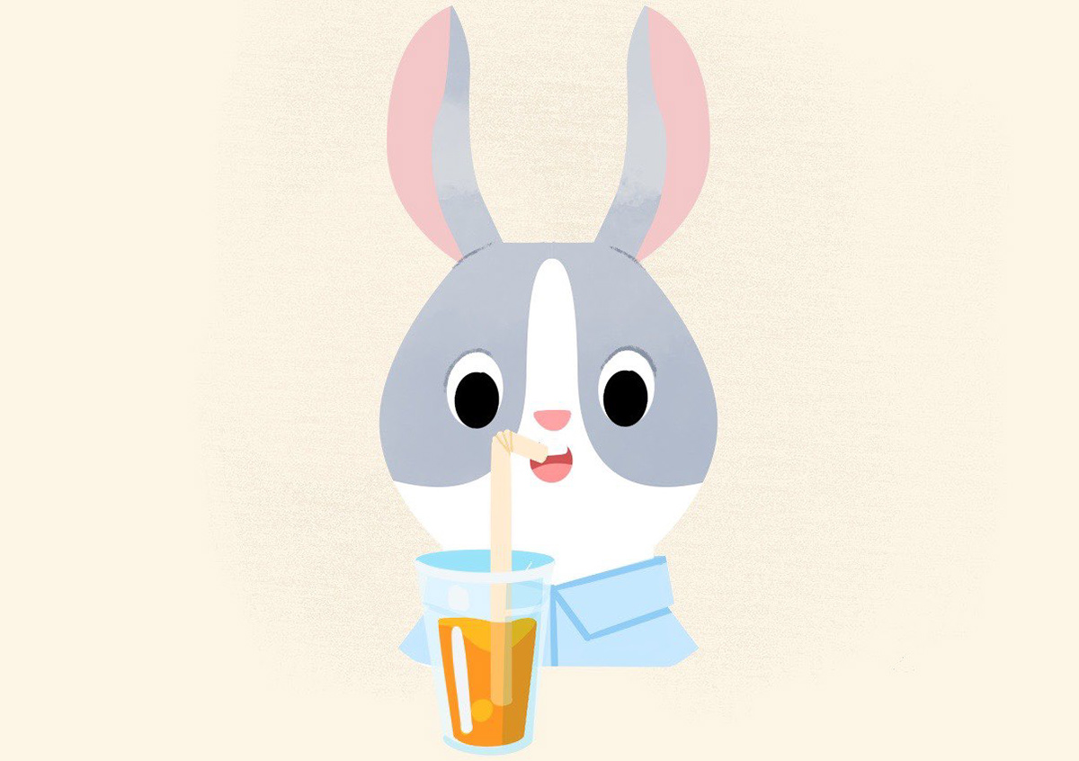
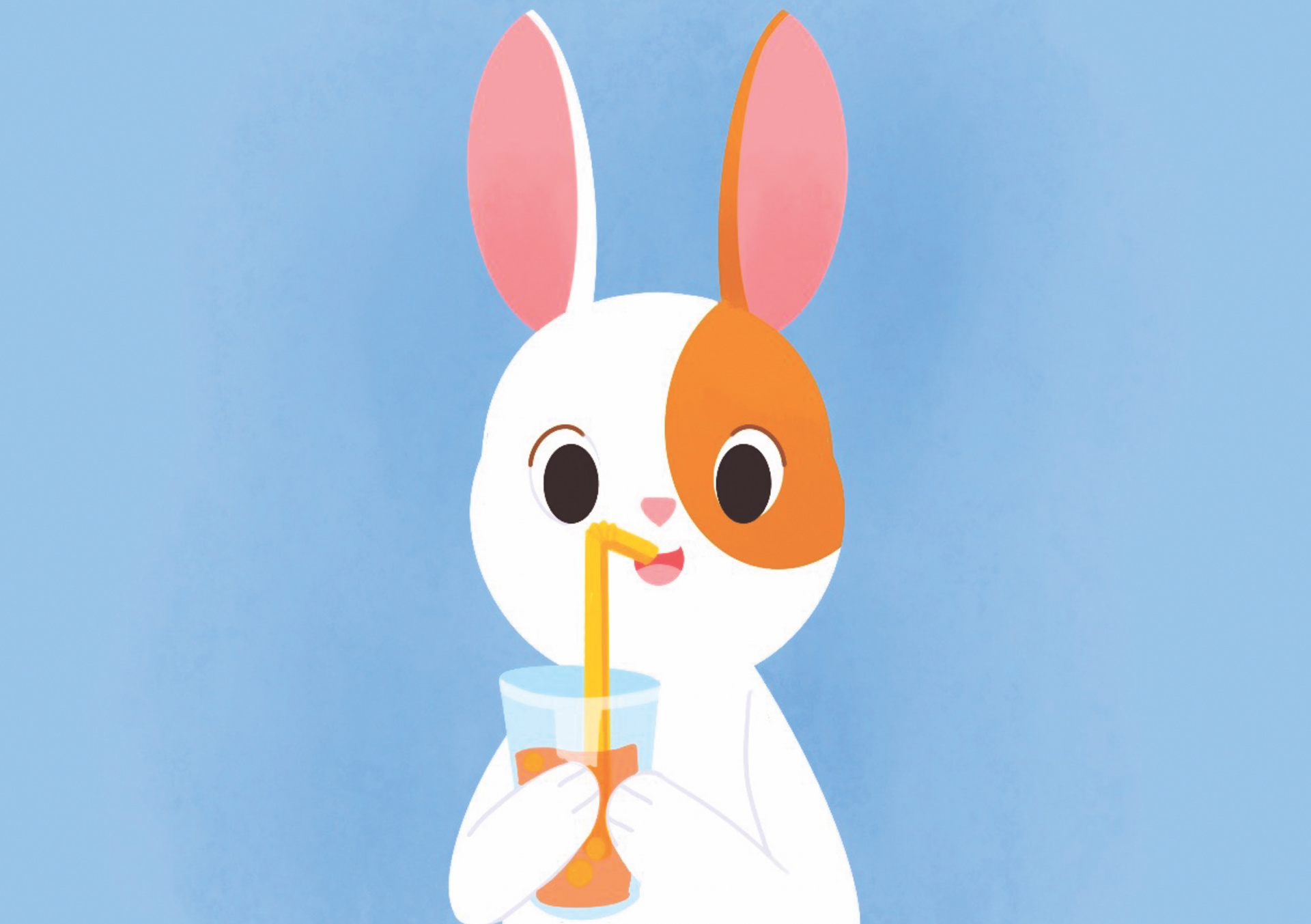
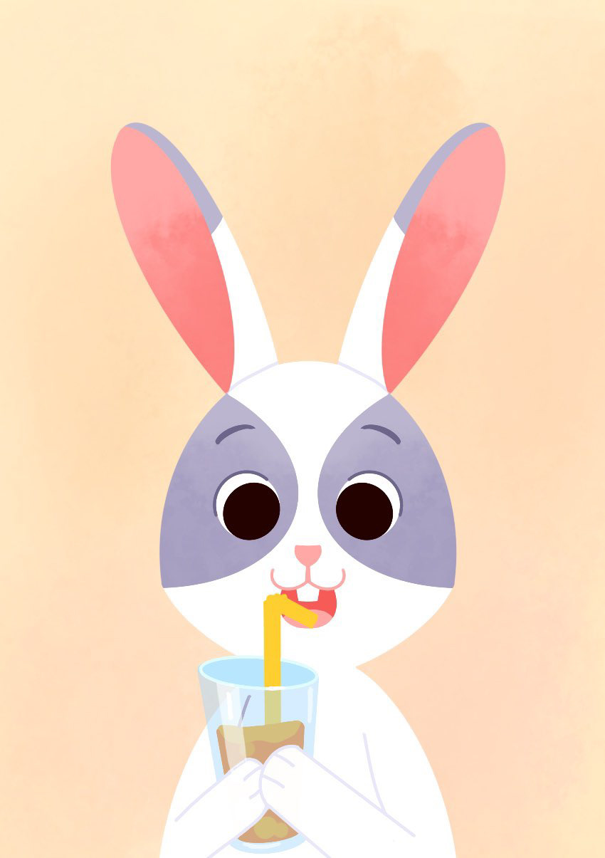
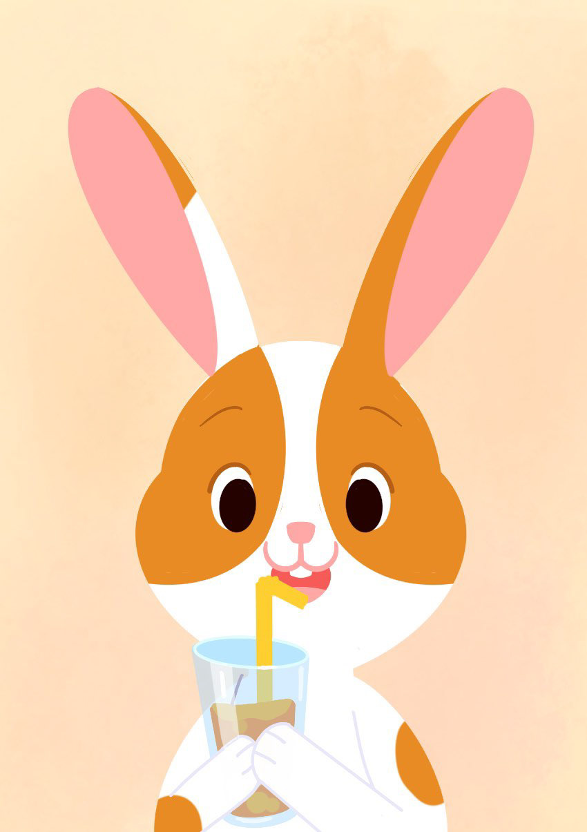
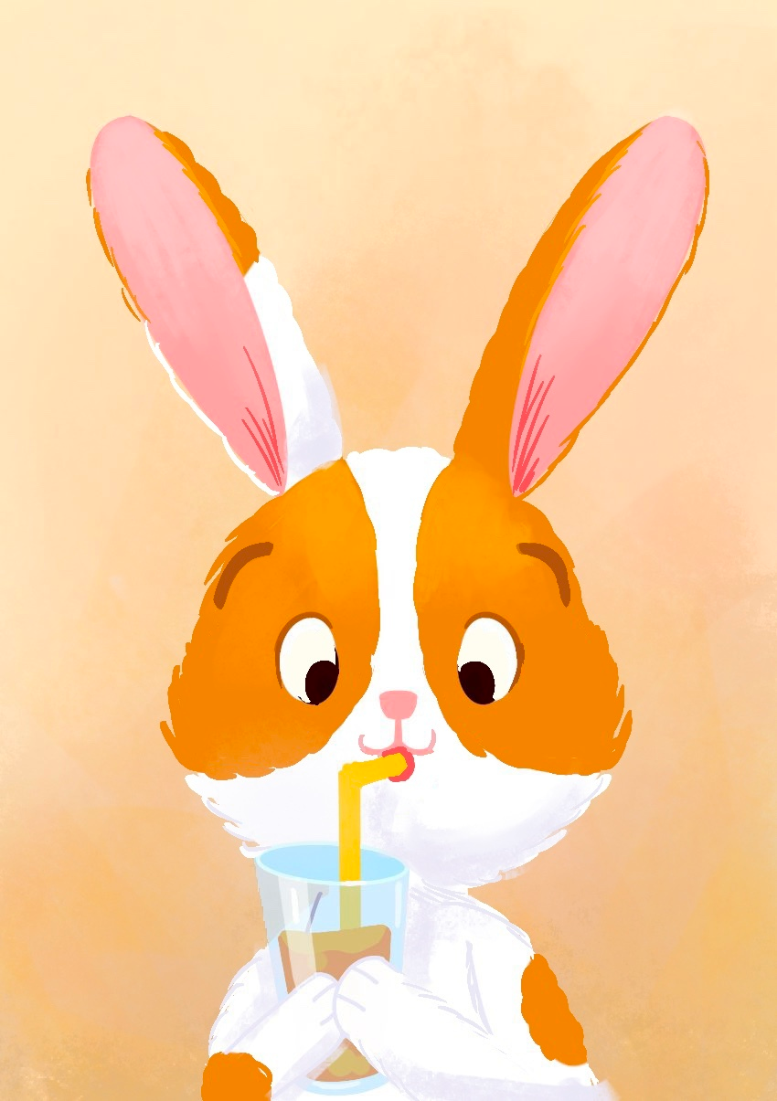
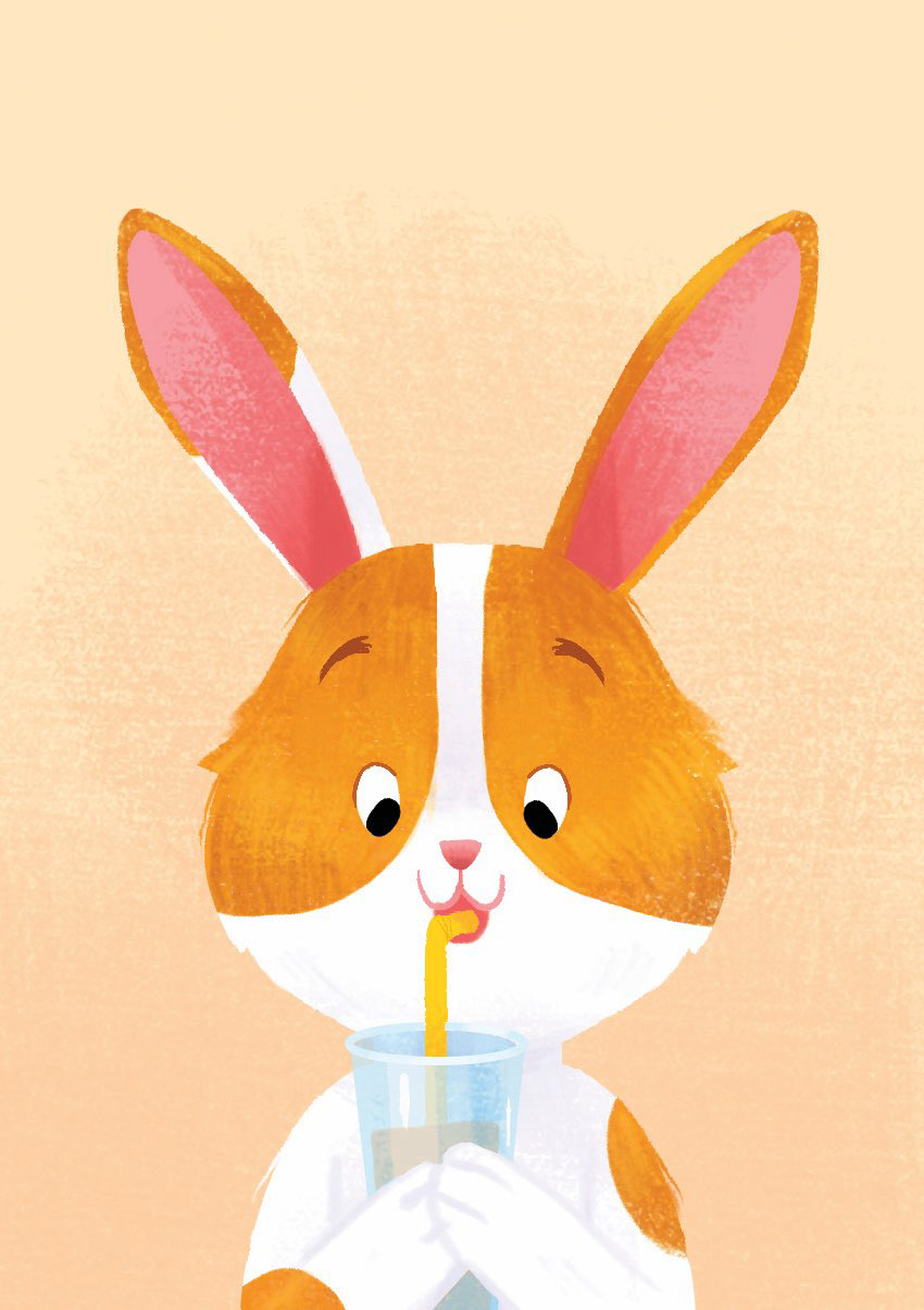
After determining the concepts present in the game, I illustrated many test rabbits to validate them in real conditions before requesting their final versions from the illustrator Emily Paik. The first illustrated rabbit helped define its graphic aspect to then apply it across the entire game. A few rare rabbits, like this one, underwent significant changes... because all were tested with children and adults to confirm, or not, their interpretation.


The burrows - the insert (the cardboard structure that organises the box)
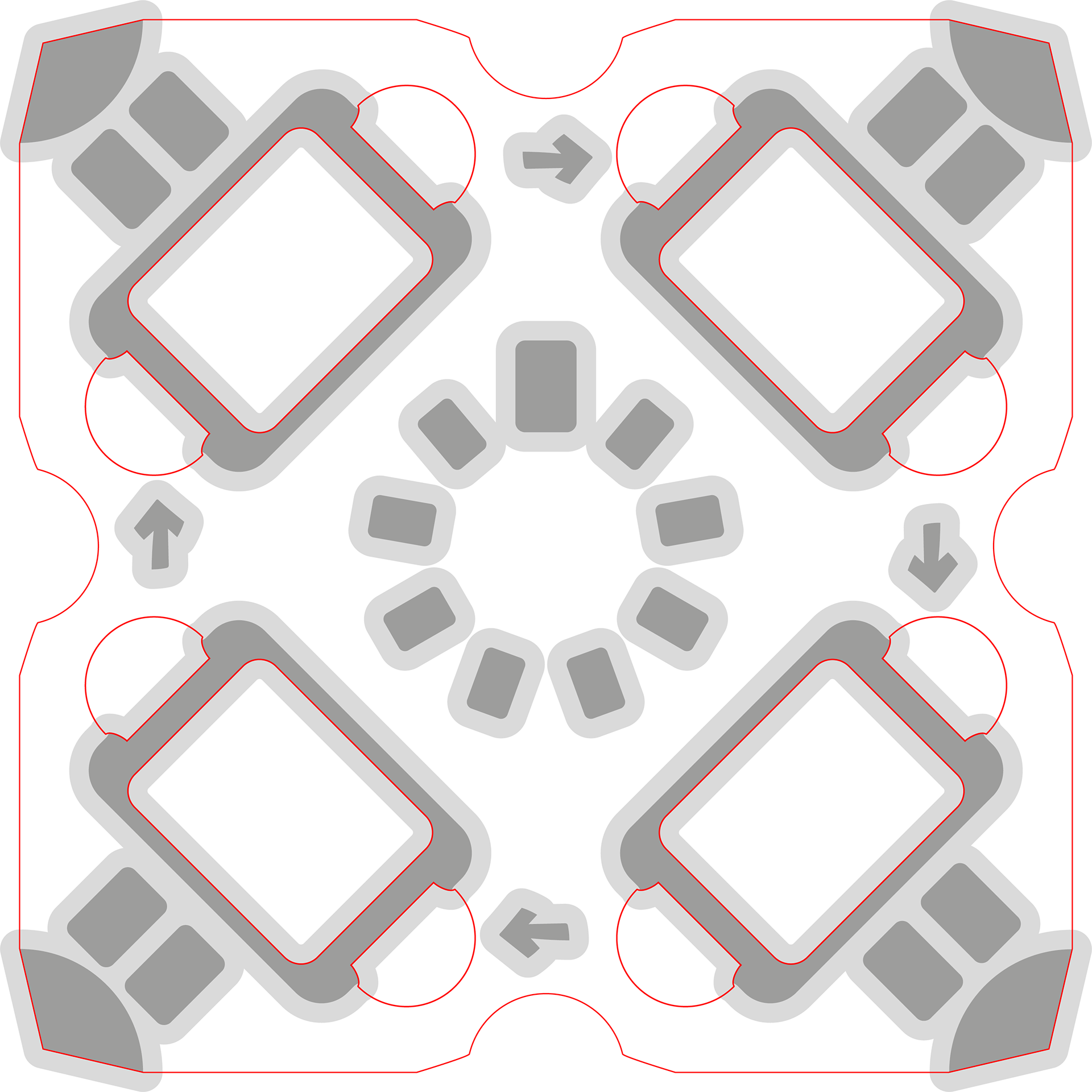
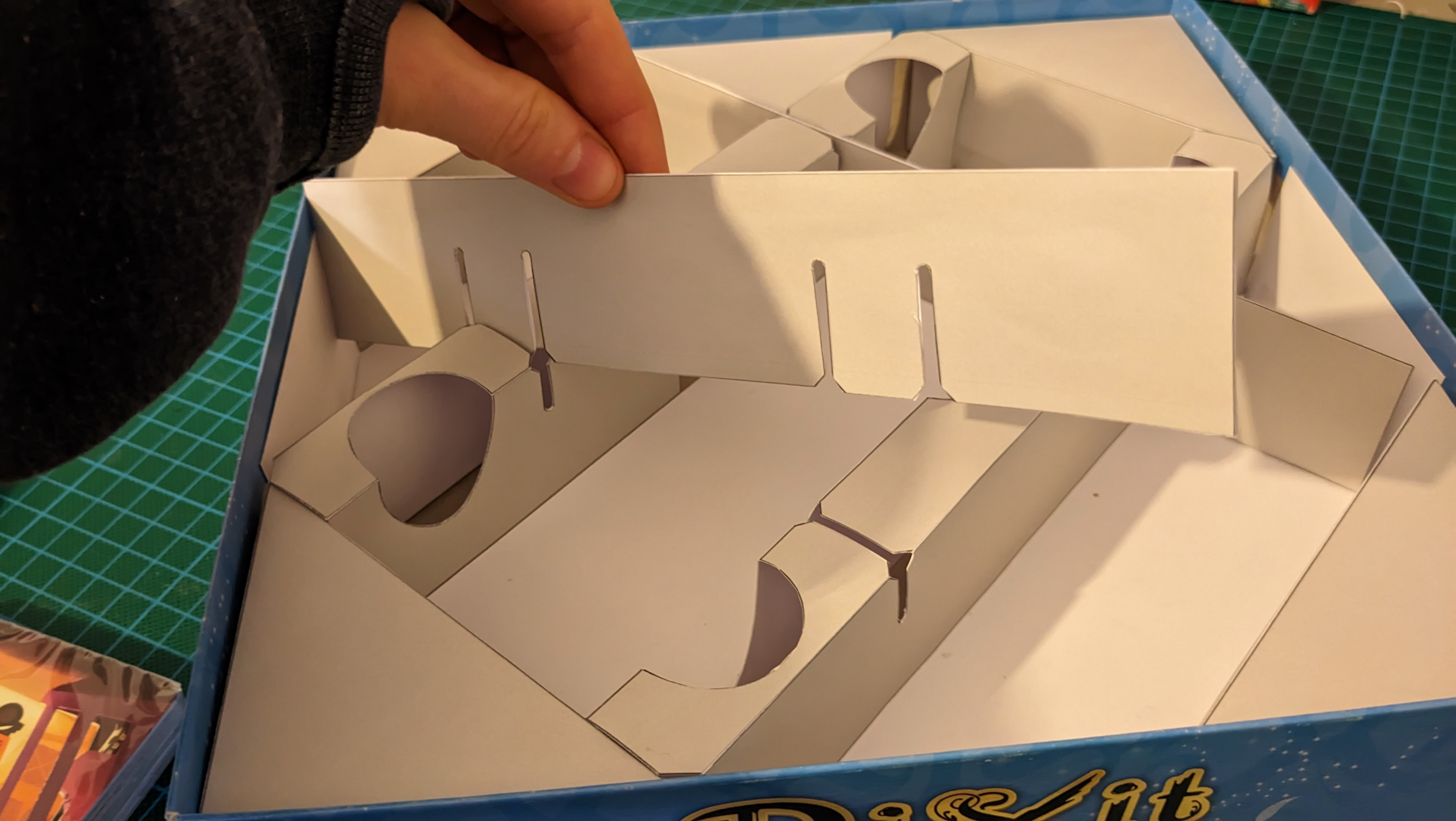
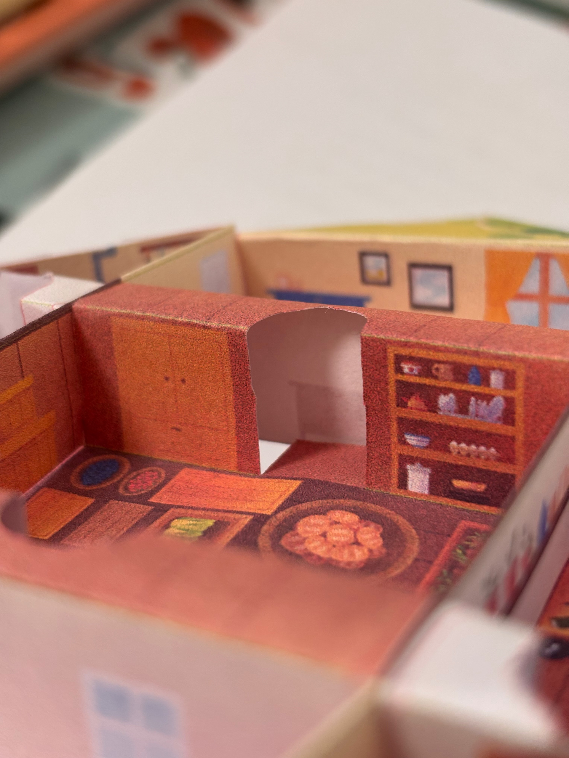
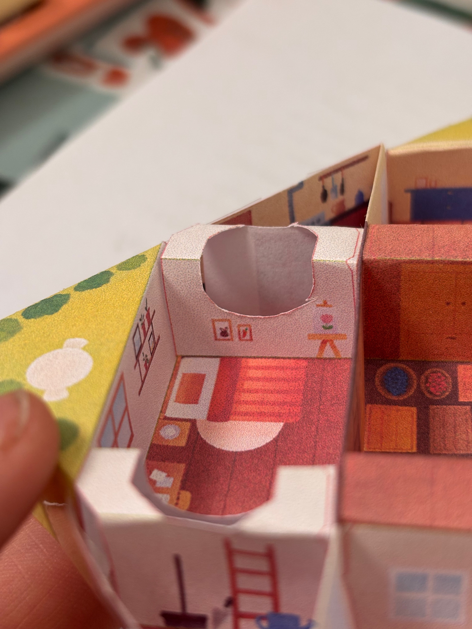
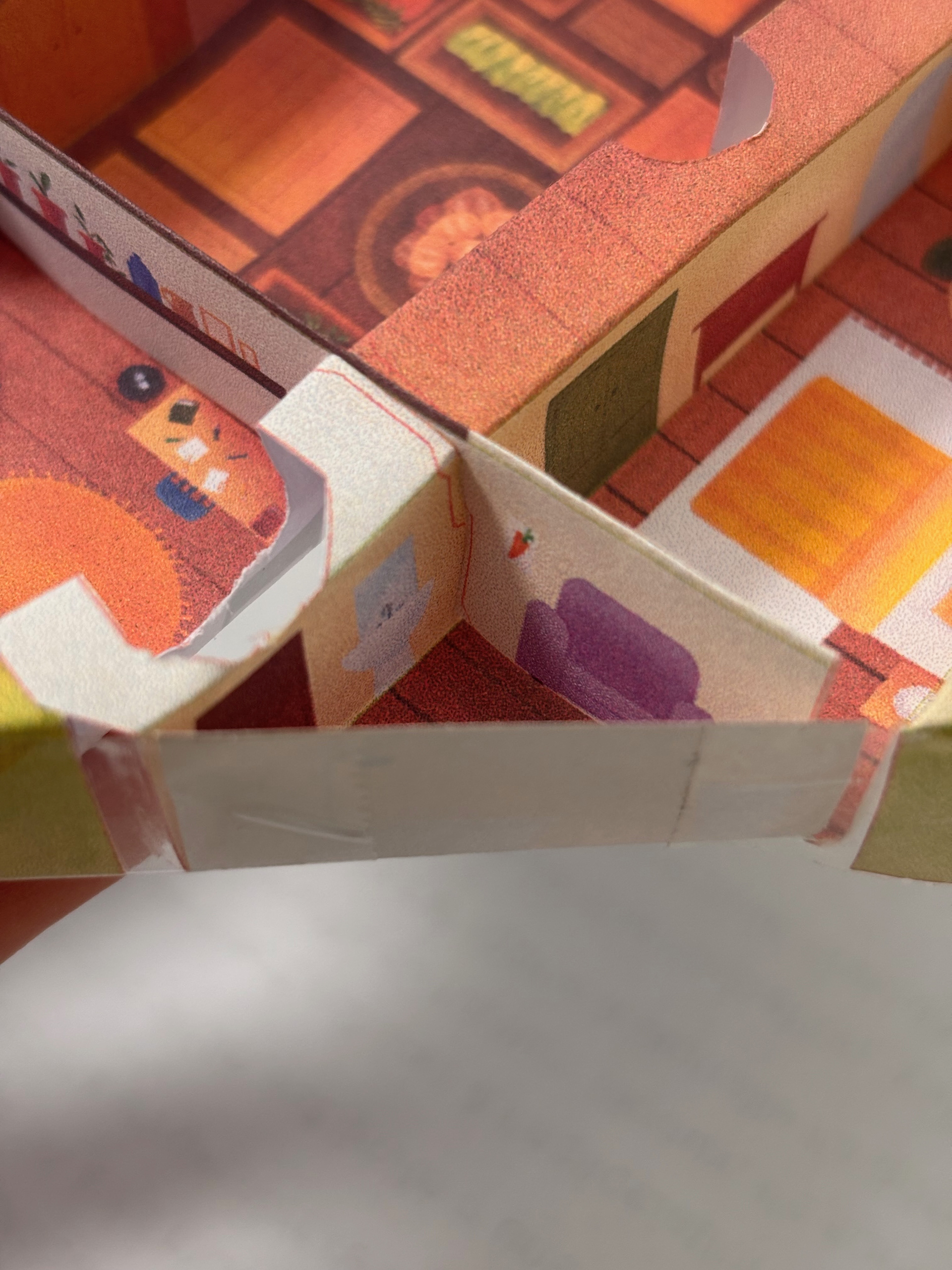
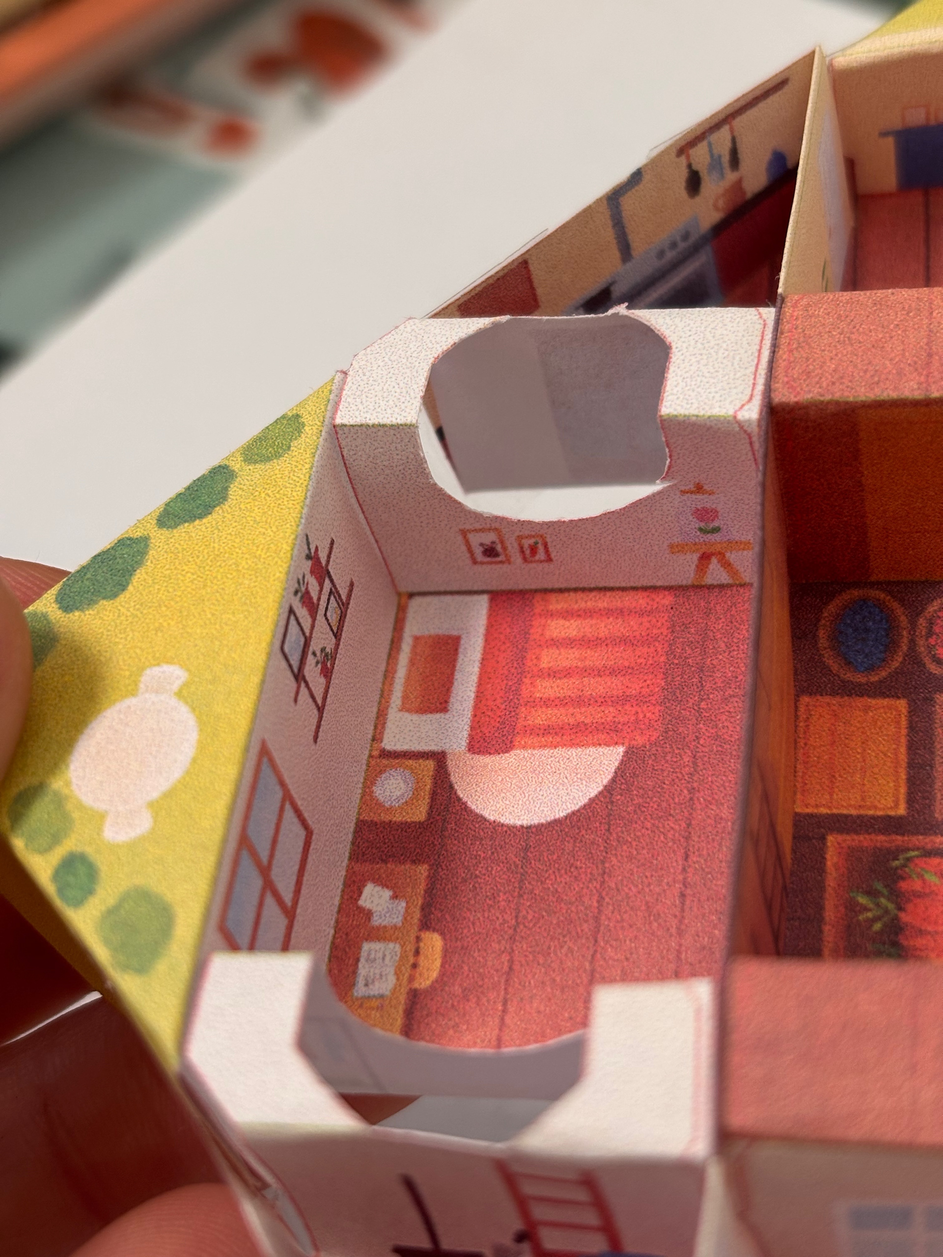
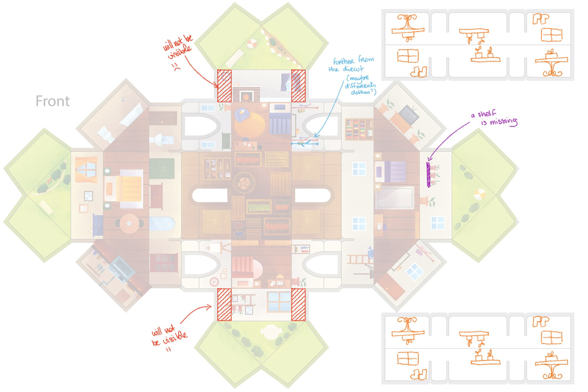
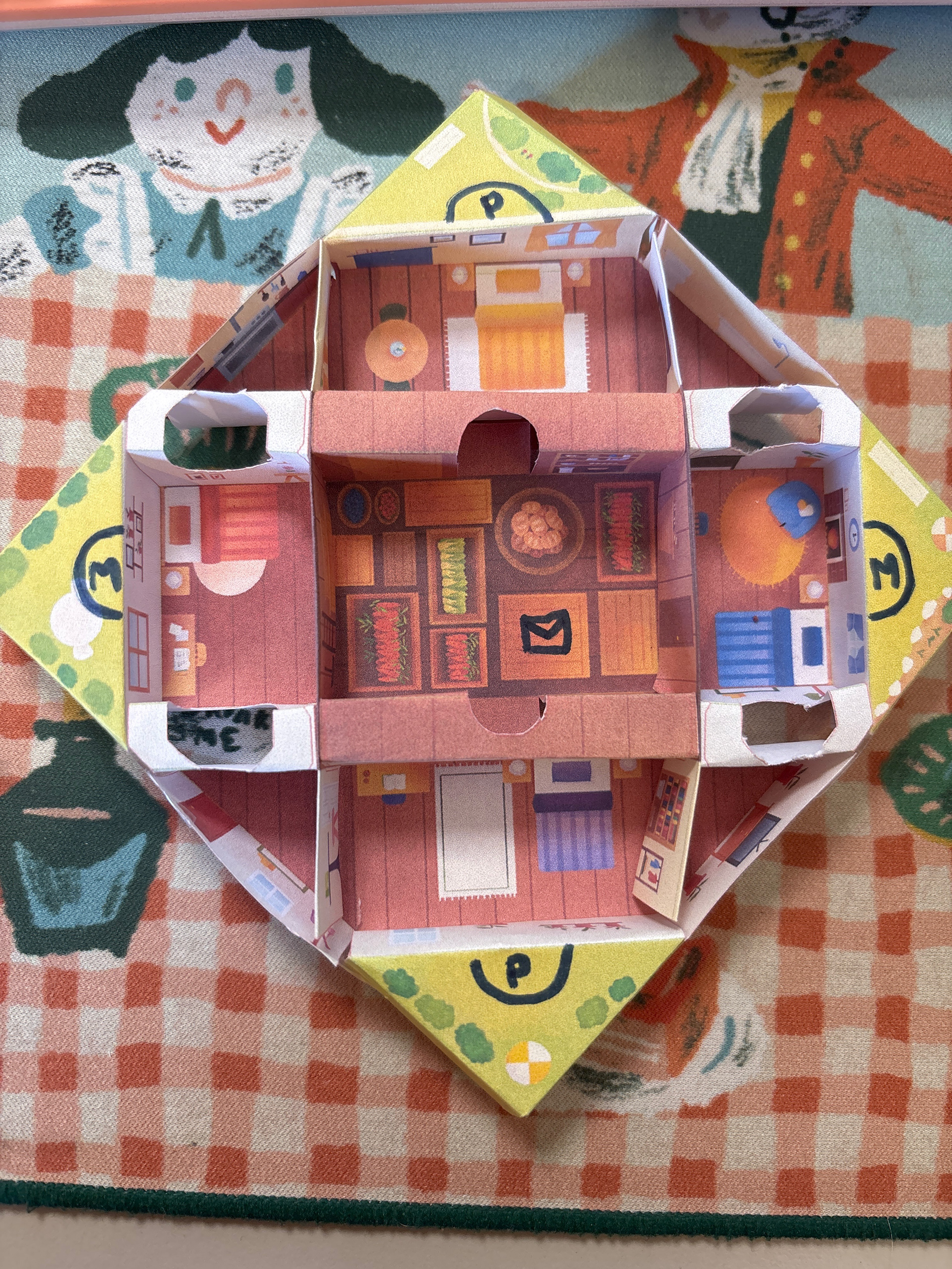
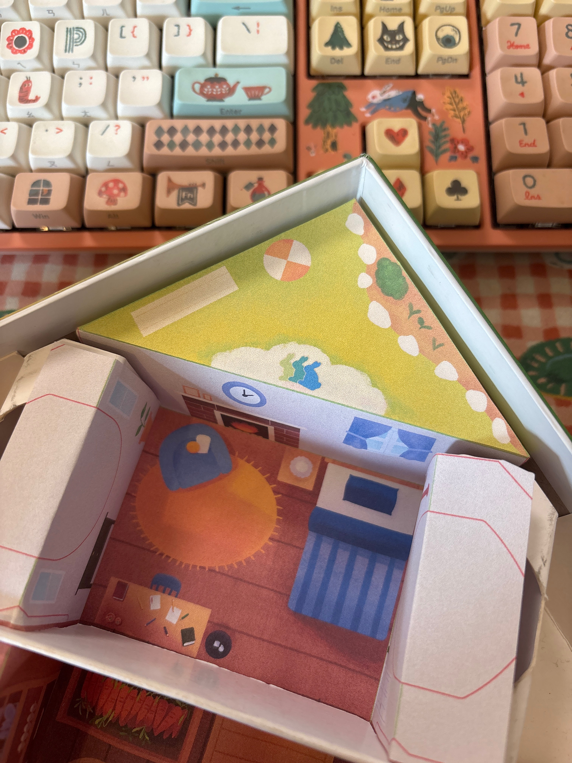
The insert was also a technical challenge and I worked on it at the same time as the game board... and for good reason, the two must work together! Under each burrow there must be a hole to accommodate the rabbit meeples, but large enough to allow the doors to open. The 4 round holes in the insert around the blue and red burrow, for example, exist to allow the tilting movement of the burrows!
The game board must be properly secured in the box, because if you lean on a corner and the entire game board tilts... you have to start a new game! With children, this kind of accident happens quickly. And with all that, where to store the cards? The burrows are too small to accommodate them. It's also the heaviest element of the game: how to ensure it doesn't destroy the insert during transport? My first versions of the insert were far too complex, but they allowed me to test and find solutions to all these issues.
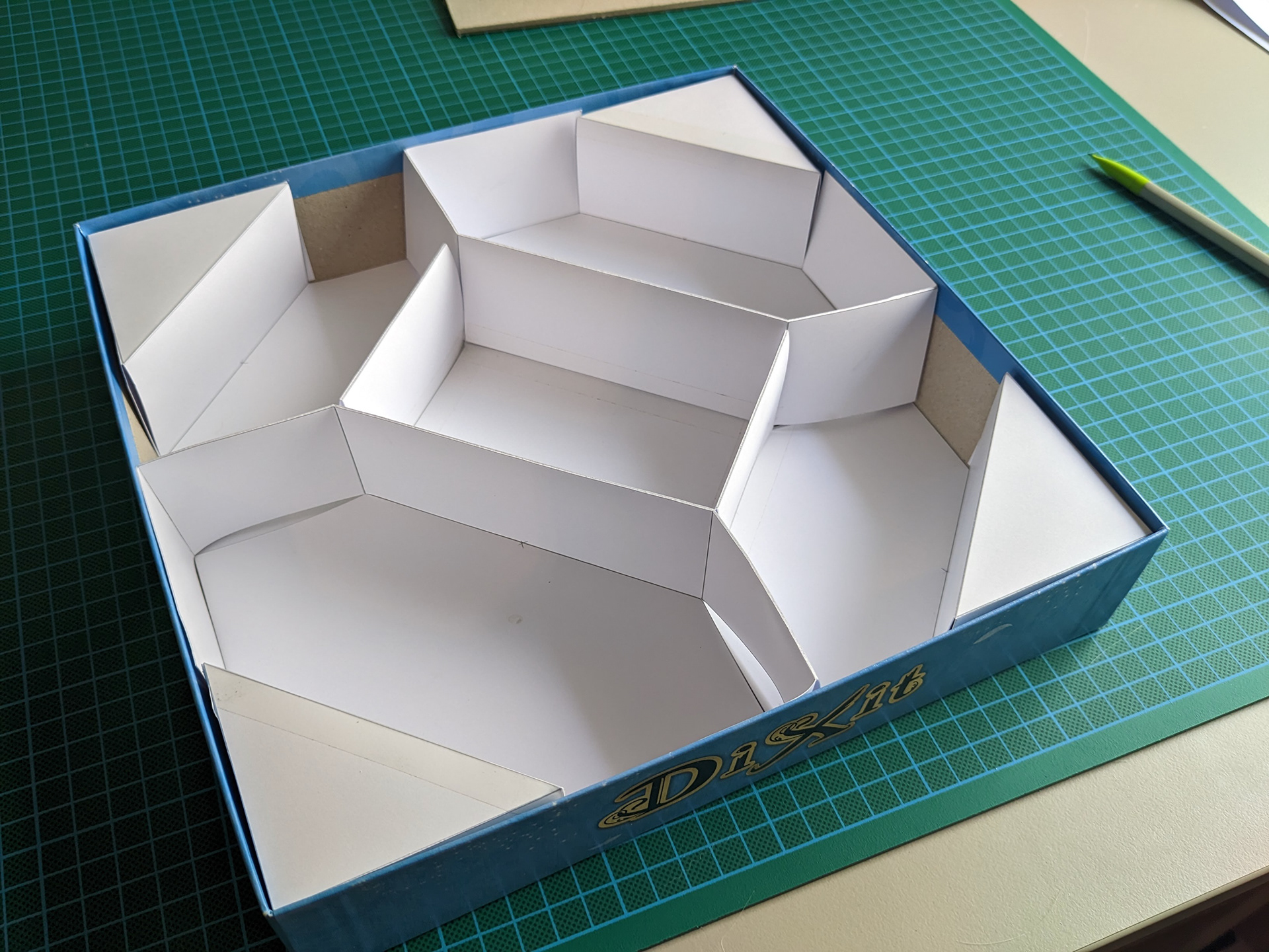
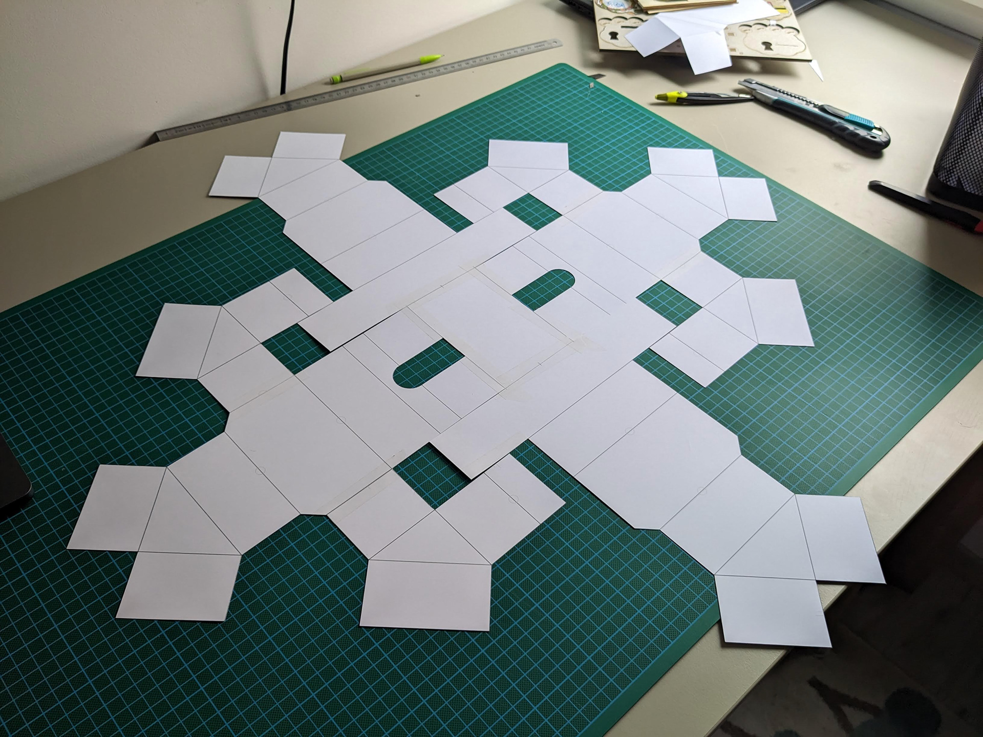
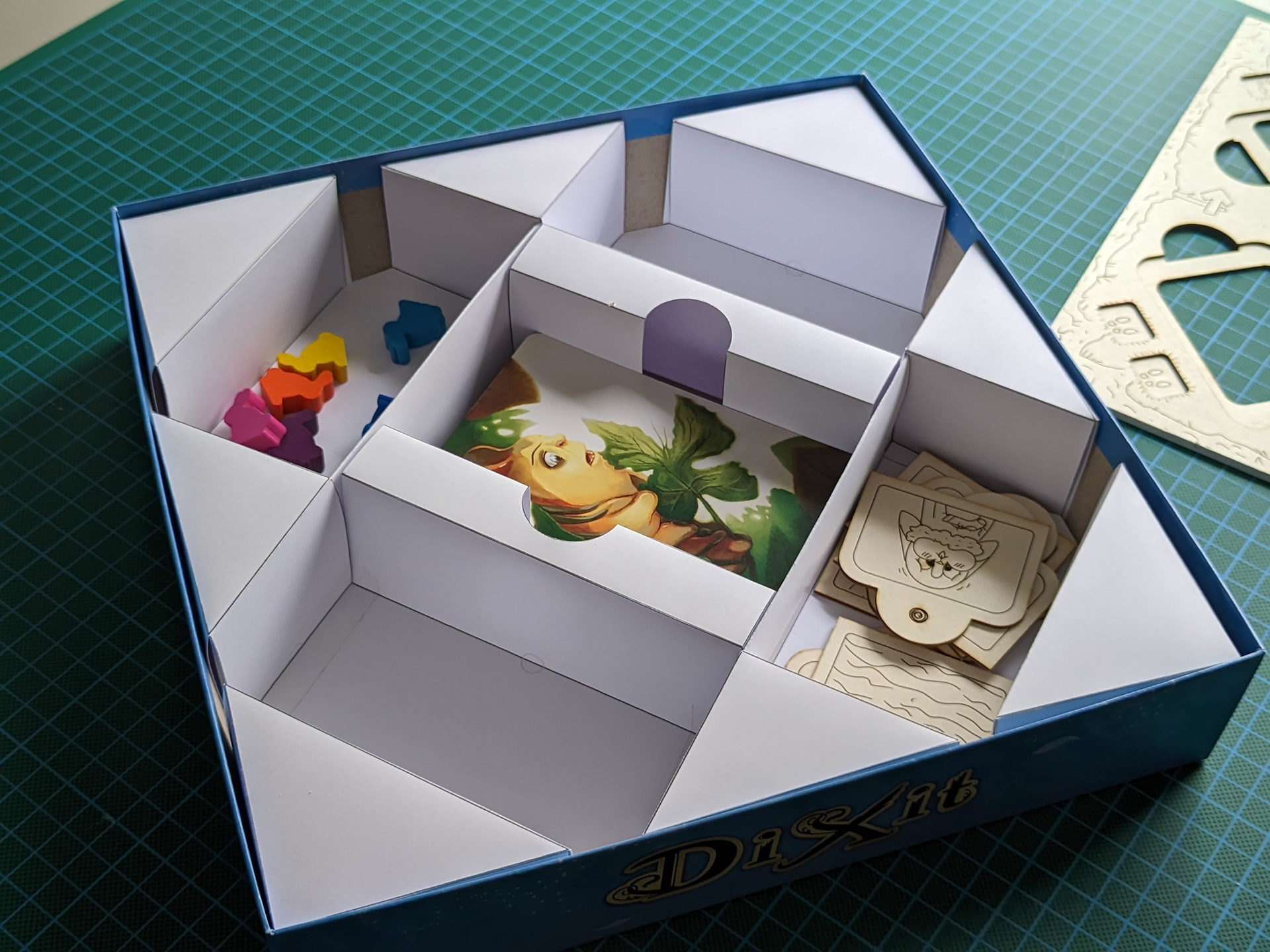
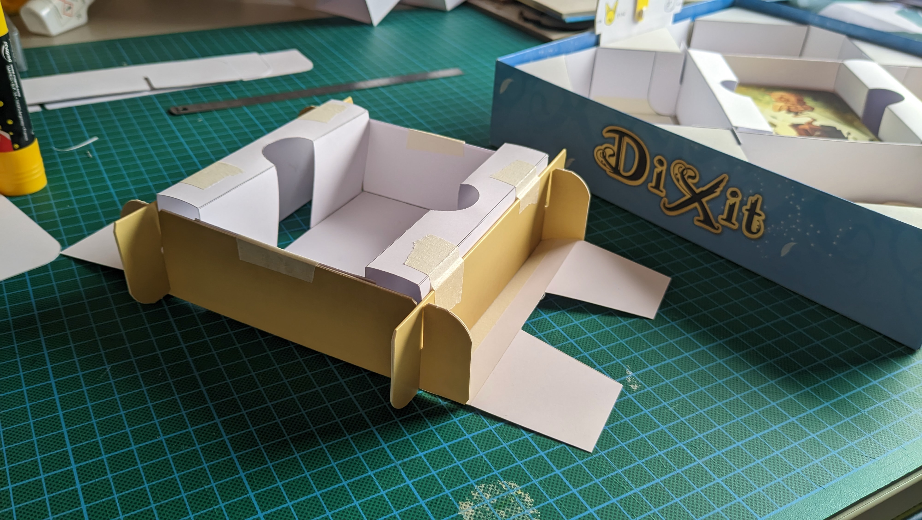
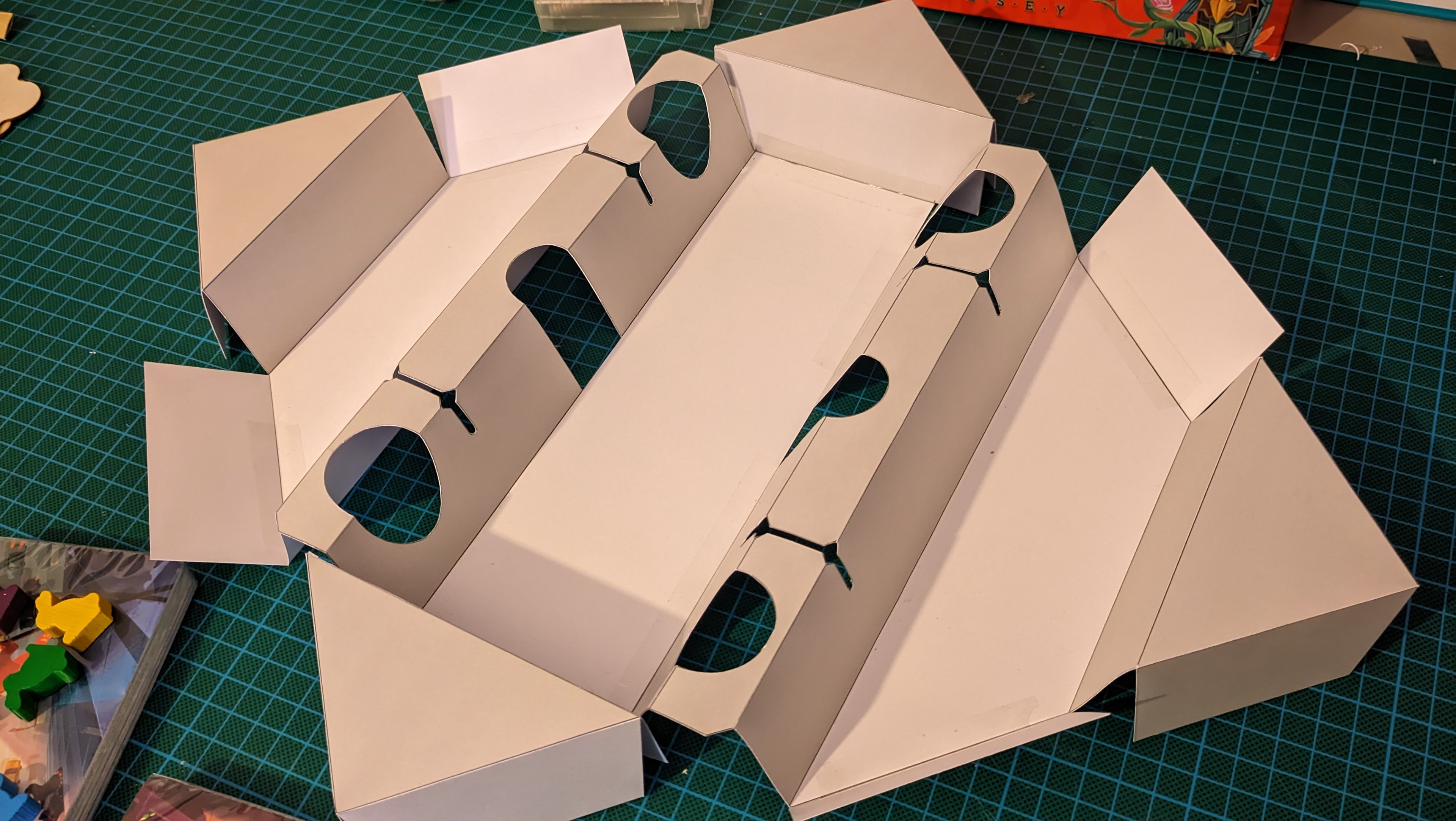
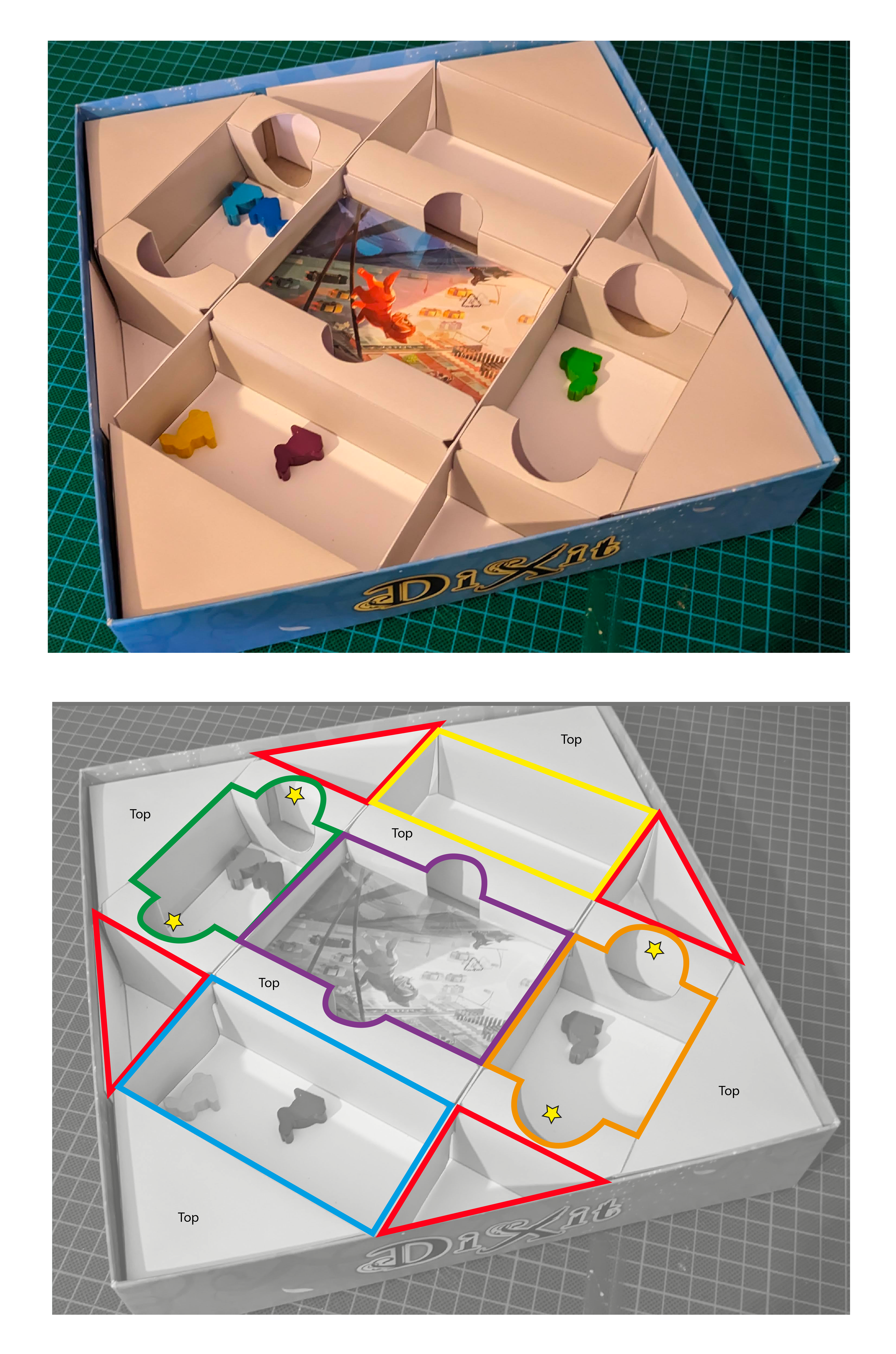
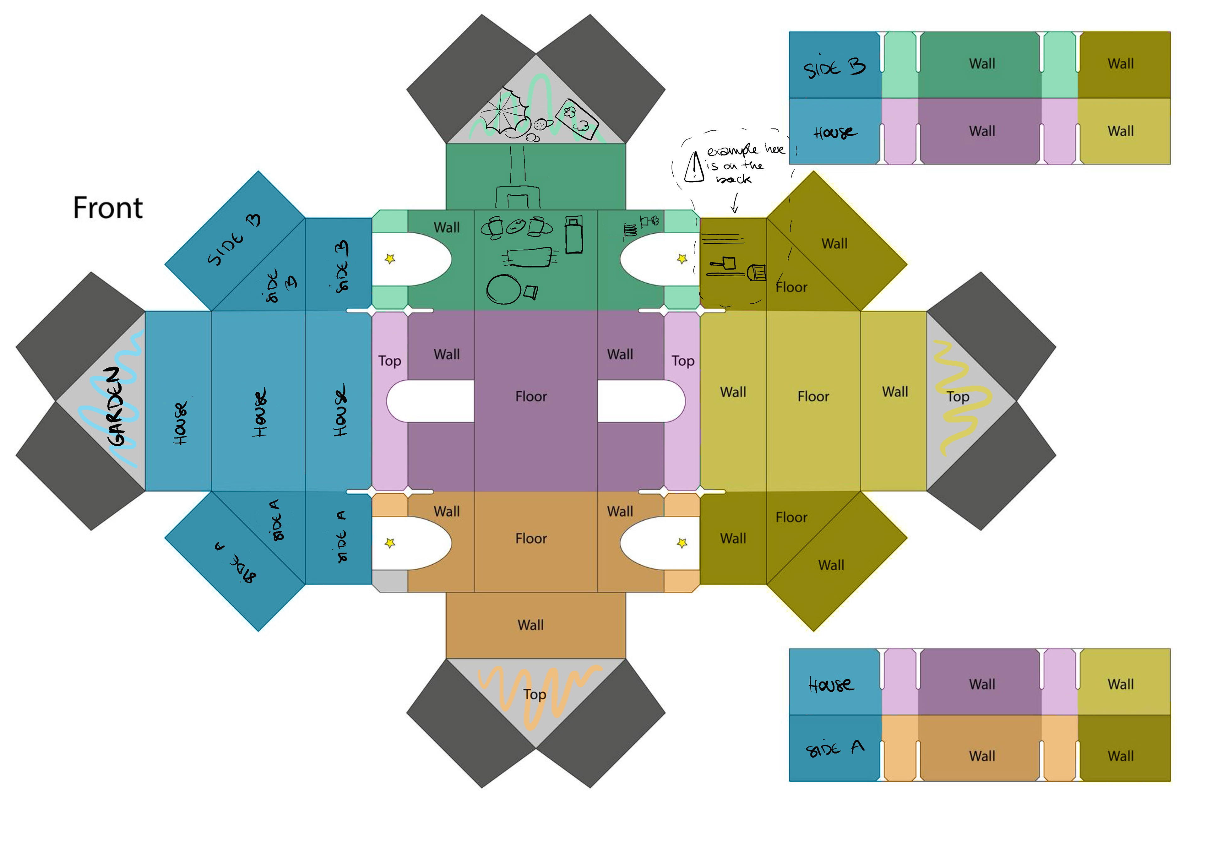
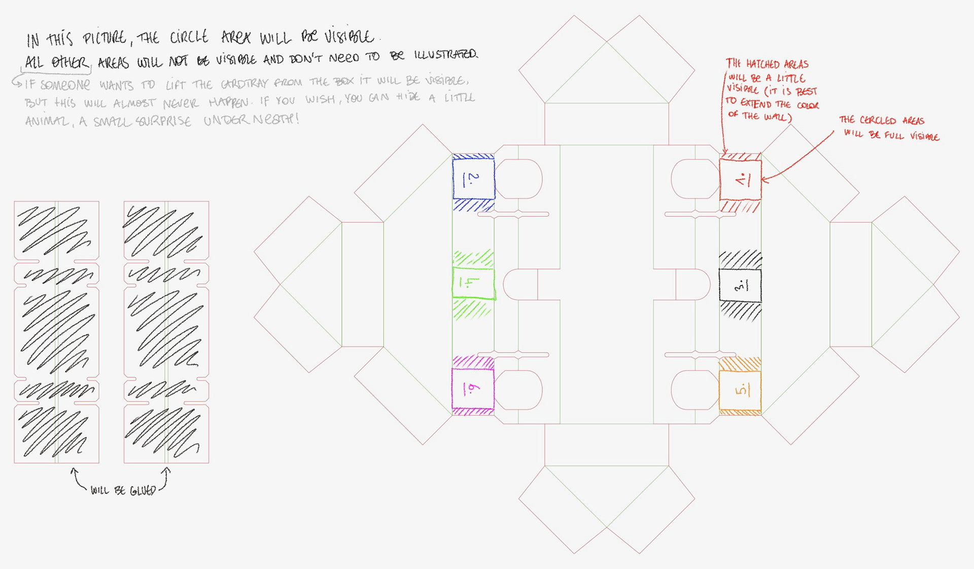
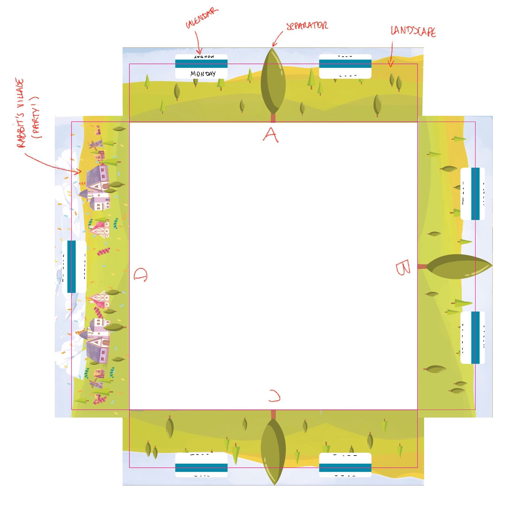
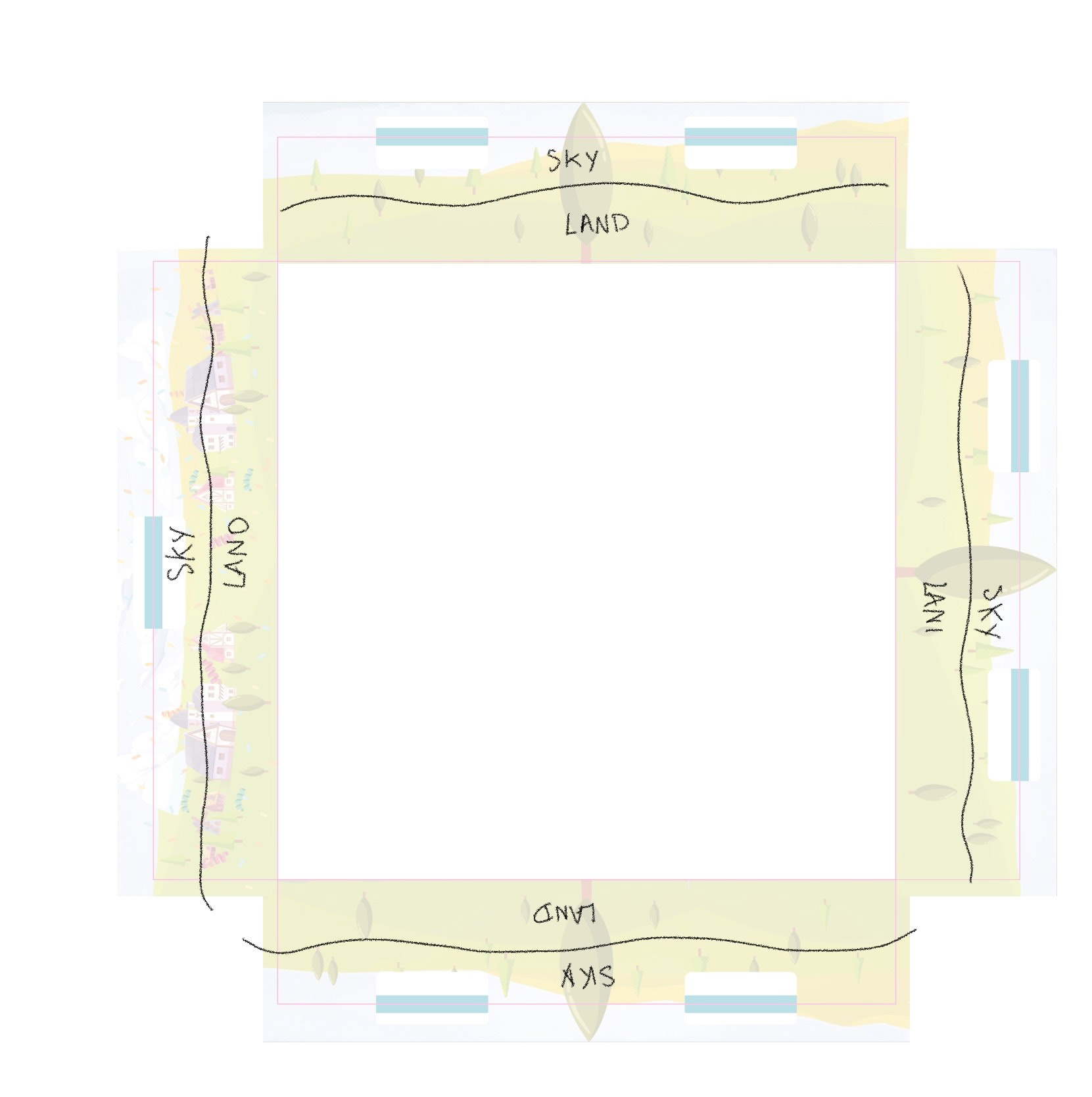
After the research and development, I had to provide instructions to the illustrator Emily Paik so she could decorate this complex template. For someone who has never illustrated a 3D object like a board game, understanding the geometry of this template can be a real challenge! We exchanged several times to ensure everything was clear, and the small adjustments were very quickly resolved.
The days of the week - the box edges
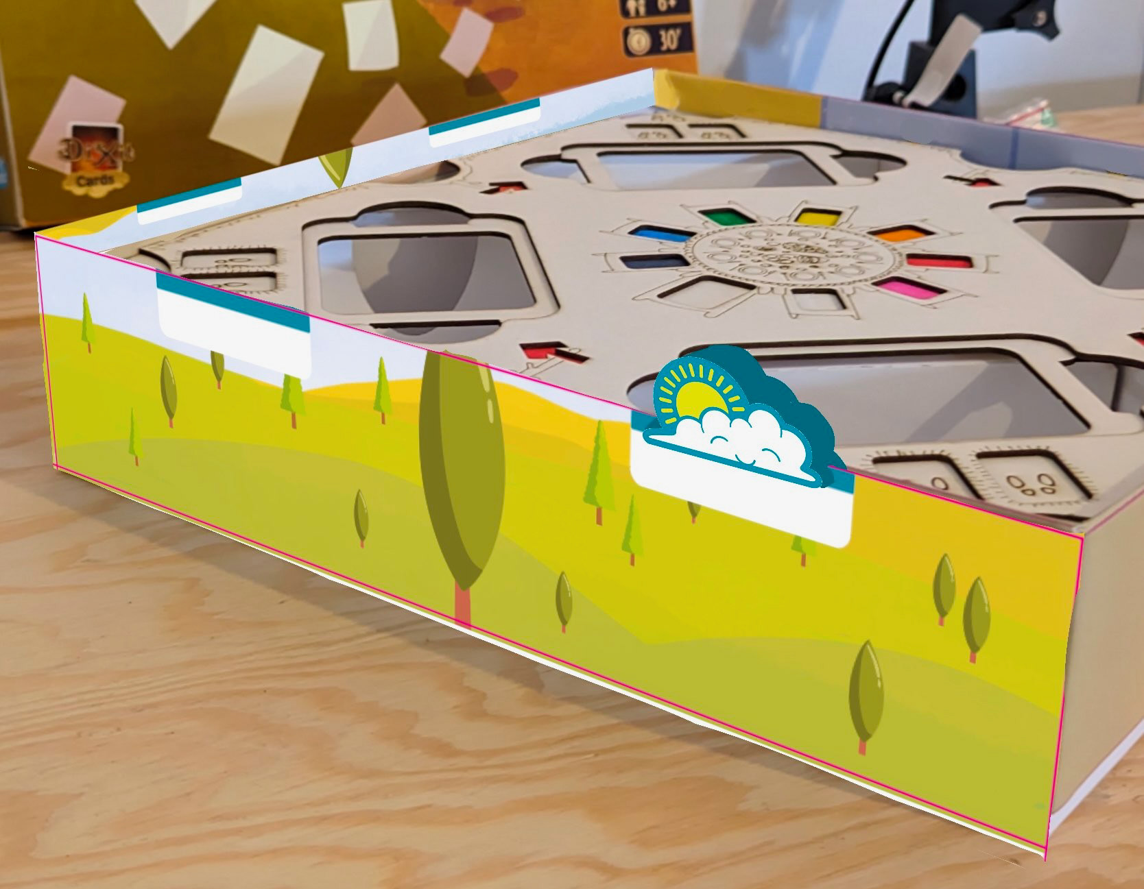
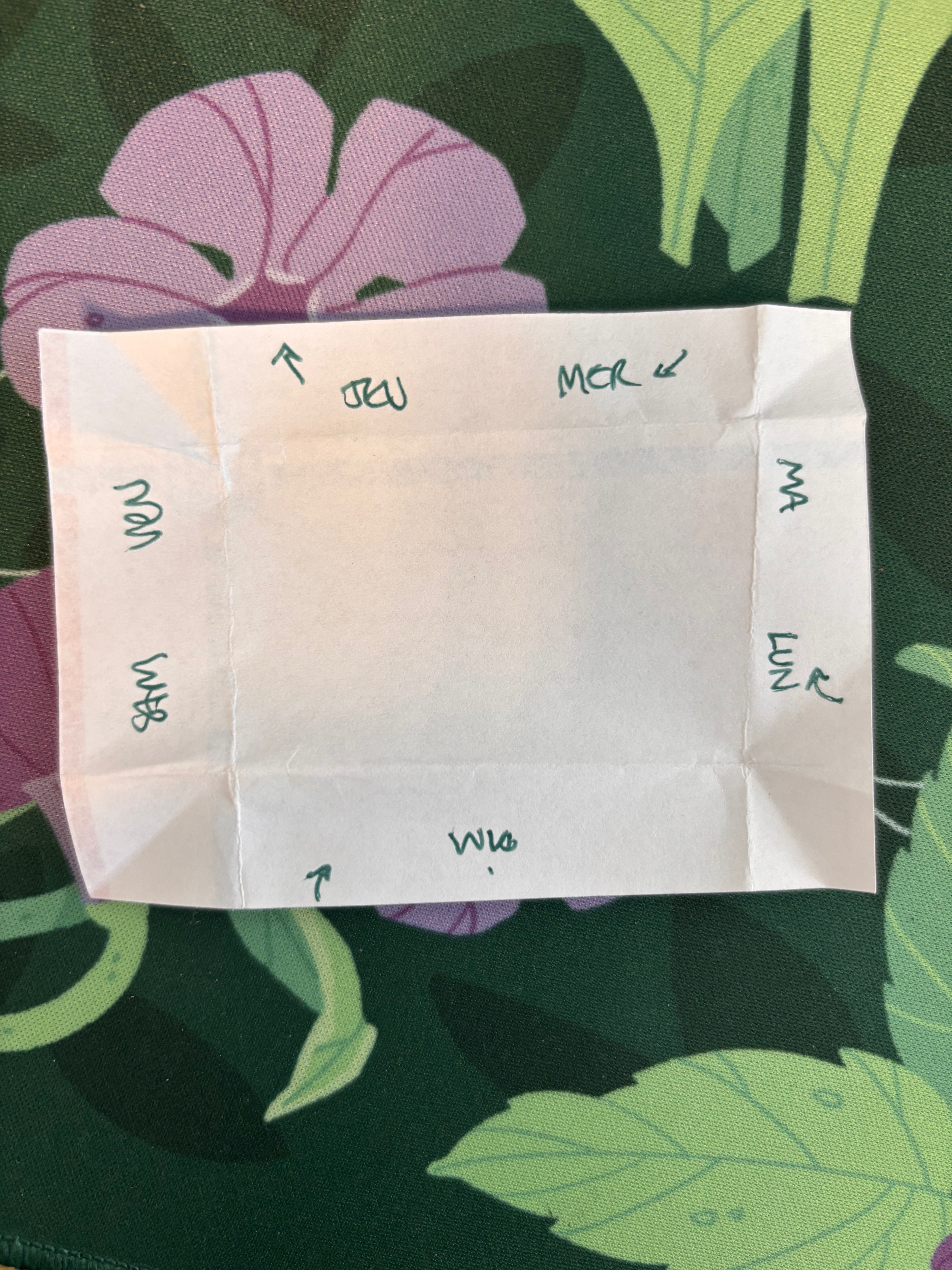
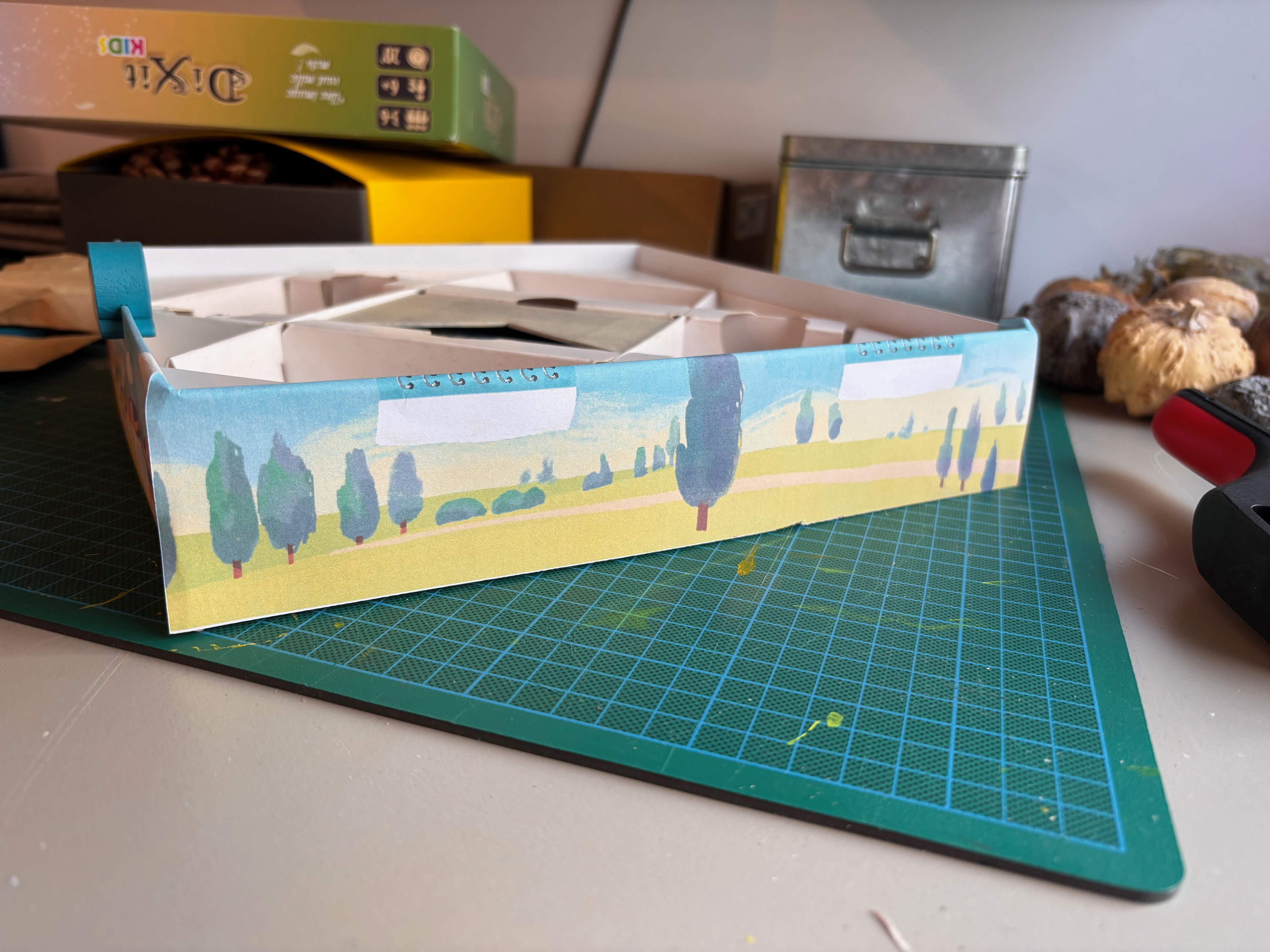
The turn-counting mechanic used on the box edges arrived late in the project. Fortunately, this is an aspect of the game that required less UX design work. After testing the concept with Joeva's help, we had to find a way to orient oneself: understand which space we're going to, which direction we're moving in... Finally, we opted for the simplest solution that disturbed players the least: 7 spaces for 7 days of the week, a direction that, seen from above, goes clockwise, and it's the same direction as the Head Mailrabbit.
The Head Mailrabbit's Mailbag - The card holder
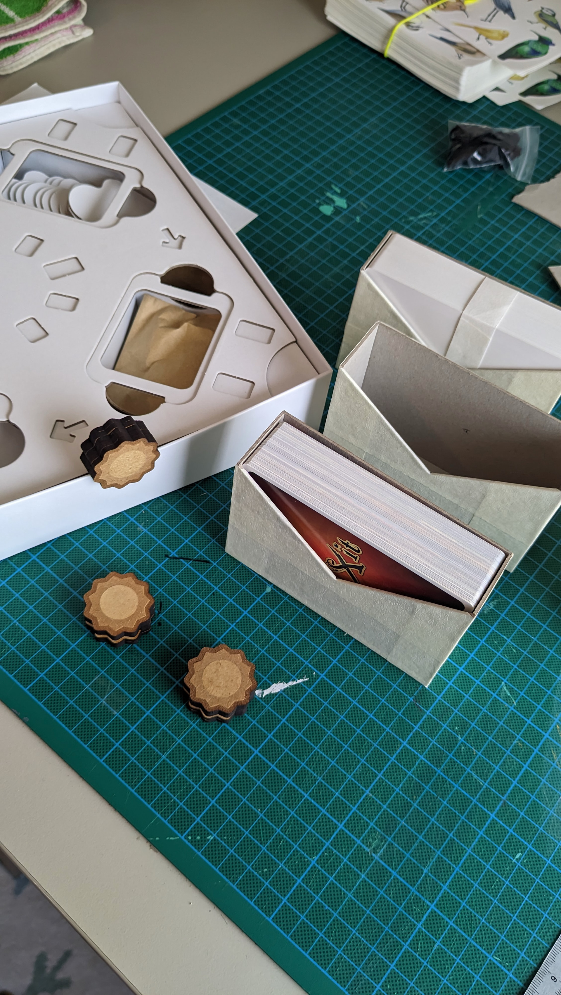
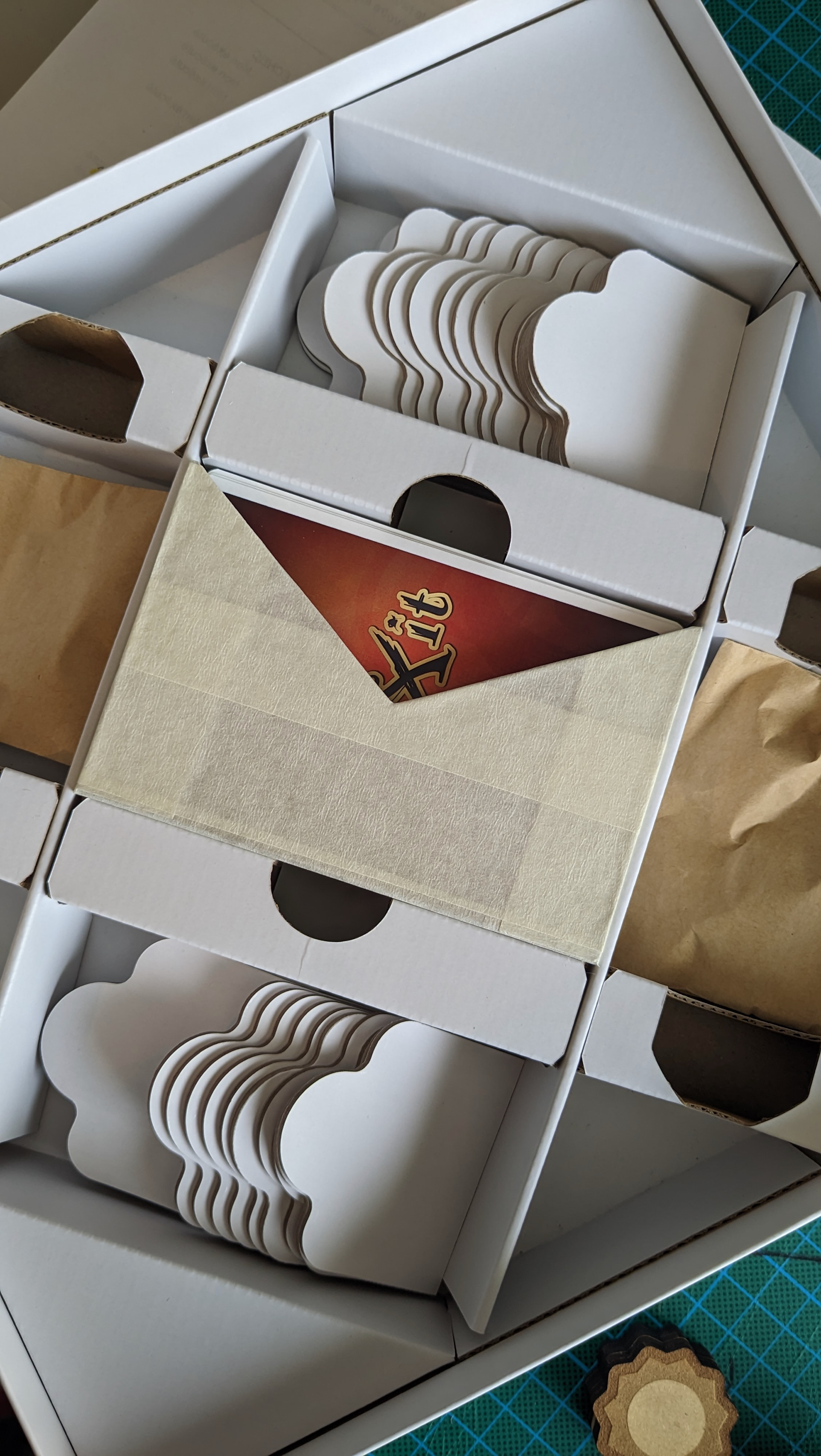
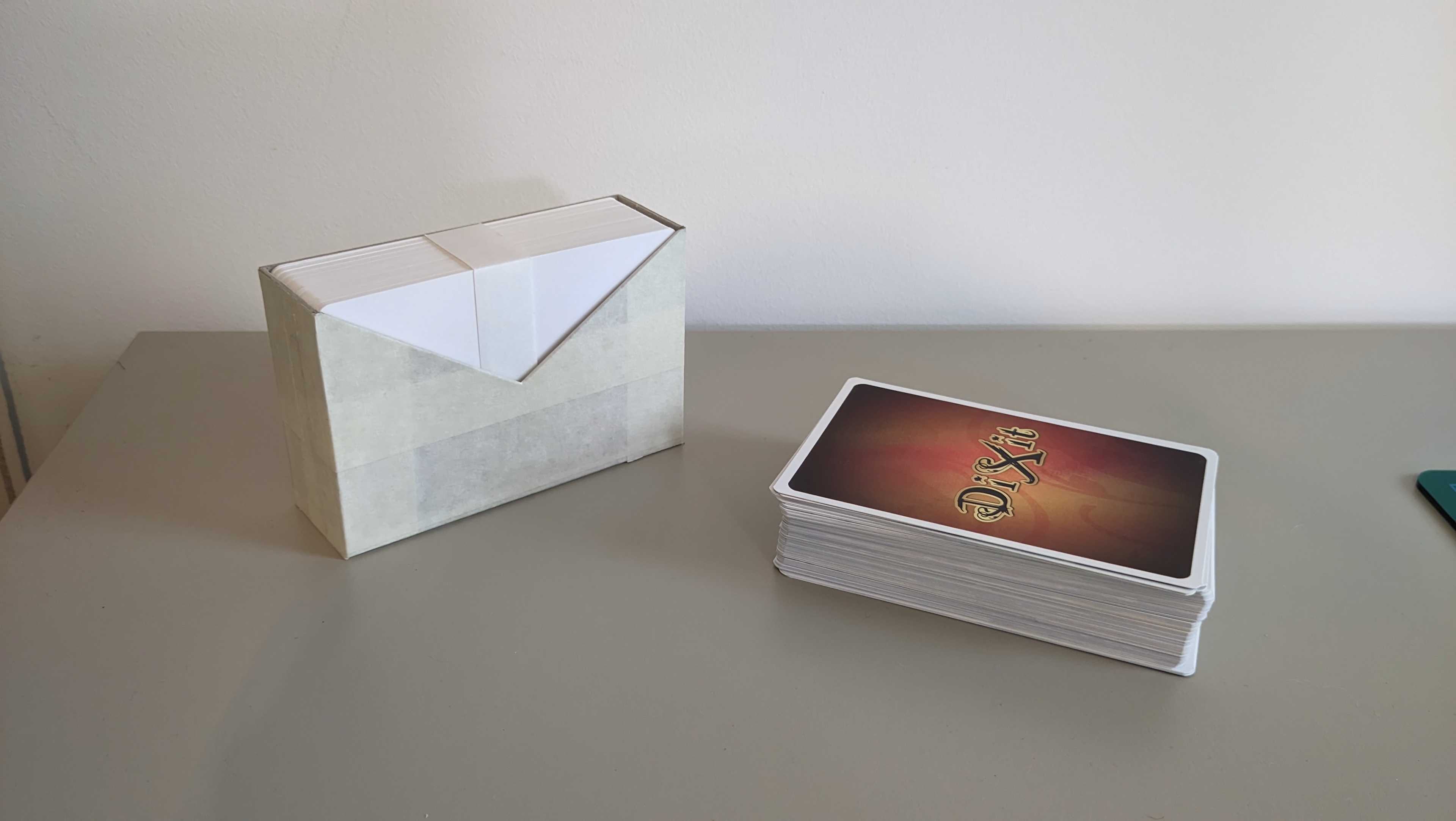
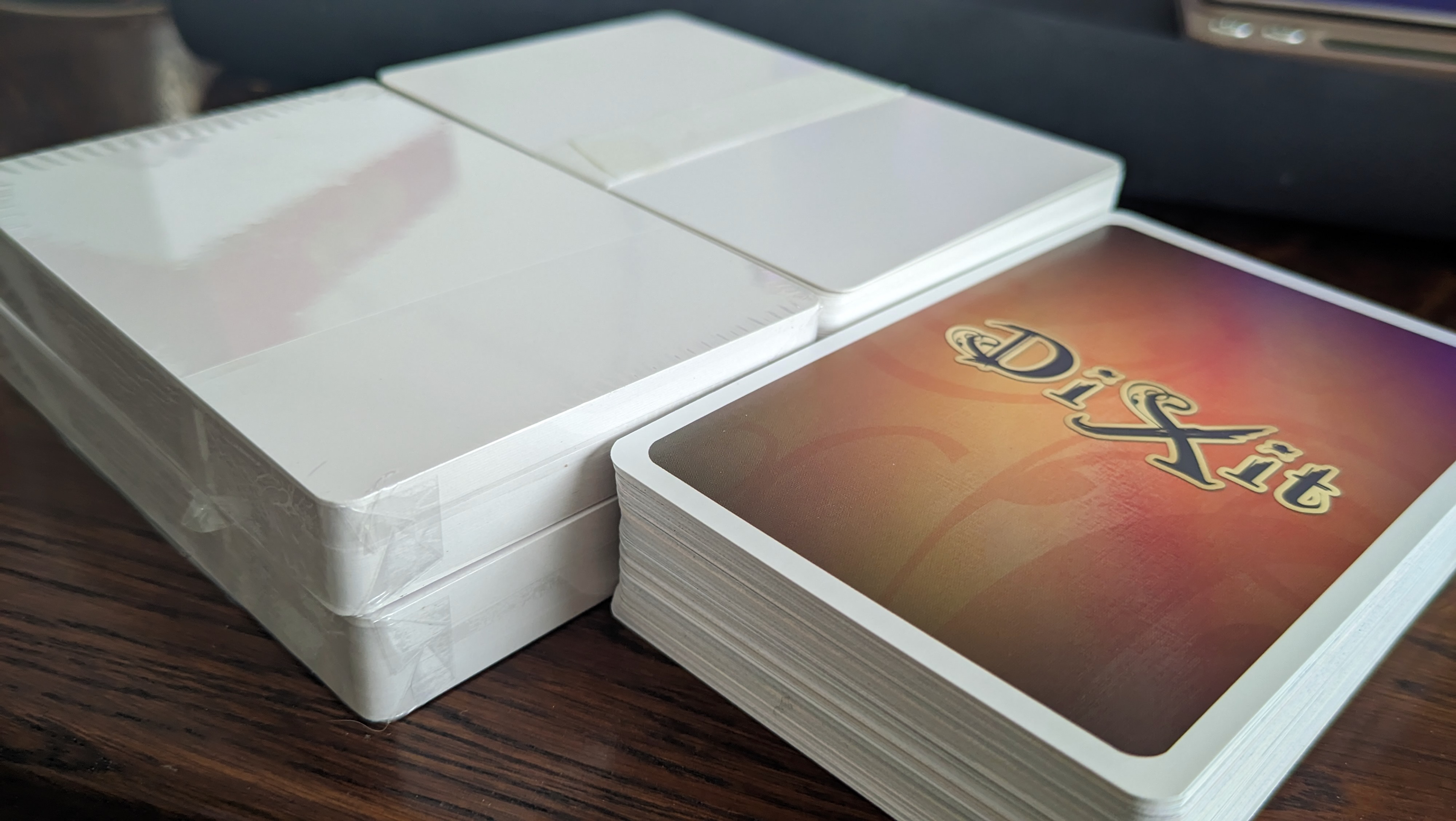
To know who is the Head Mailrabbit during the turn, there was supposed to be a first player pawn. Its appearance changed several times, but we very often forgot it: it wasn't intuitive to pass it to the next player, and we got lost. Moreover, children have smaller hands than us, so it's difficult for them to hold such a large deck of cards and distribute them.
It was when Space Cow was introduced to the project team that this new solution was proposed: add a card holder around the cards. The Head Mailrabbit distributes the cards and passes the deck to their left neighbour at the end of the round. Initially I made it in the form of an envelope. But it was more coherent, in terms of the story the game rules tell, to represent it as the mailbag containing all the invitations.
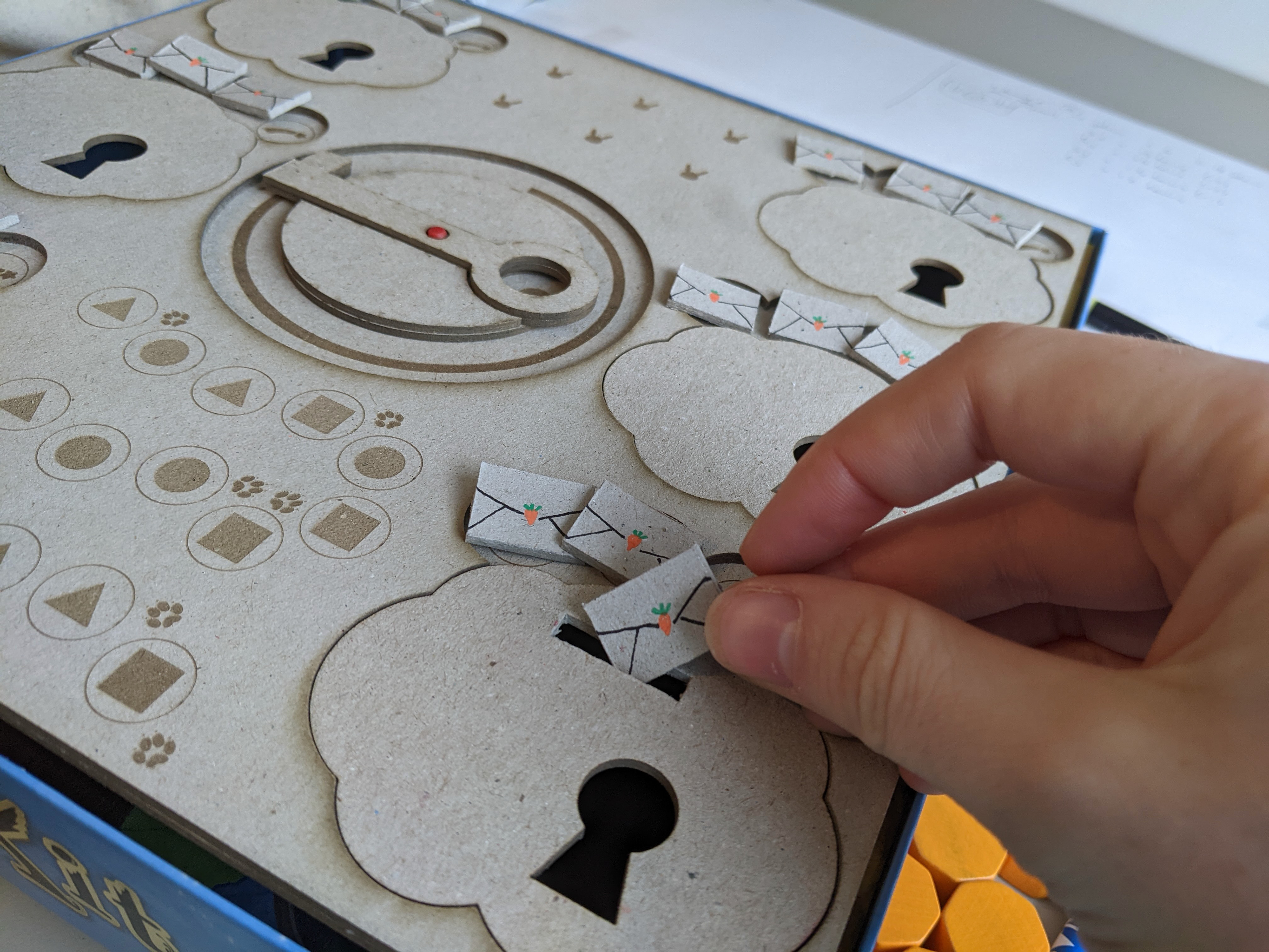
In addition to simplifying this aspect of the game, the mailbag also allows the cards to be much better secured in the insert and prevents any damage during transport! The solution therefore arrived at the right time to resolve several issues. After working on its shape and precise dimensions – to hold all the cards and fit into the insert – I created the illustration for this mailbag. My favourite detail? The little carrot patch underneath it.
The envelopes - the storage bags
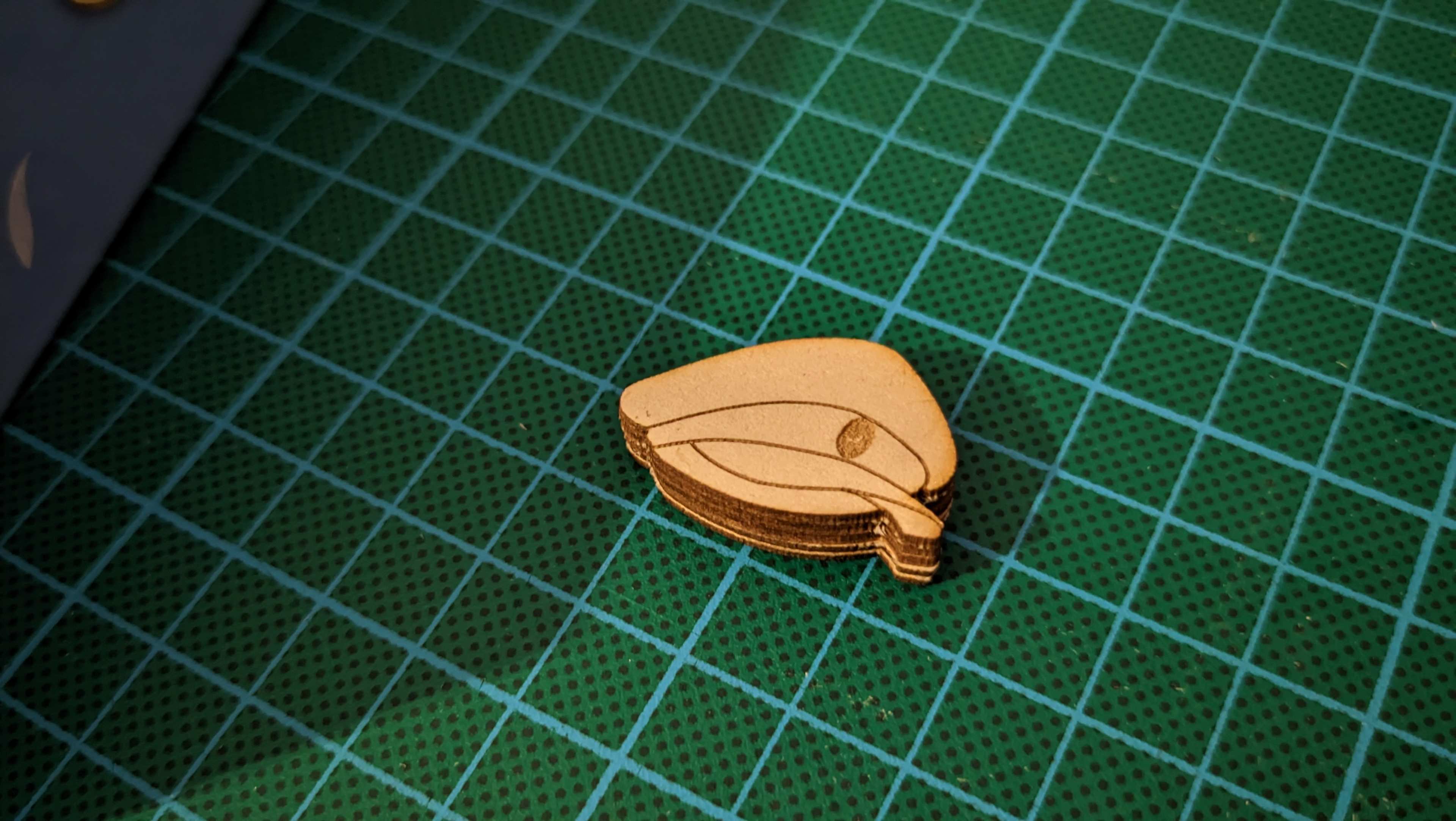
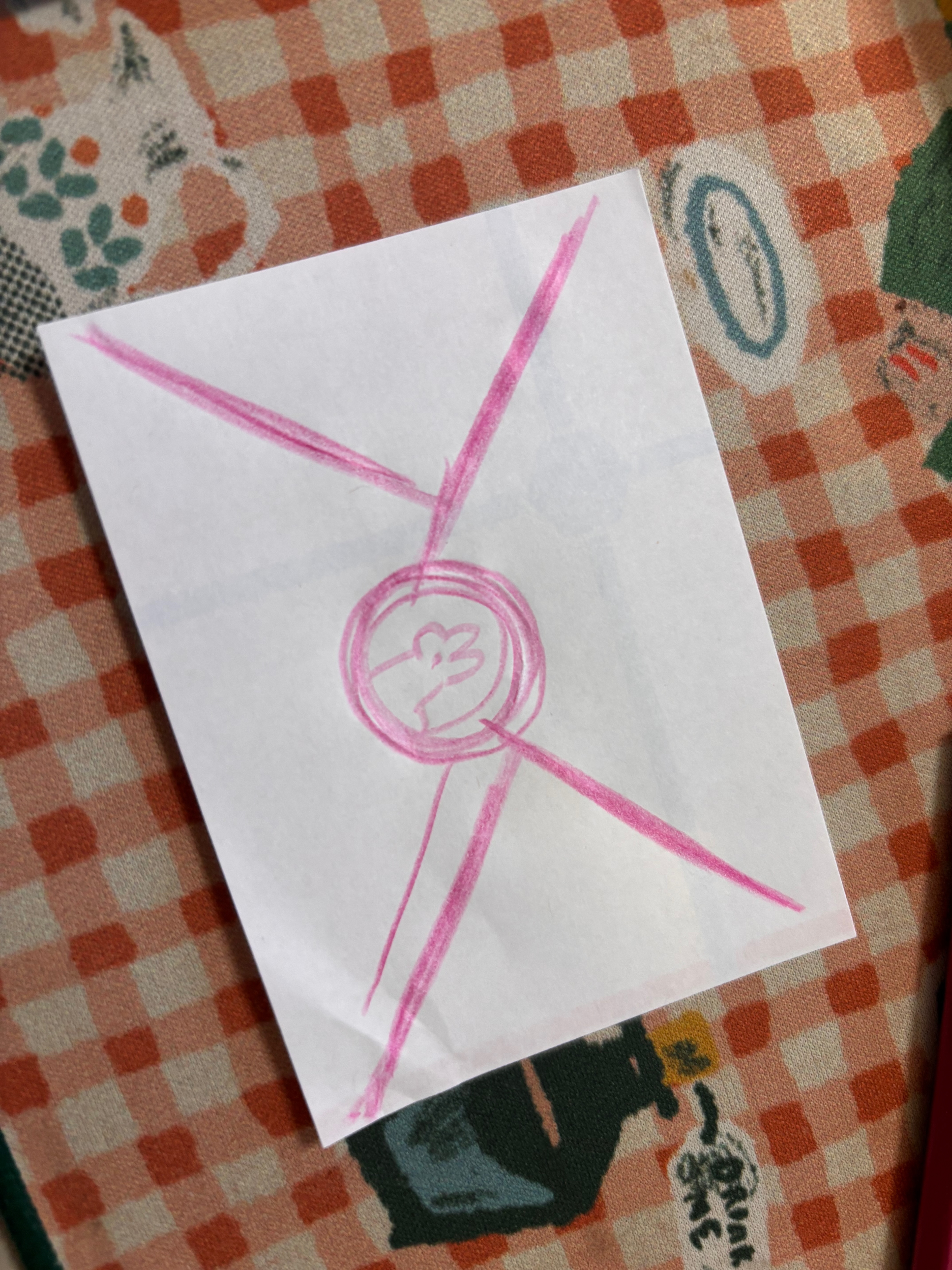
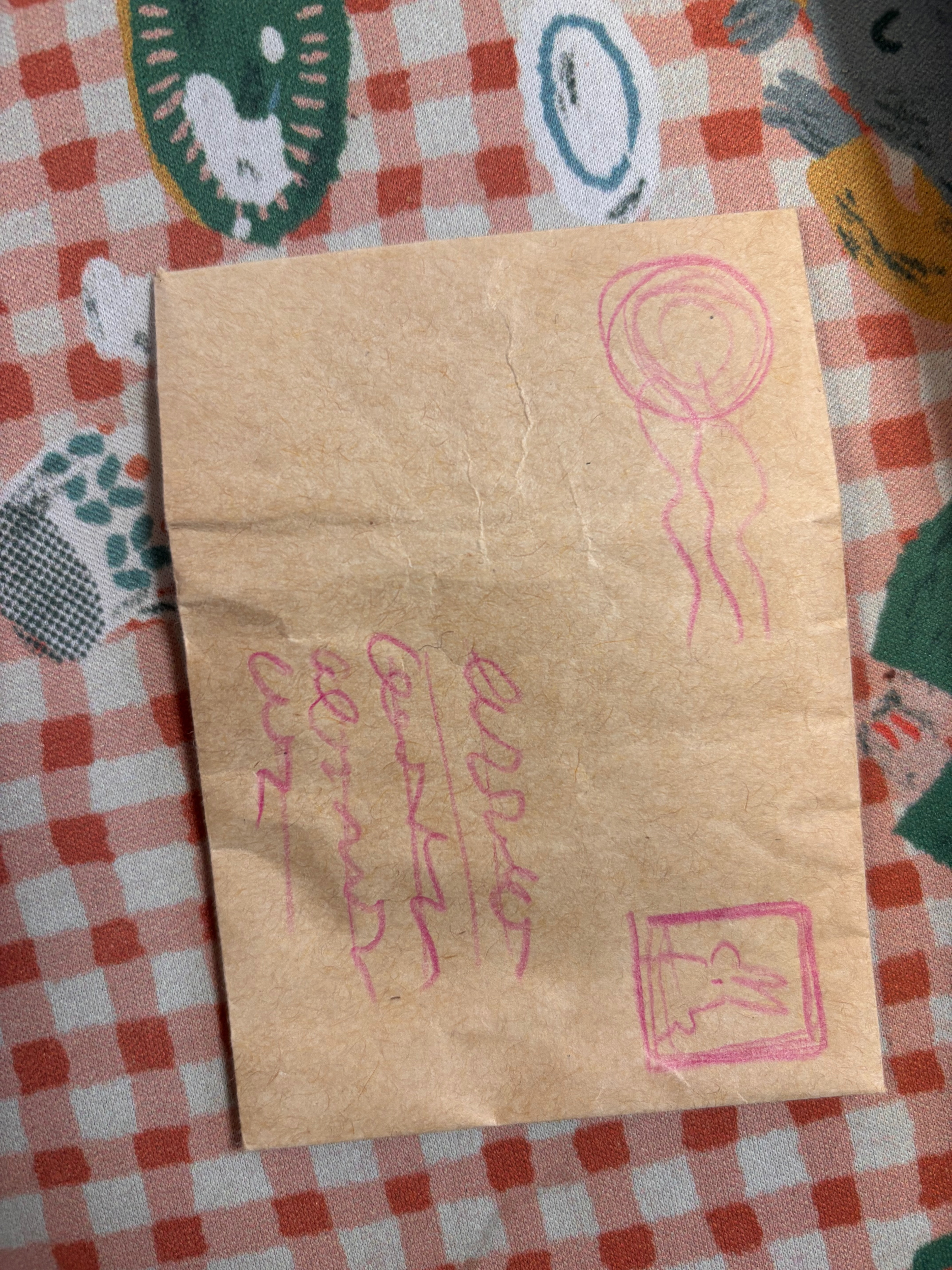
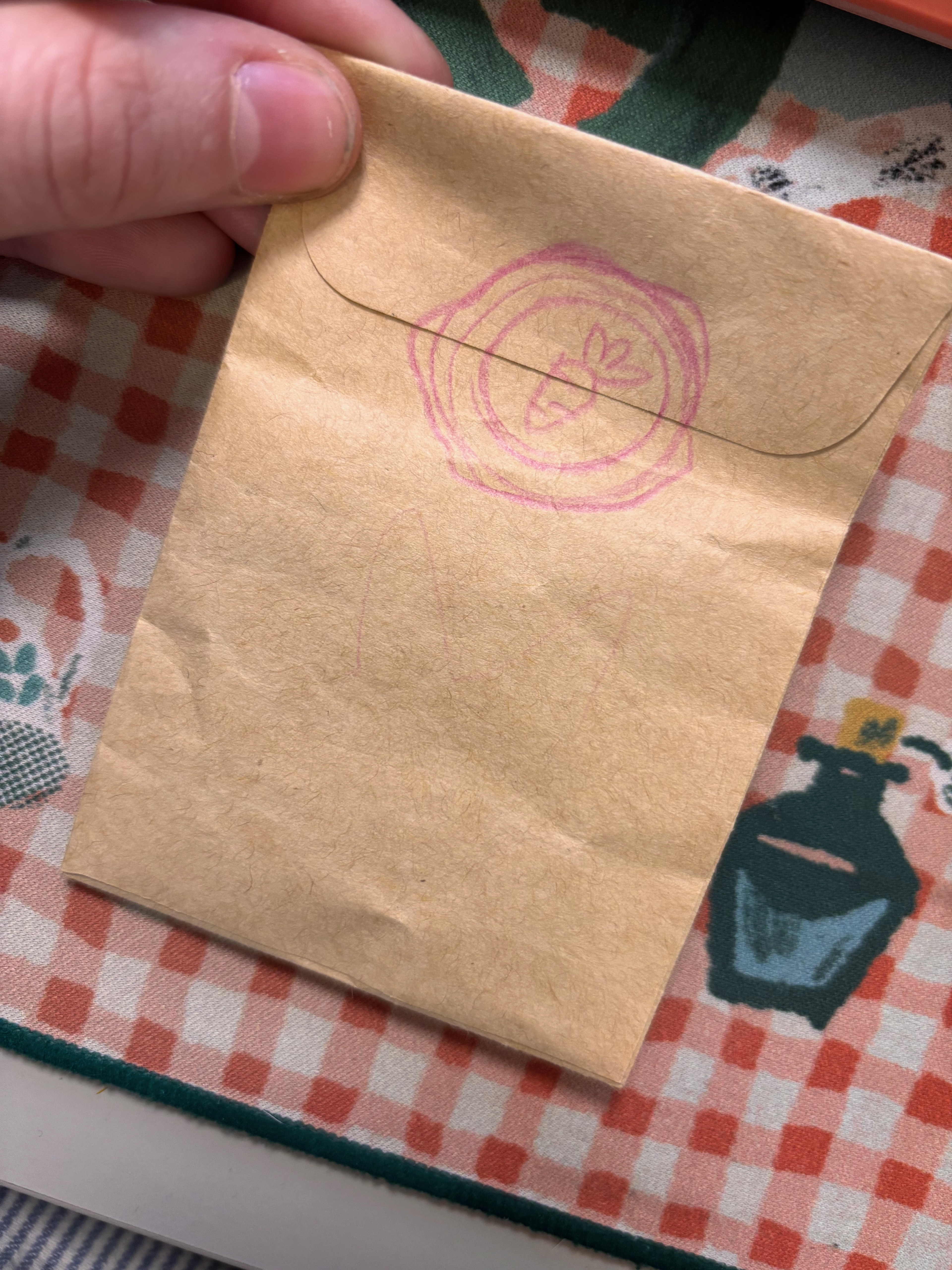
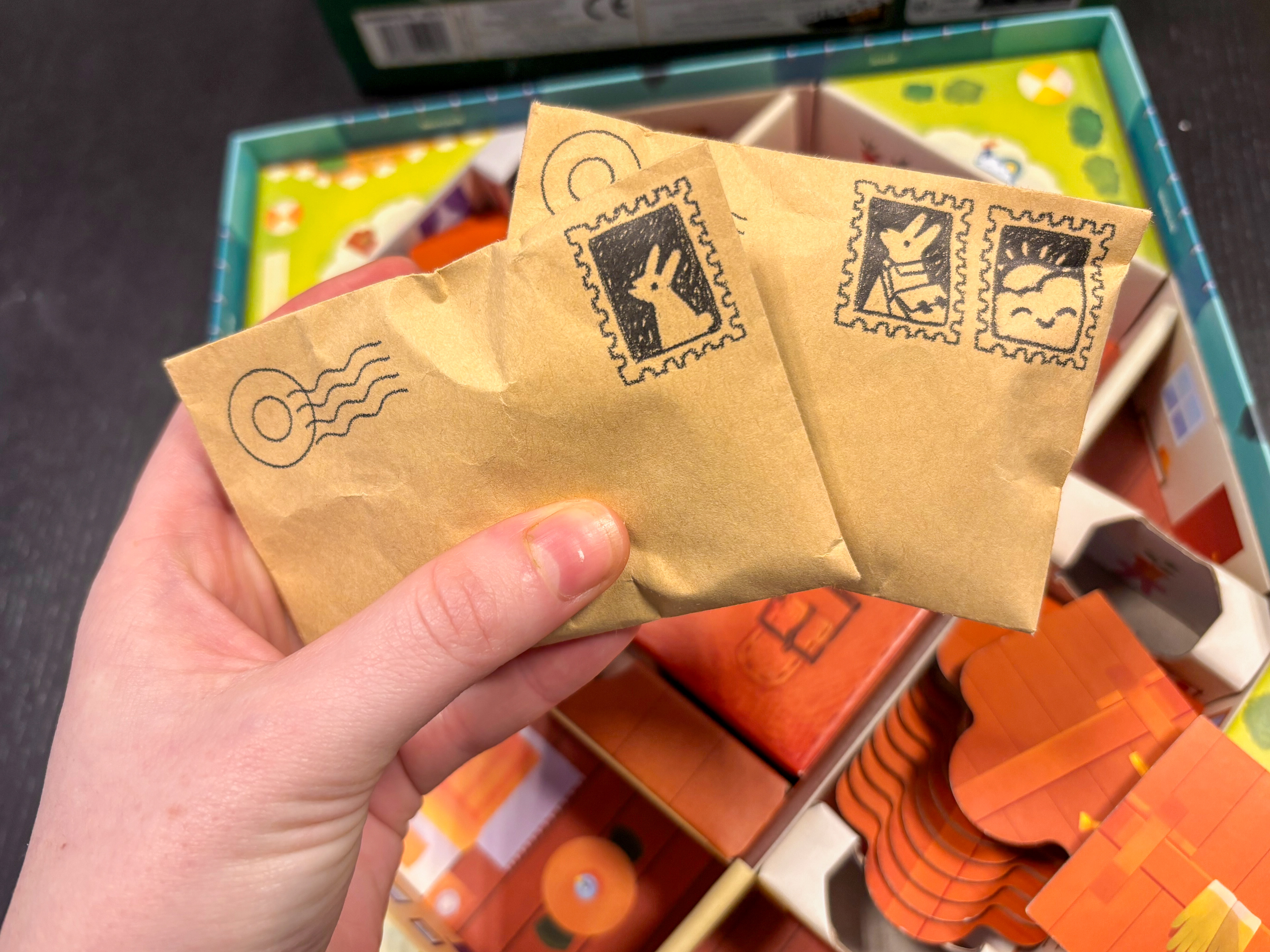
To store the meeples and prevent them from getting damaged during transport, it was obvious to add small bags. Rather than using plastic bags, we wanted to go with paper envelopes instead. And to stay within the game's theme, I turned them into postal envelopes ! I illustrated the stamps to decorate them nicely but there are also a lovely nod to what you can store inside!
Art Direction
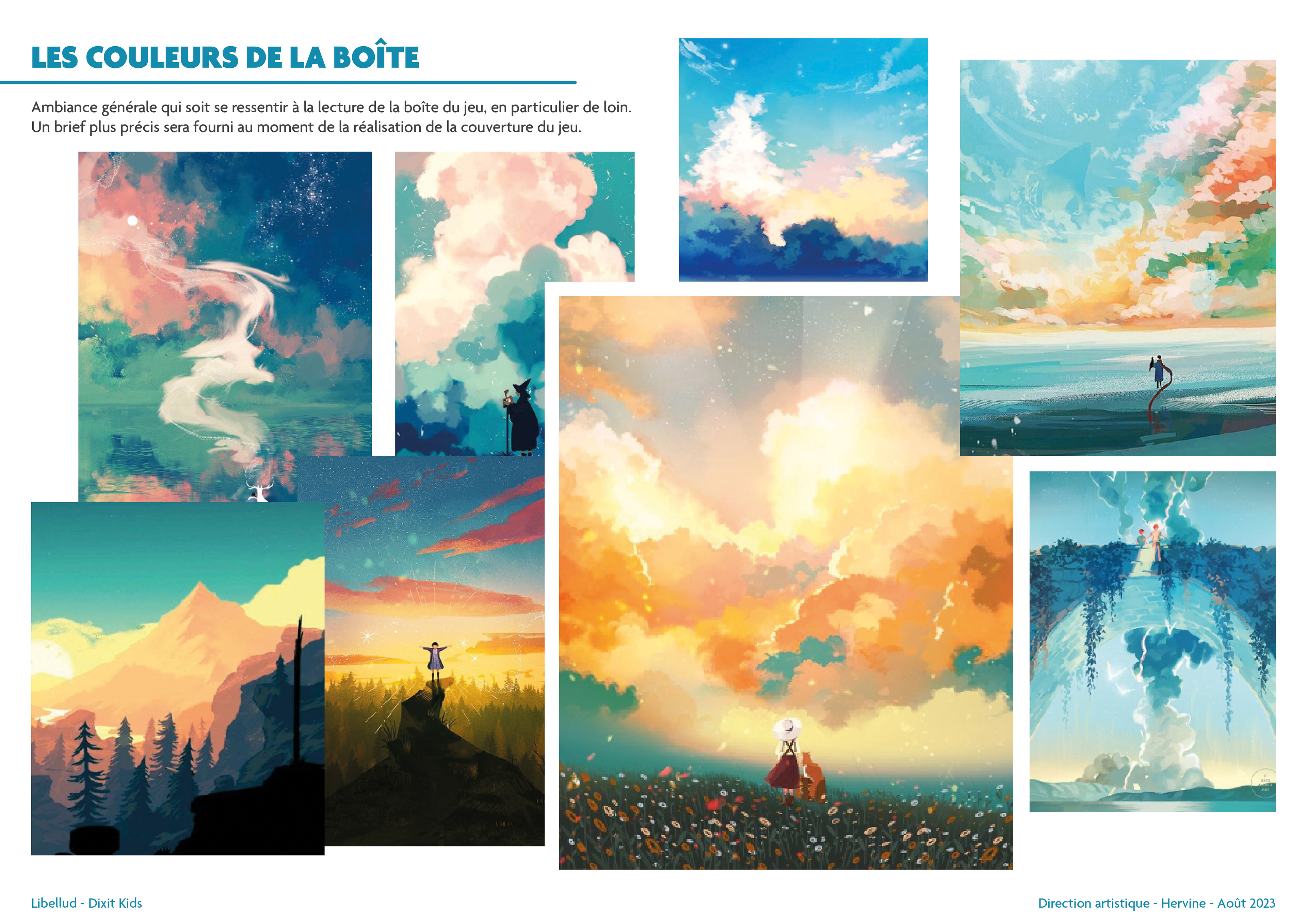
The game's art direction is another important aspect of the Dixit Kids work. My biggest challenge for this game is to create an object that is highly identifiable within the Dixit range whilst differentiating it. It remains a new game, with very different mechanics for a new audience.
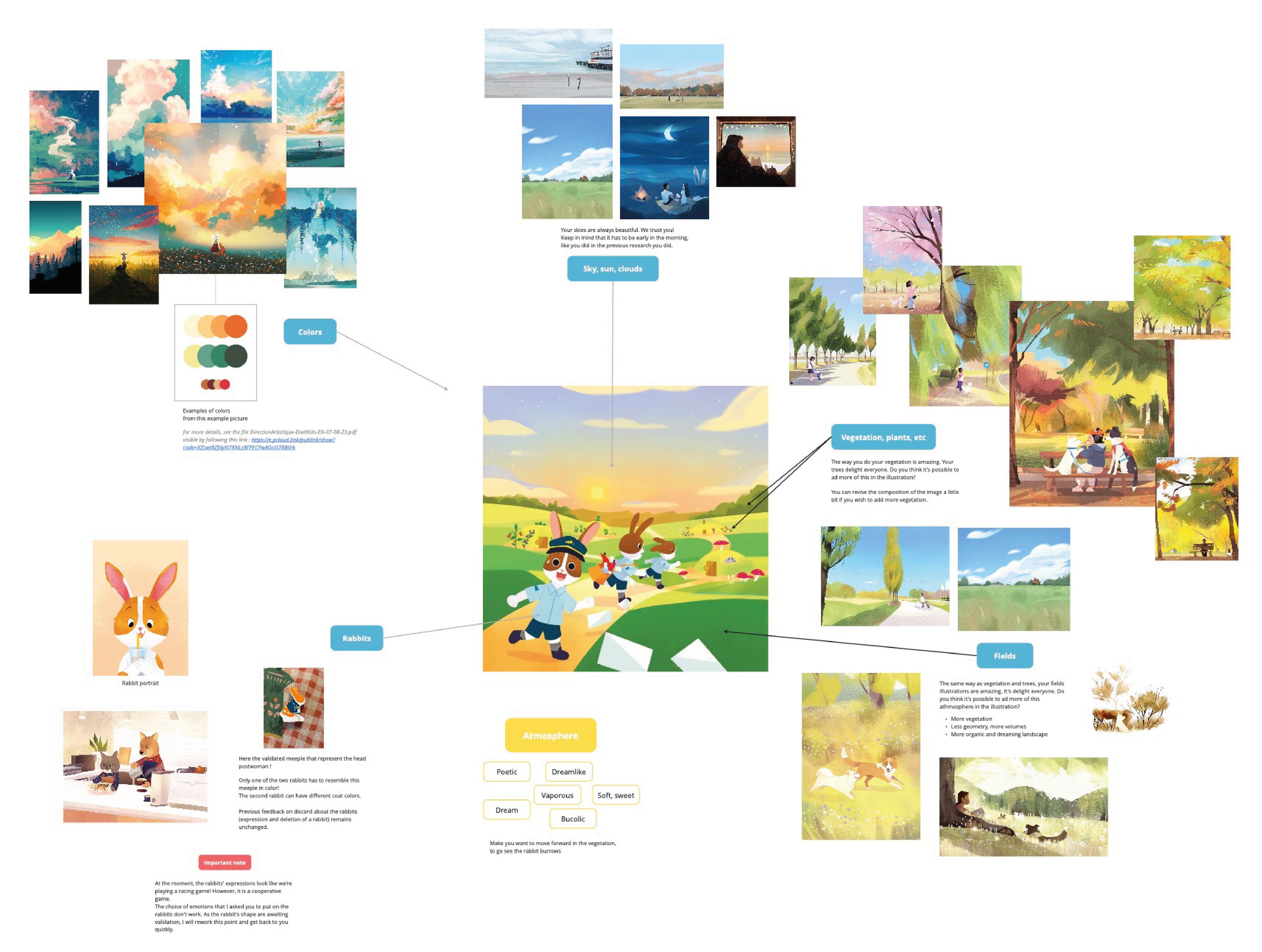
I cannot reveal certain aspects of the process, but here is an overview of the work I carried out so that the four illustrators, Seppyo (Mélanie Bardin), Lucie Dessertine, Emily (Seung Eun) Paik and Lemonjuiceday (Iris Winker), could work in the best possible conditions. The illustrations in the moodboards presented opposite include illustrations that do not belong to Dixit or the publishing houses.
Integration into the range
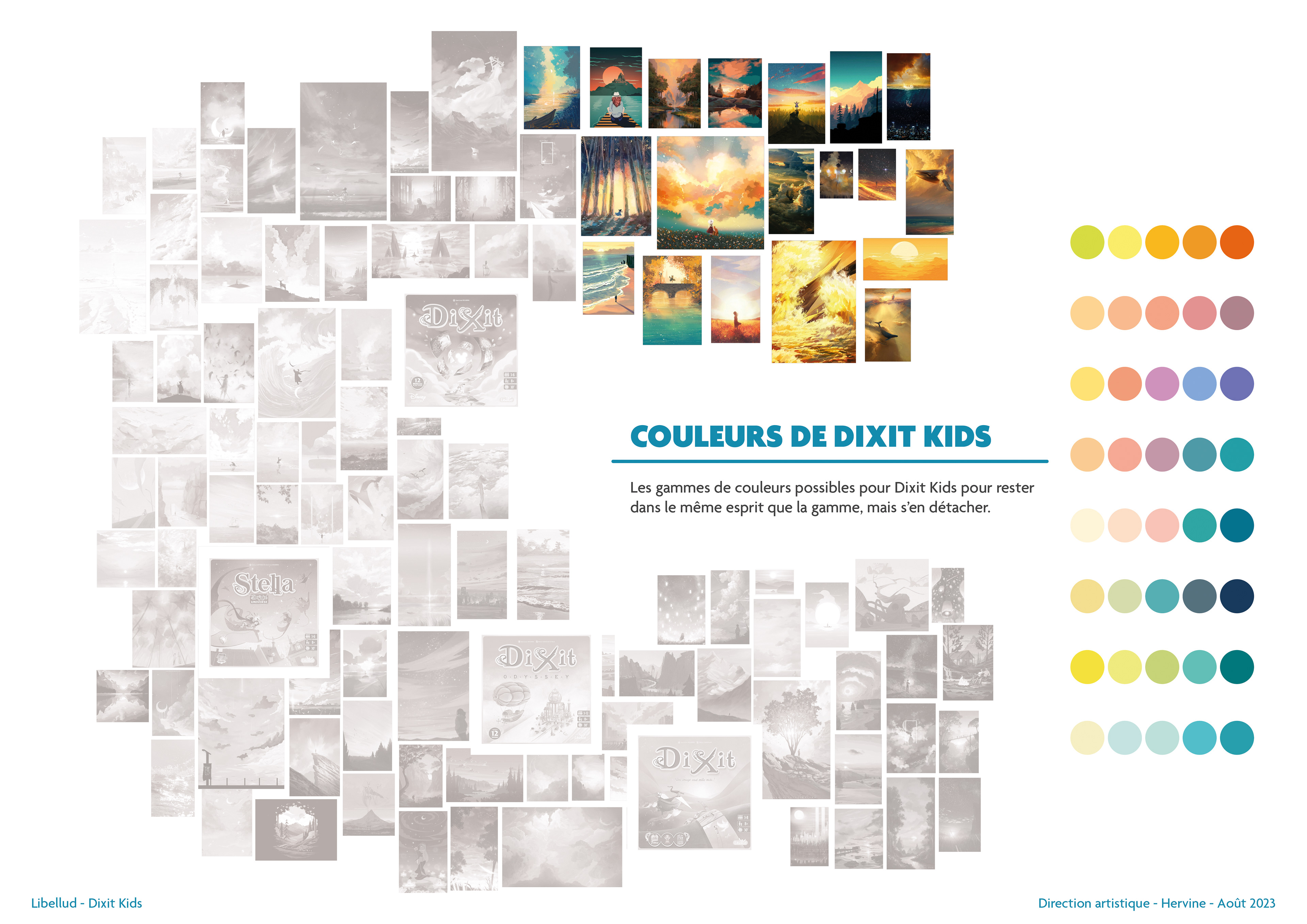
One of the strong aspects of the Dixit Universe is the presence of a celestial body in a sky. However, the sky can take on several shades and different atmospheres, which is particularly felt in the already published Dixit games. To better visualise the range of possibilities, I composed a gradient of skies and positioned the Dixit range in this spectrum. Dixit Kids' place was naturally found in green and yellow tones!
Card set colours
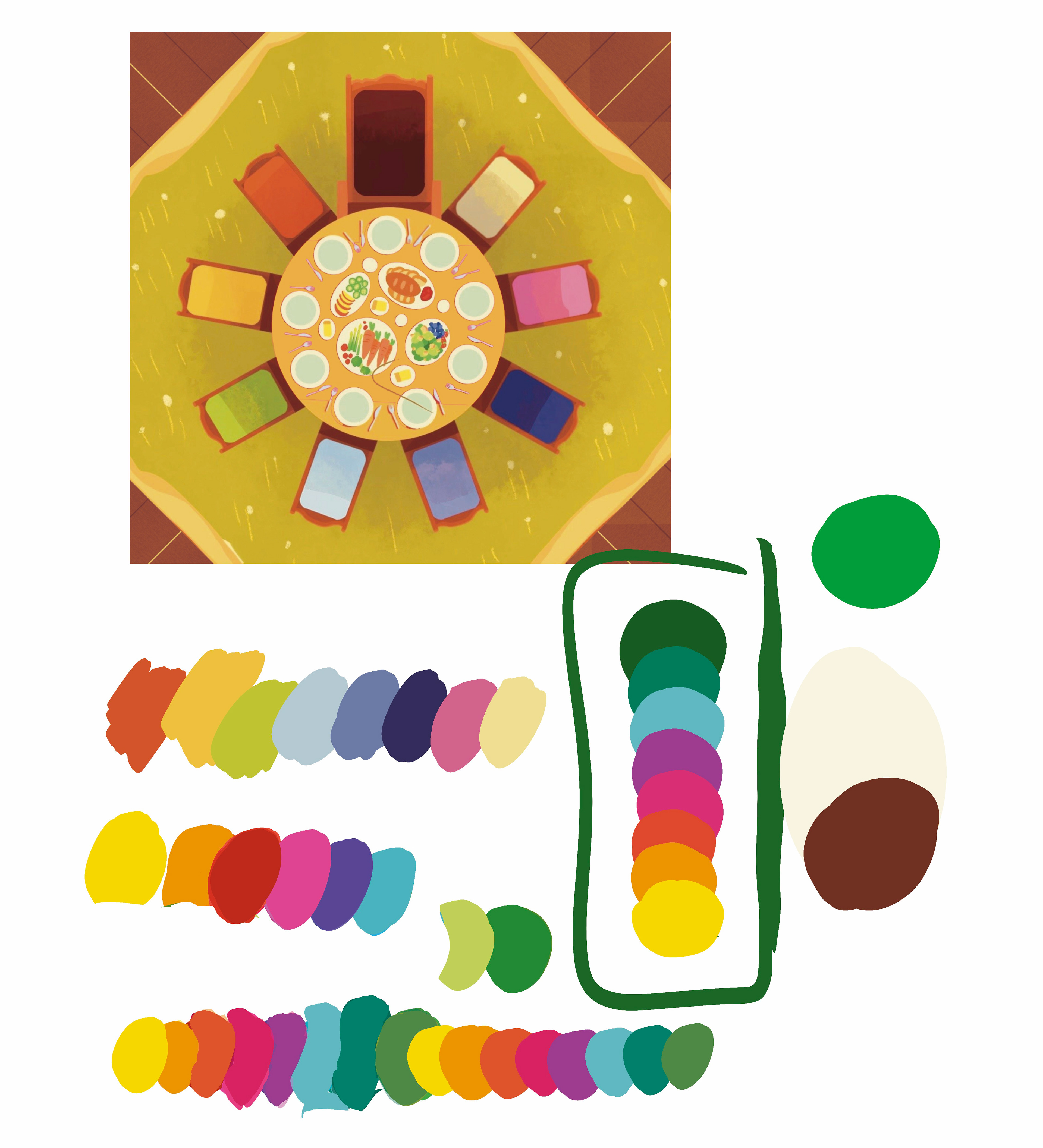
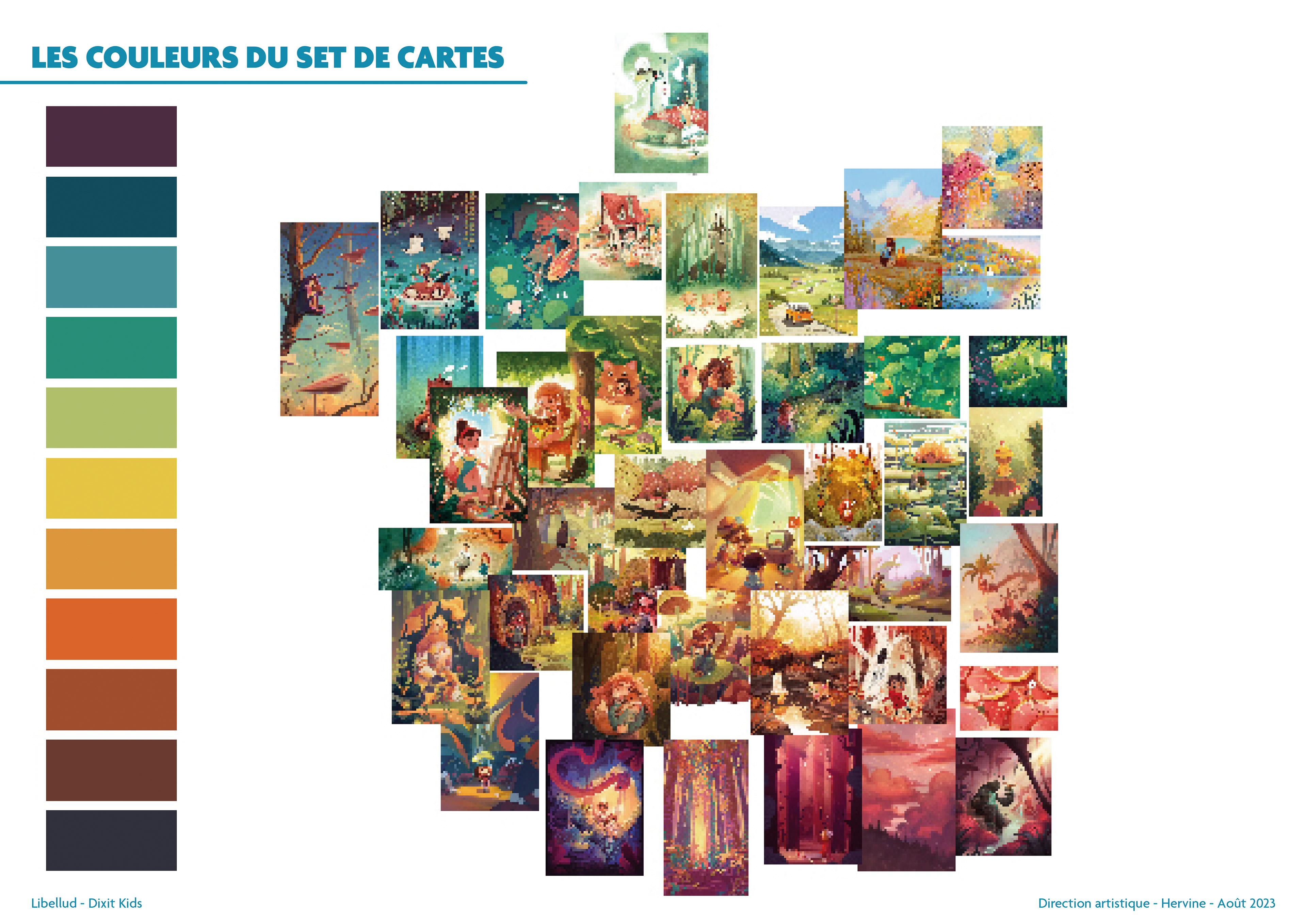
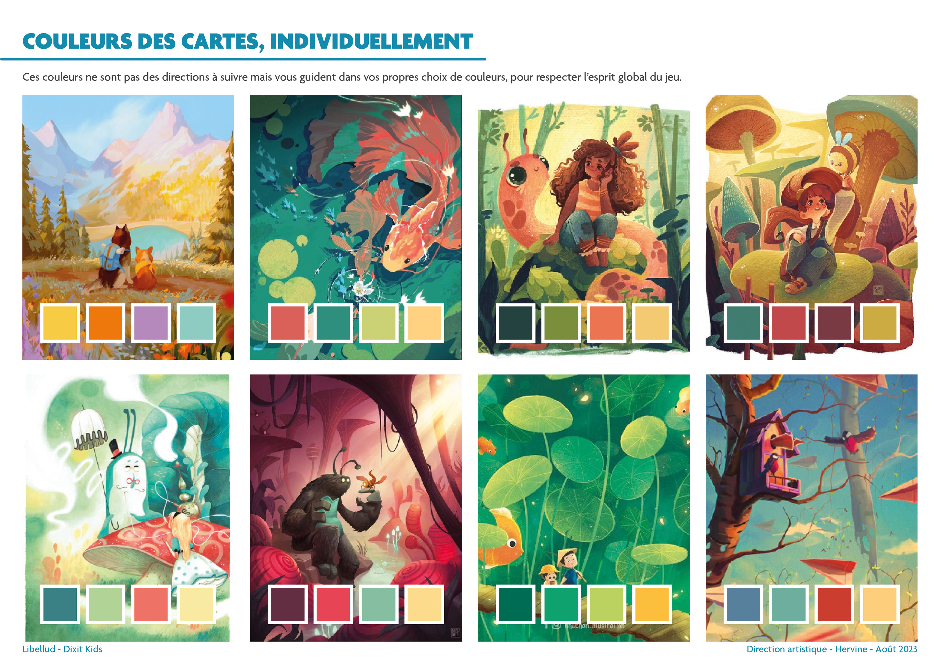
After the cover, I explored colour palettes to provide the four illustrators with an overview of the universe they were going to create. The illustrators nevertheless kept their creative freedom, but I remained vigilant throughout the project to maintain a balance of colours, shapes, and compositions, both in the global set of 84 cards but also in each set of 21 cards per illustrator.
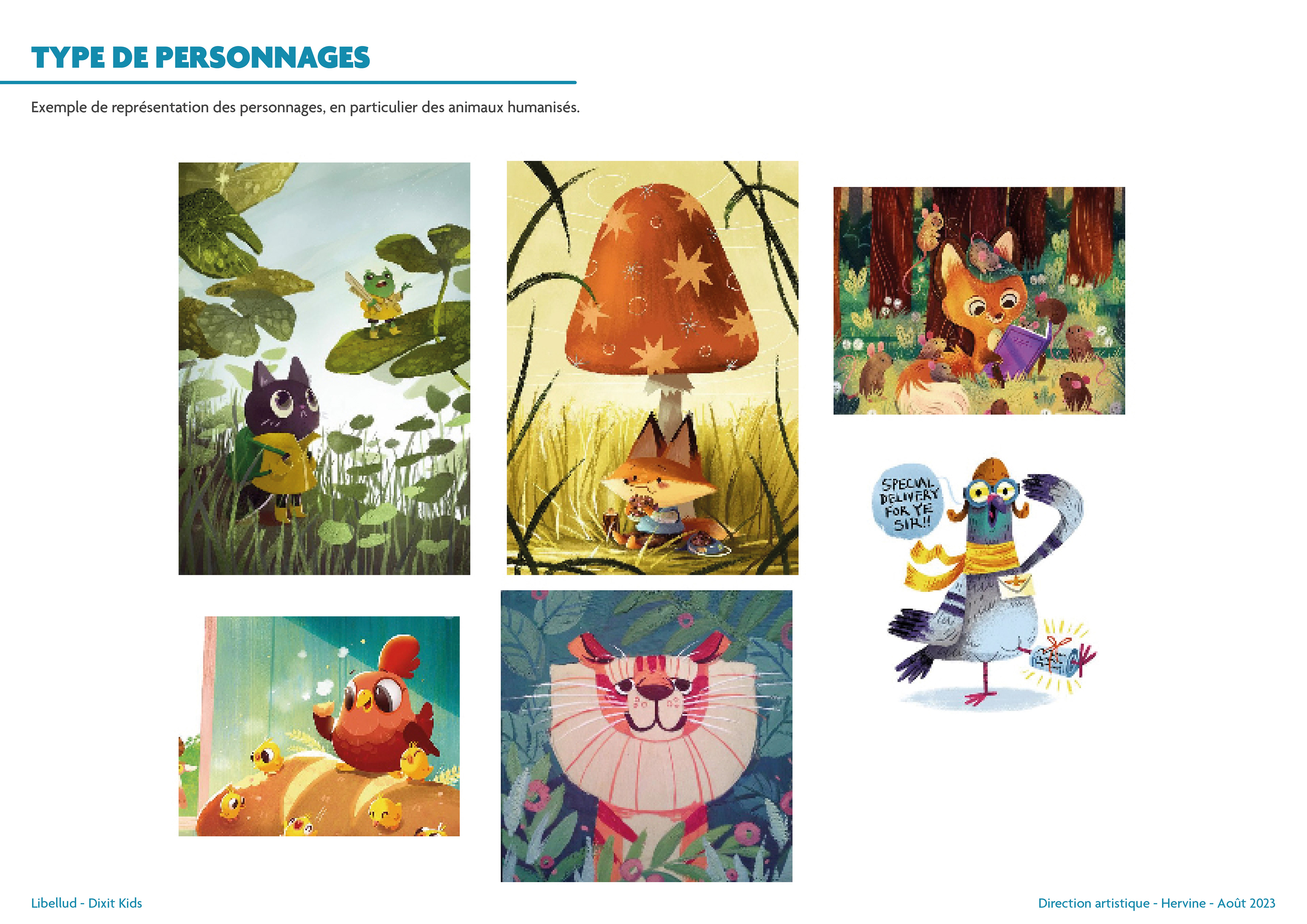
Exploration of styles and universes
When I start a project, I like to immerse myself in the universe of different artists and go in all directions, until I refocus on what truly corresponds to the game we are creating. For a project of this scale, I explored many graphic directions.
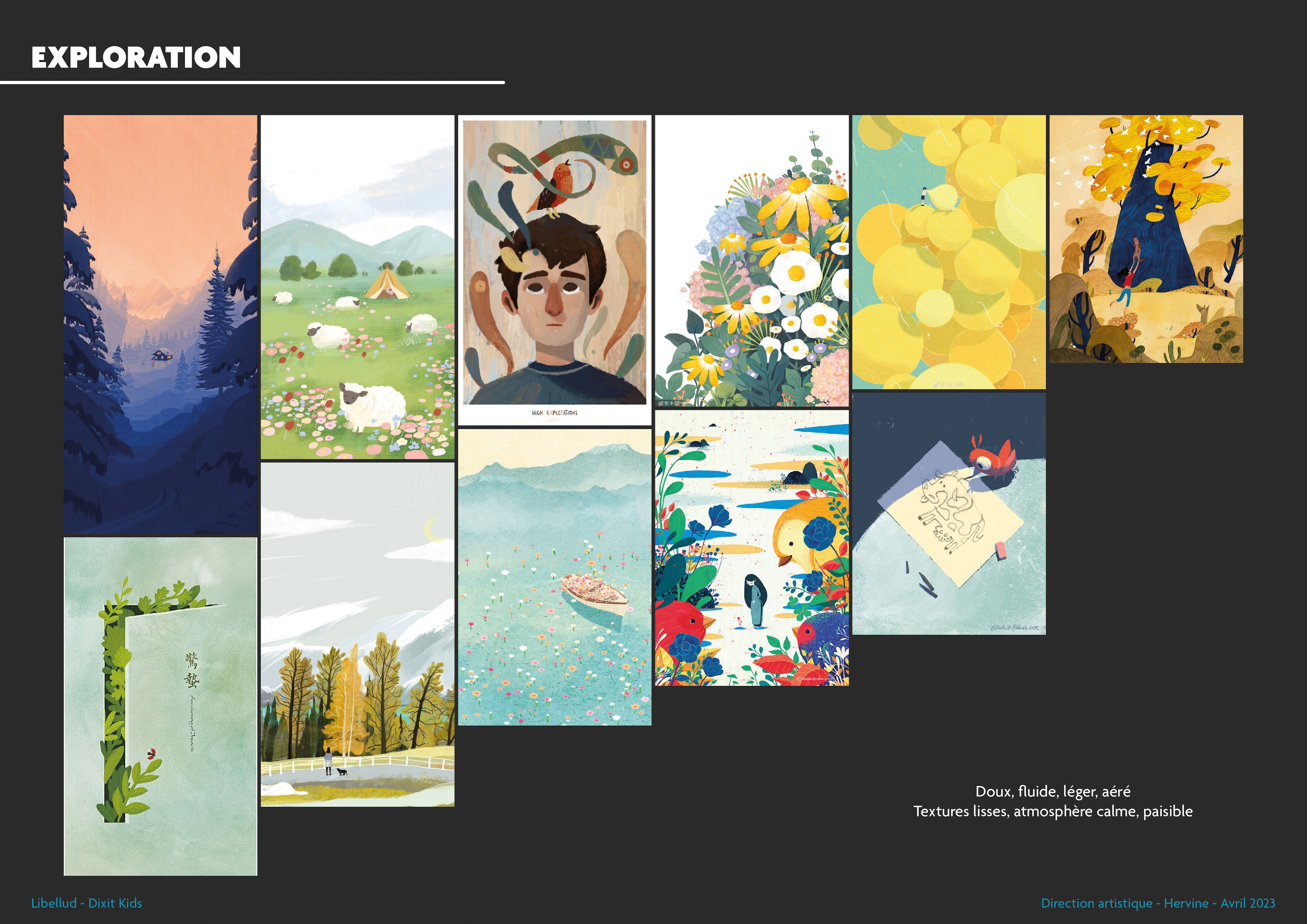
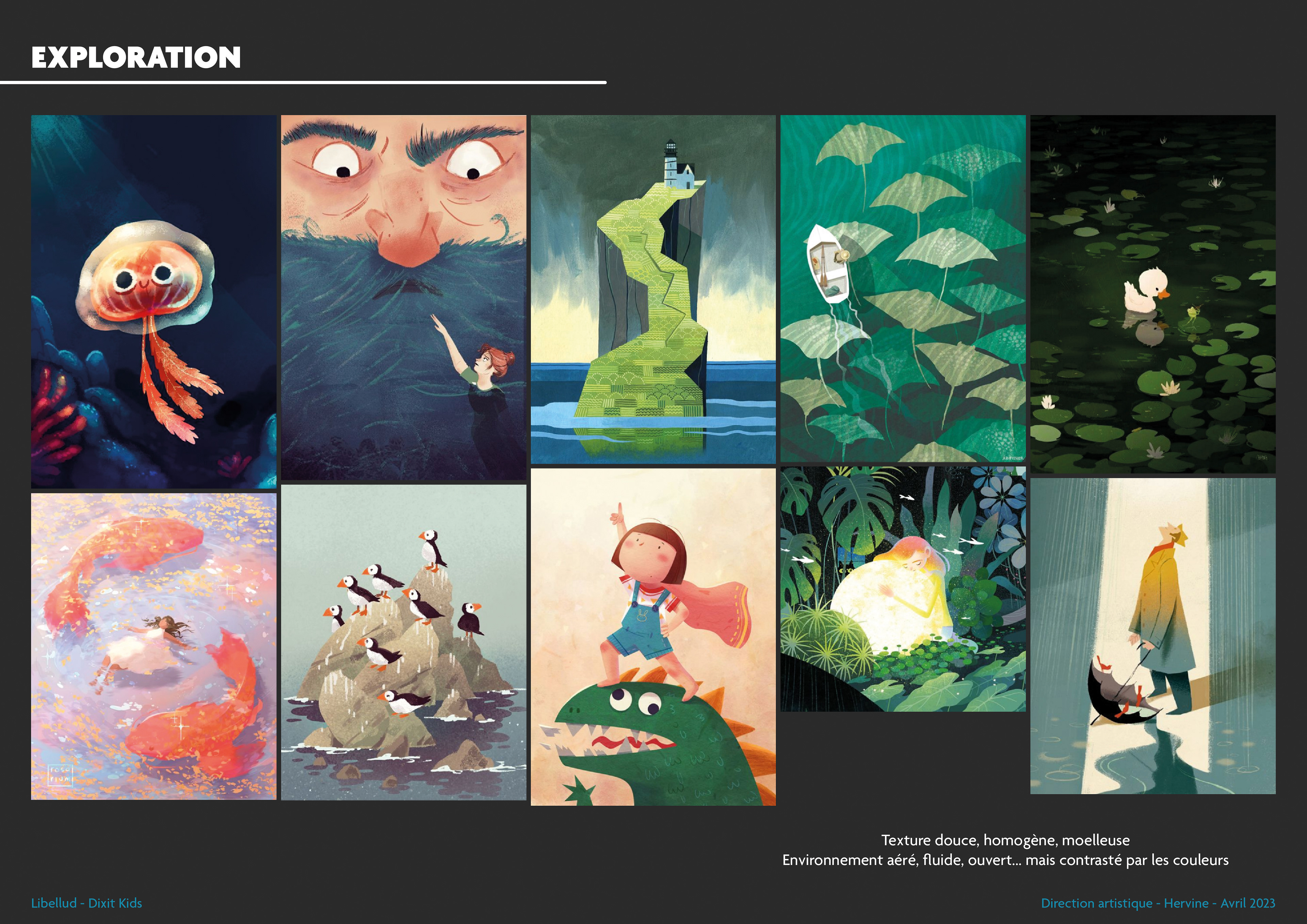
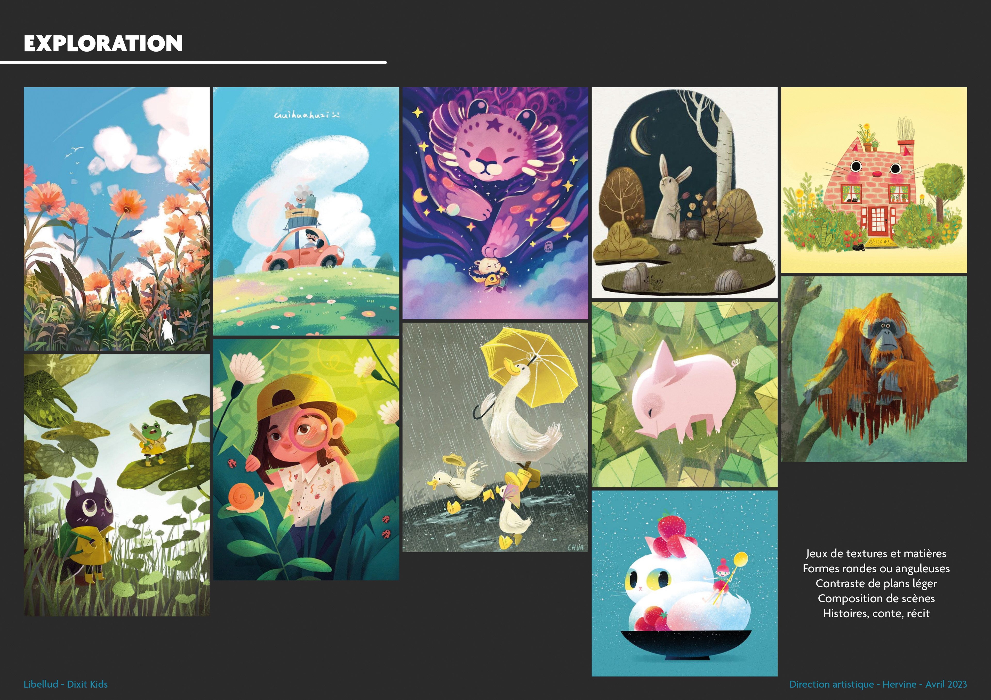
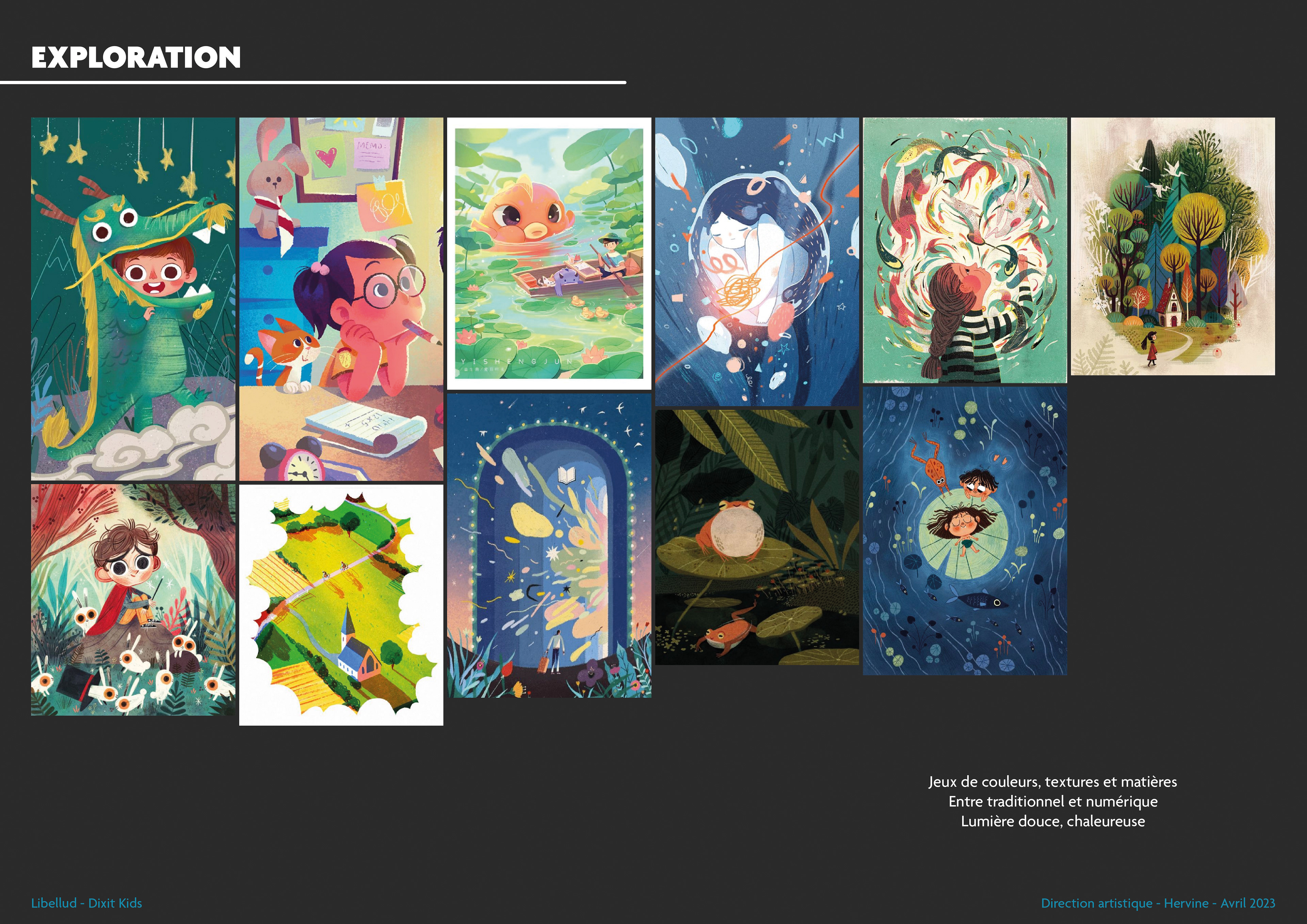
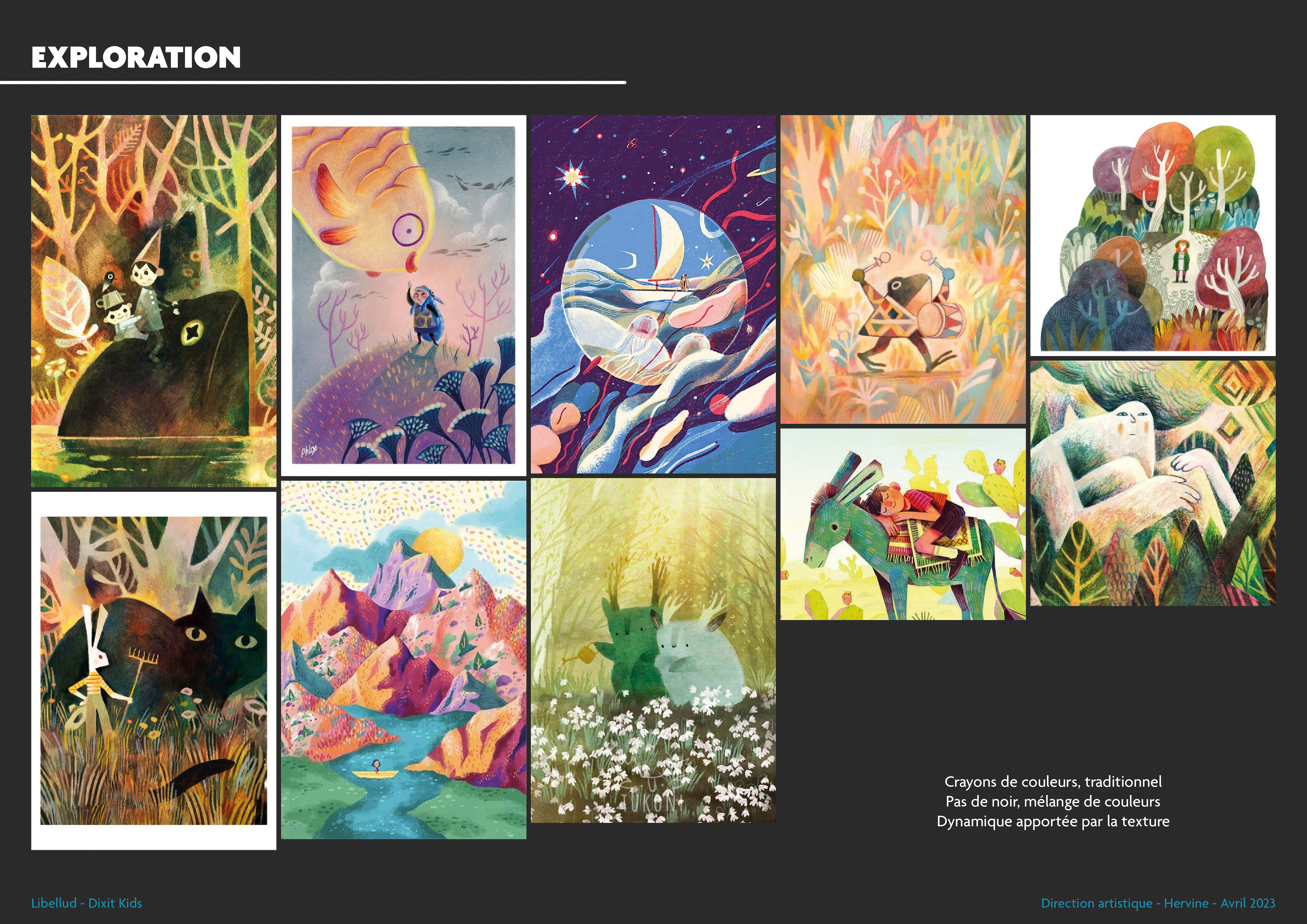
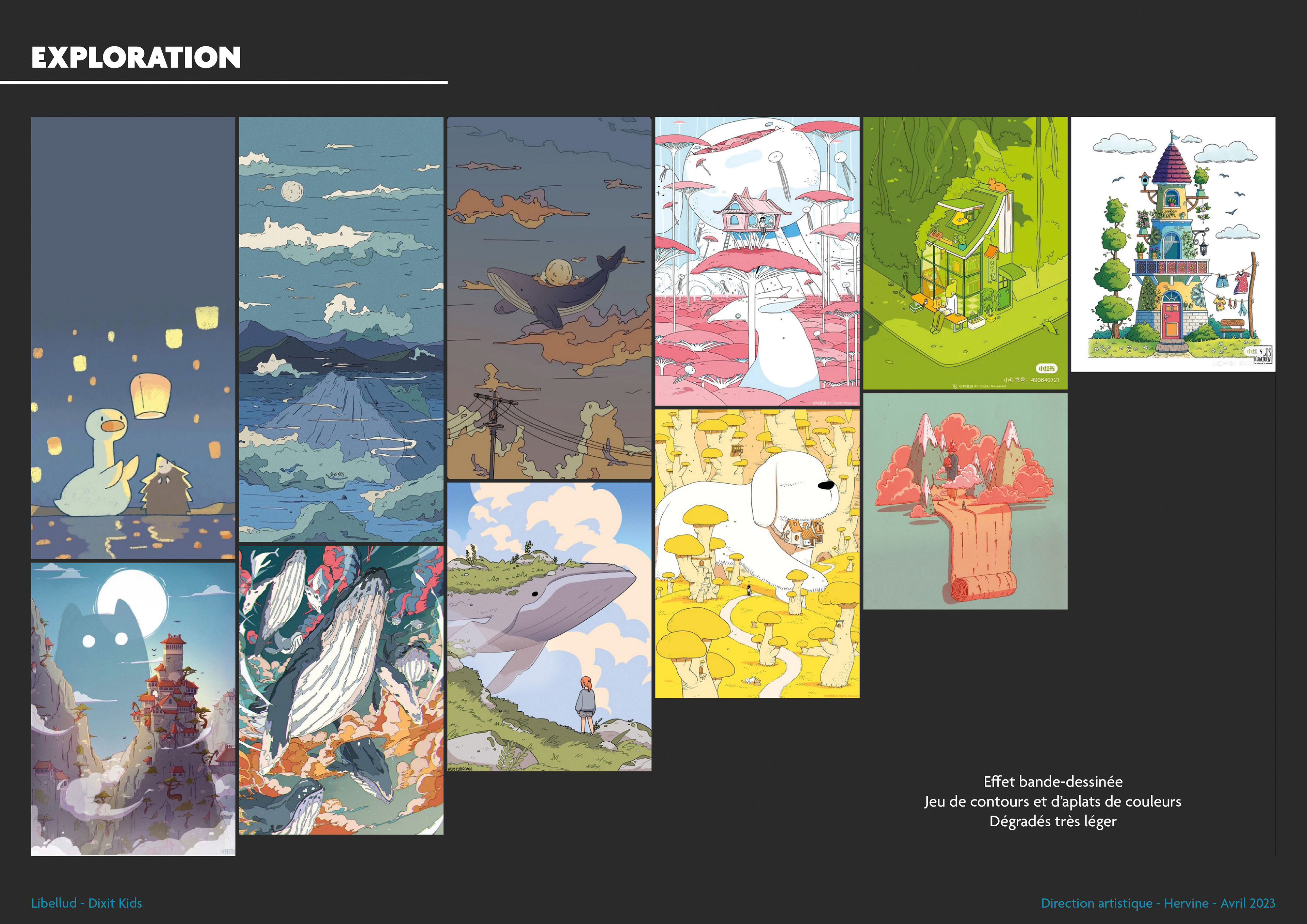
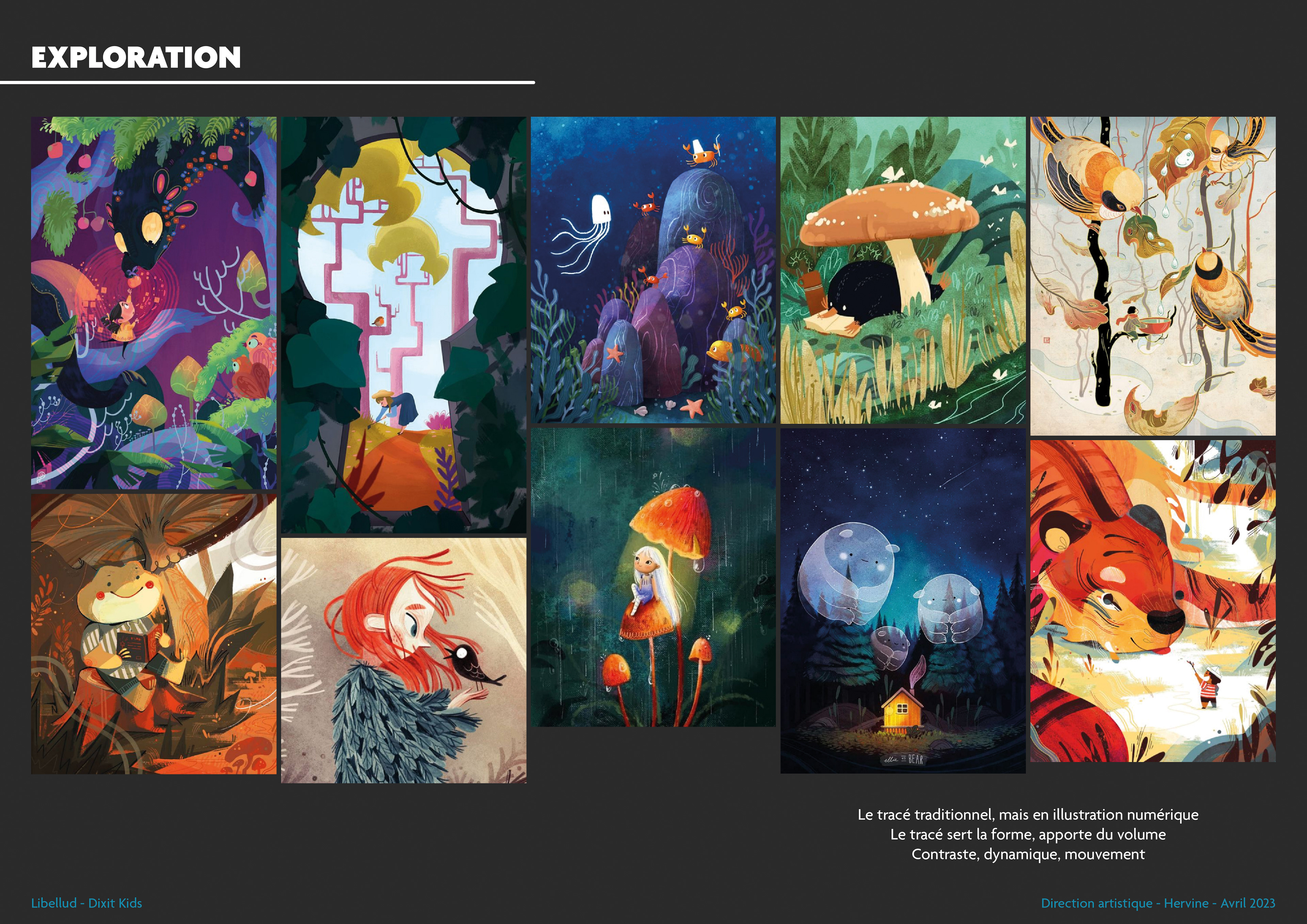
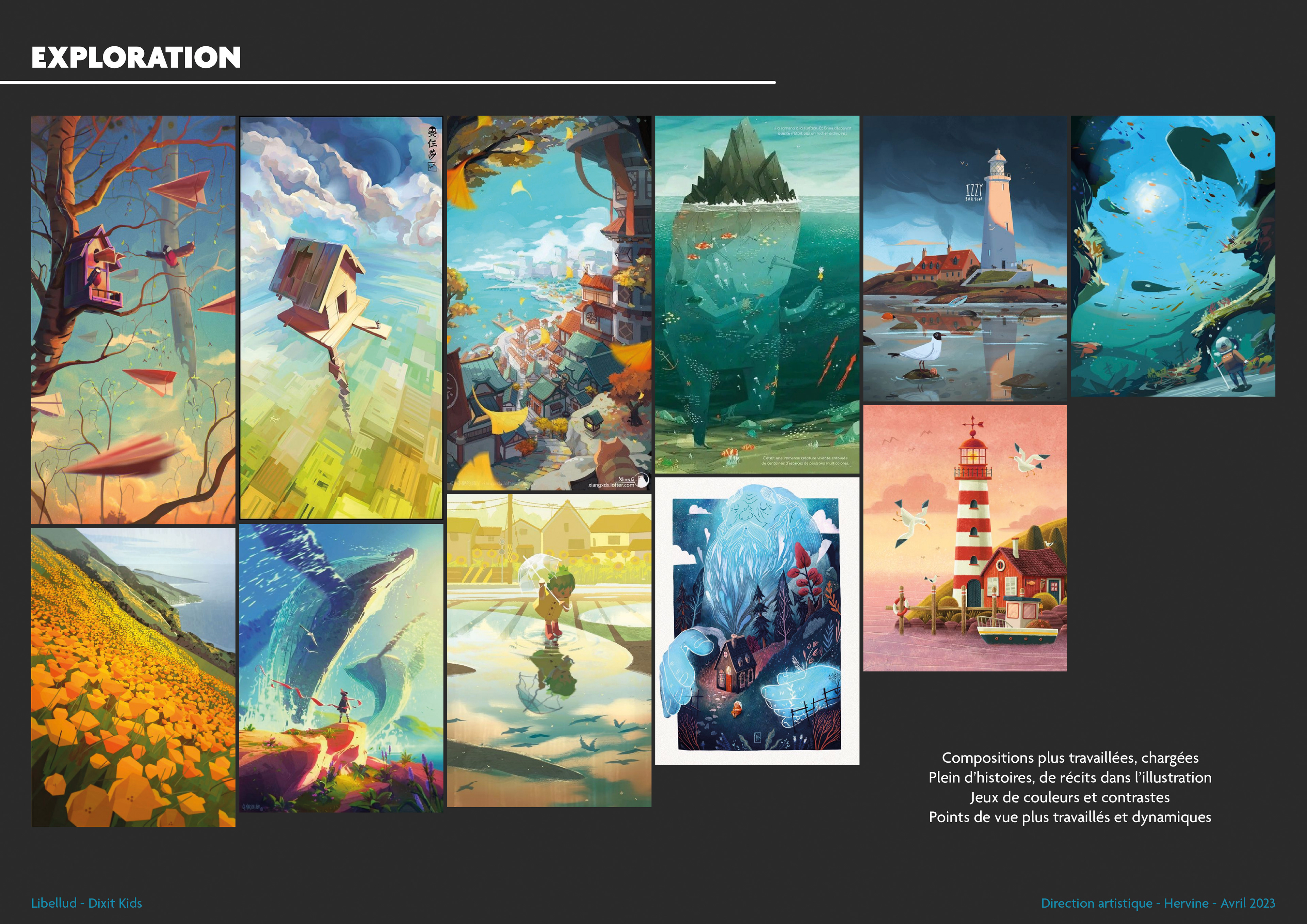
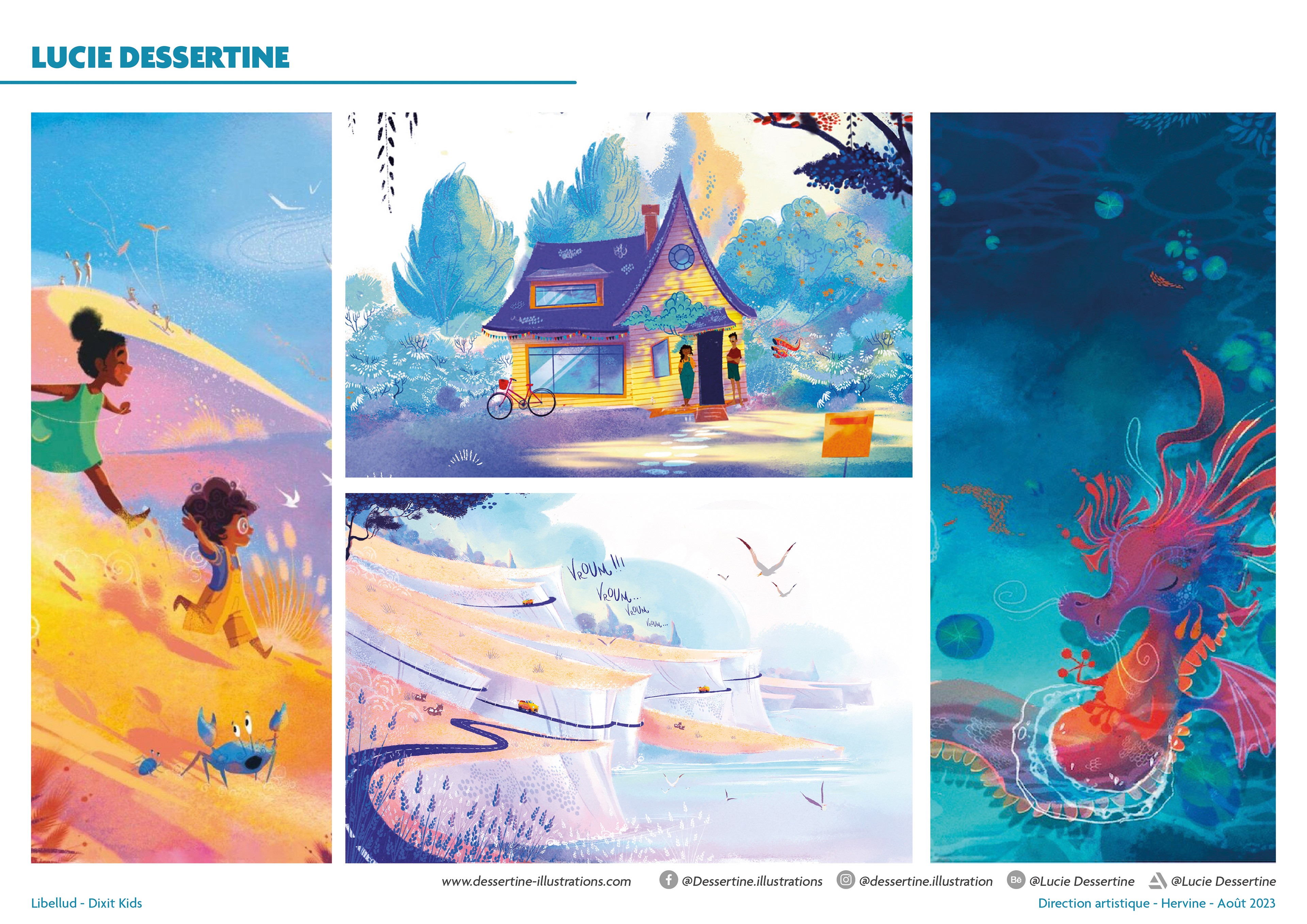
Once these explorations were complete, I proposed four graphic universes, each accompanied by four potential artists. This is a starting point for choosing the artists, but it allows us to immediately envision what the final version of Dixit Kids could look like. You'll notice that two of Dixit Kids' illustrators were already present in this pre-selection!
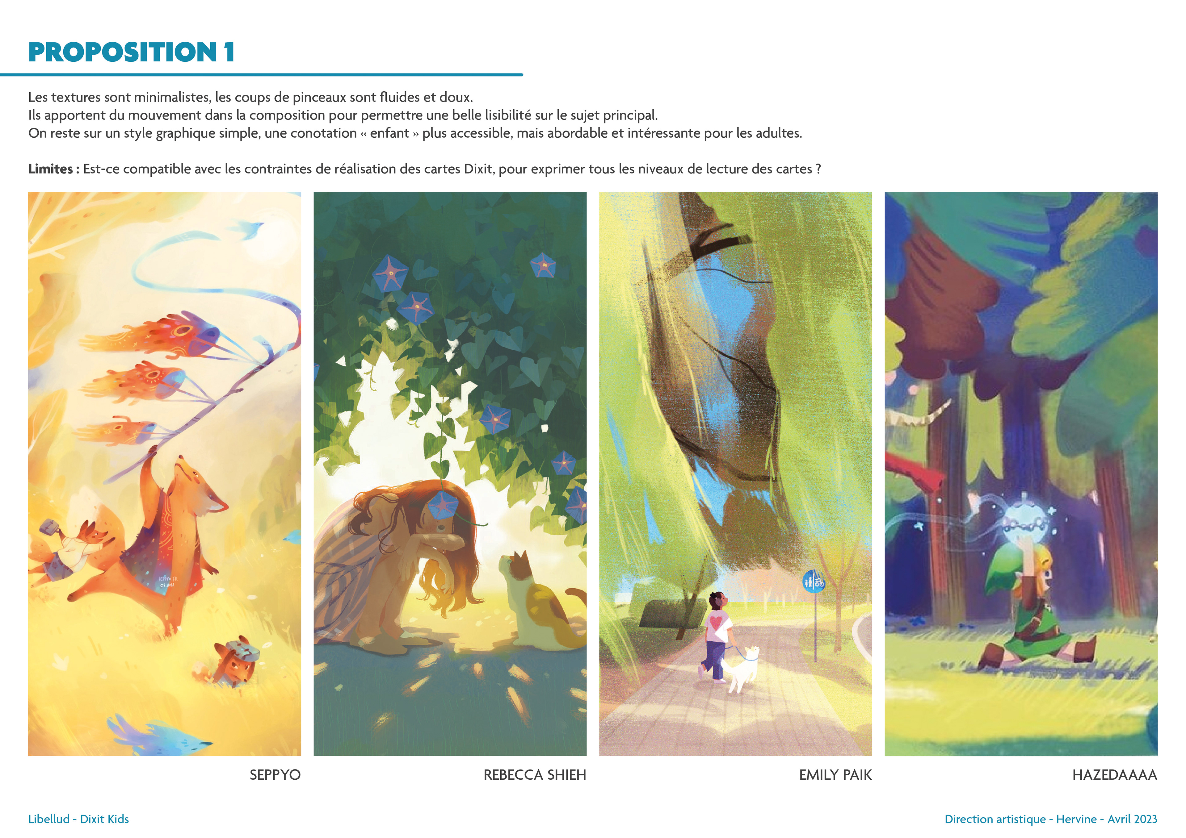
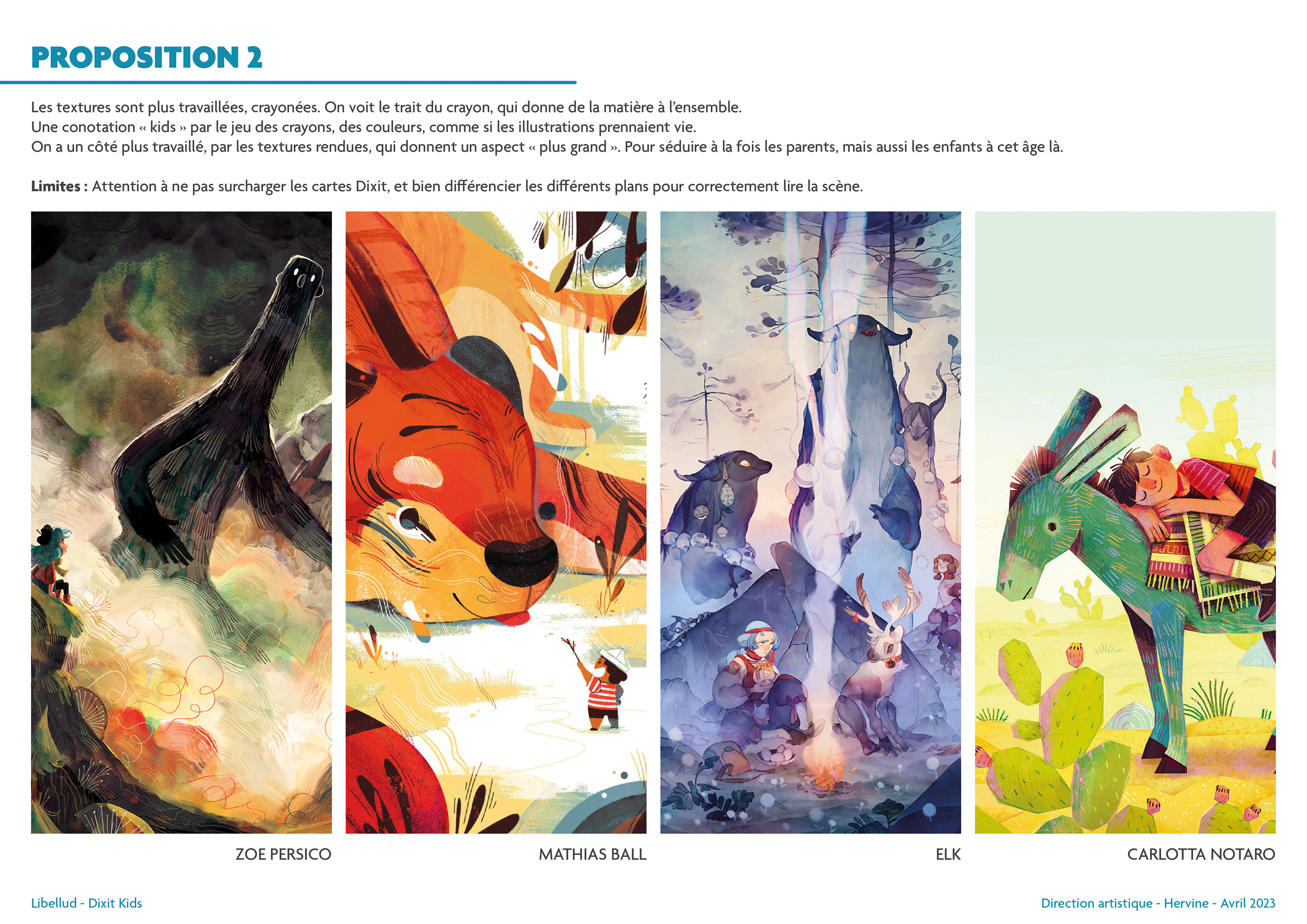
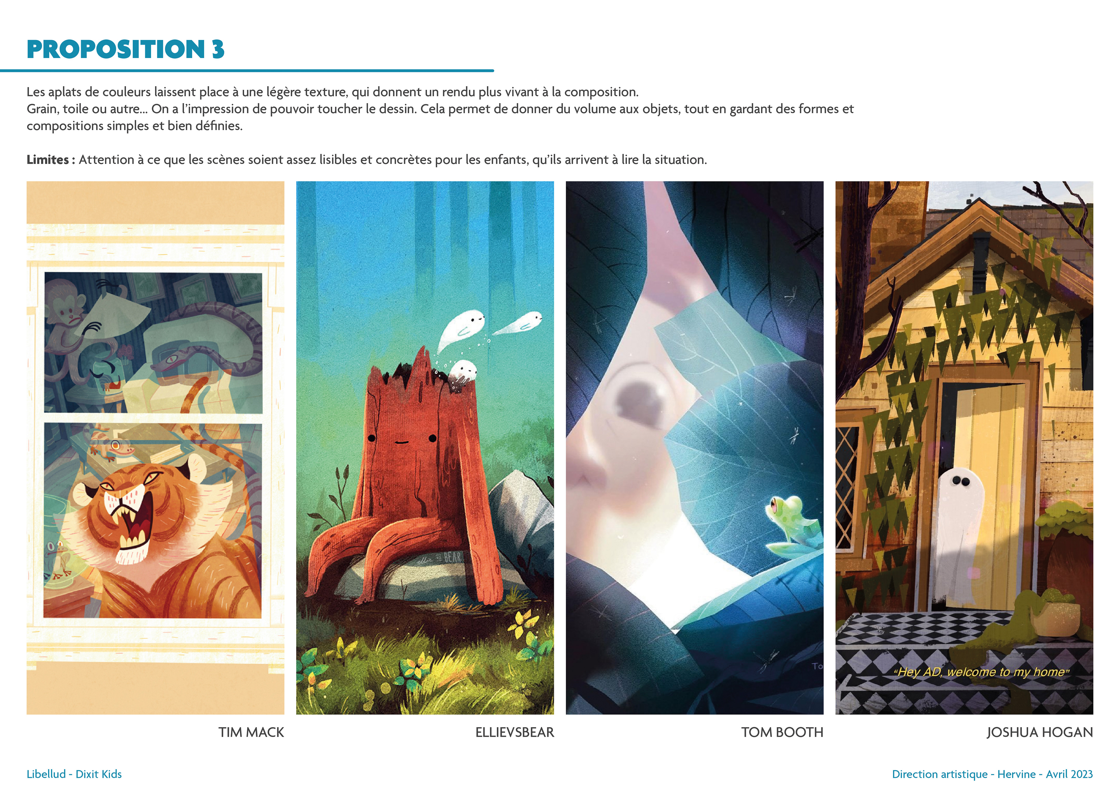
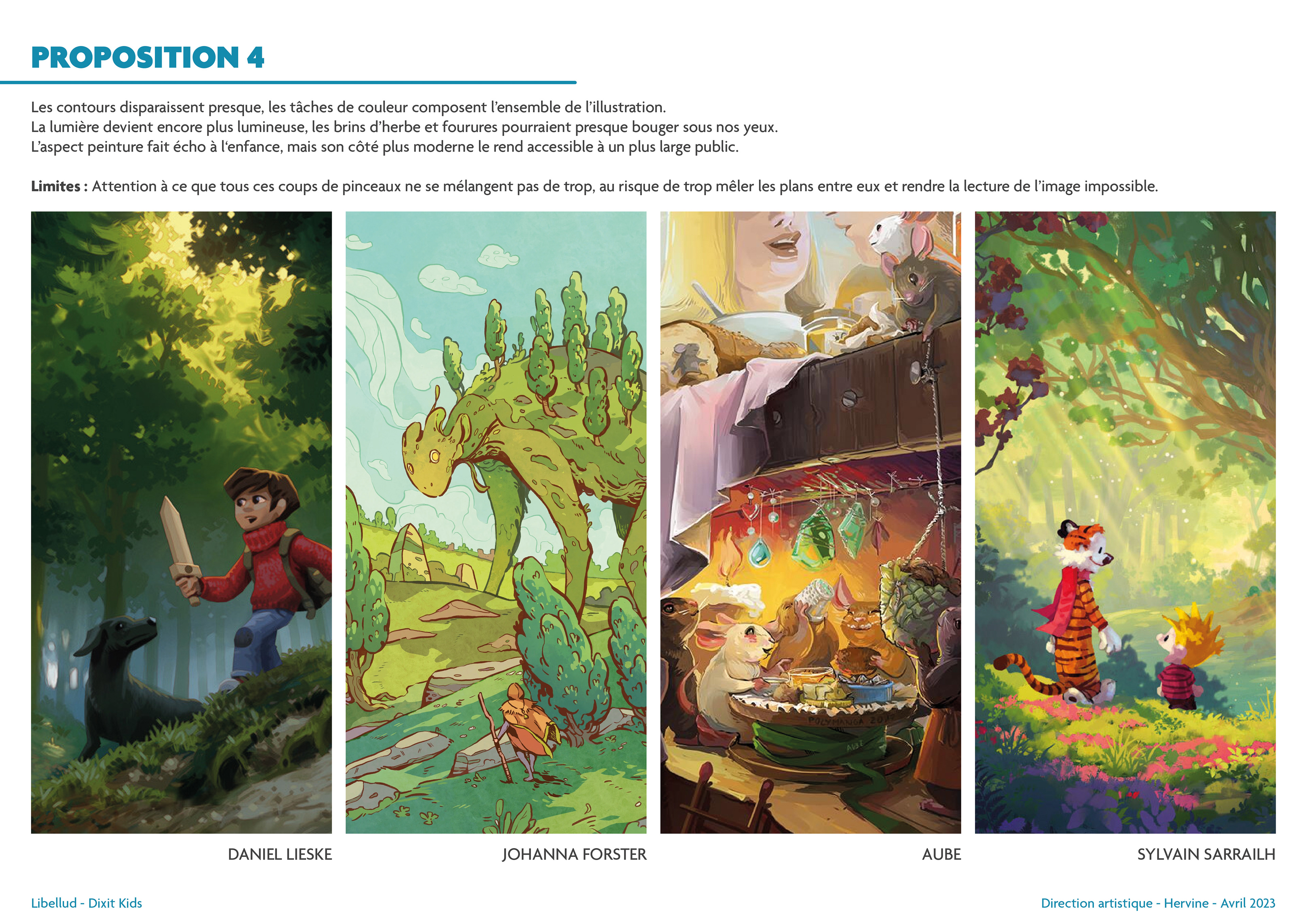
The illustrators
After multiple exchanges, I found the four illustrators available and motivated to work on Dixit Kids!
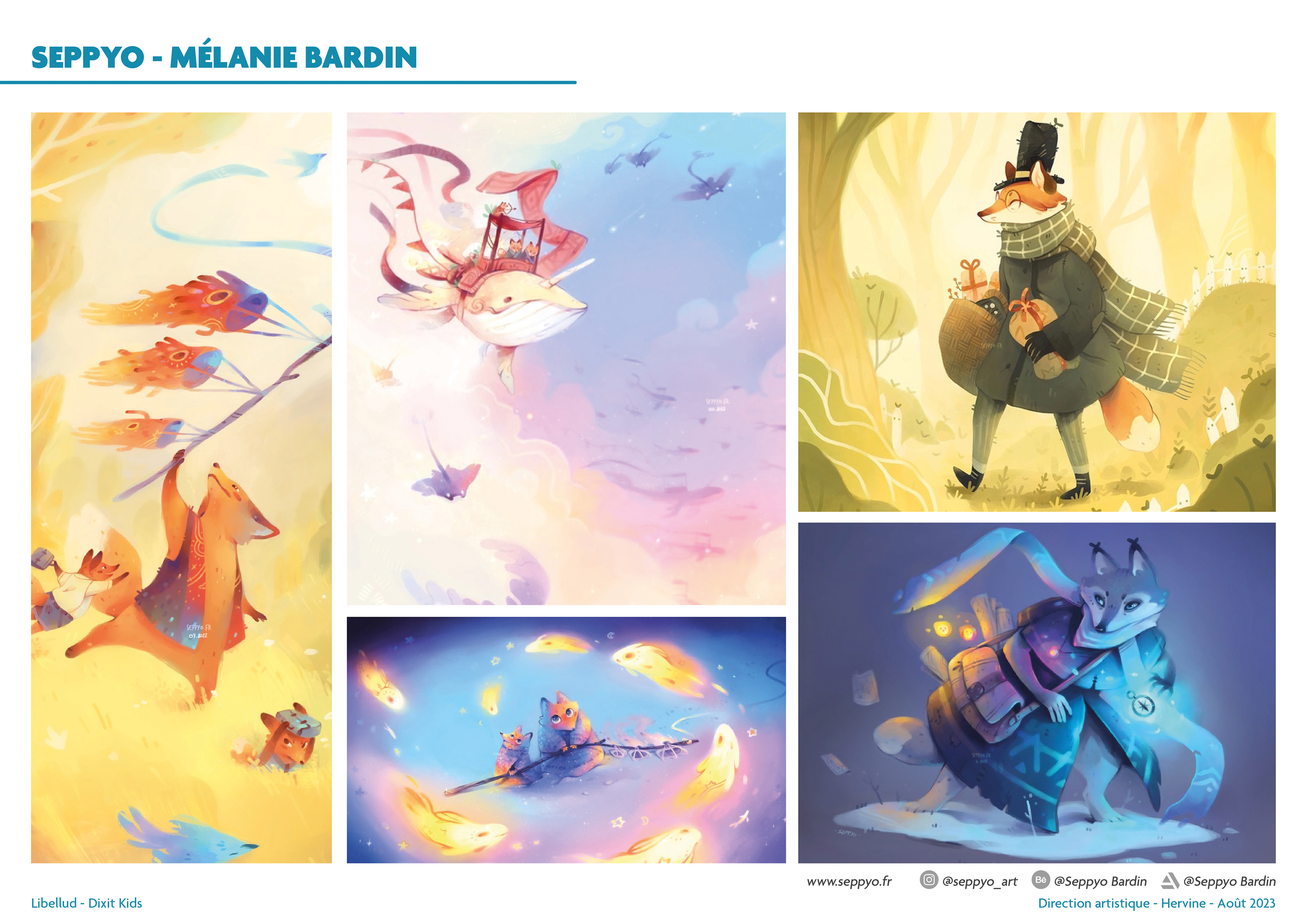
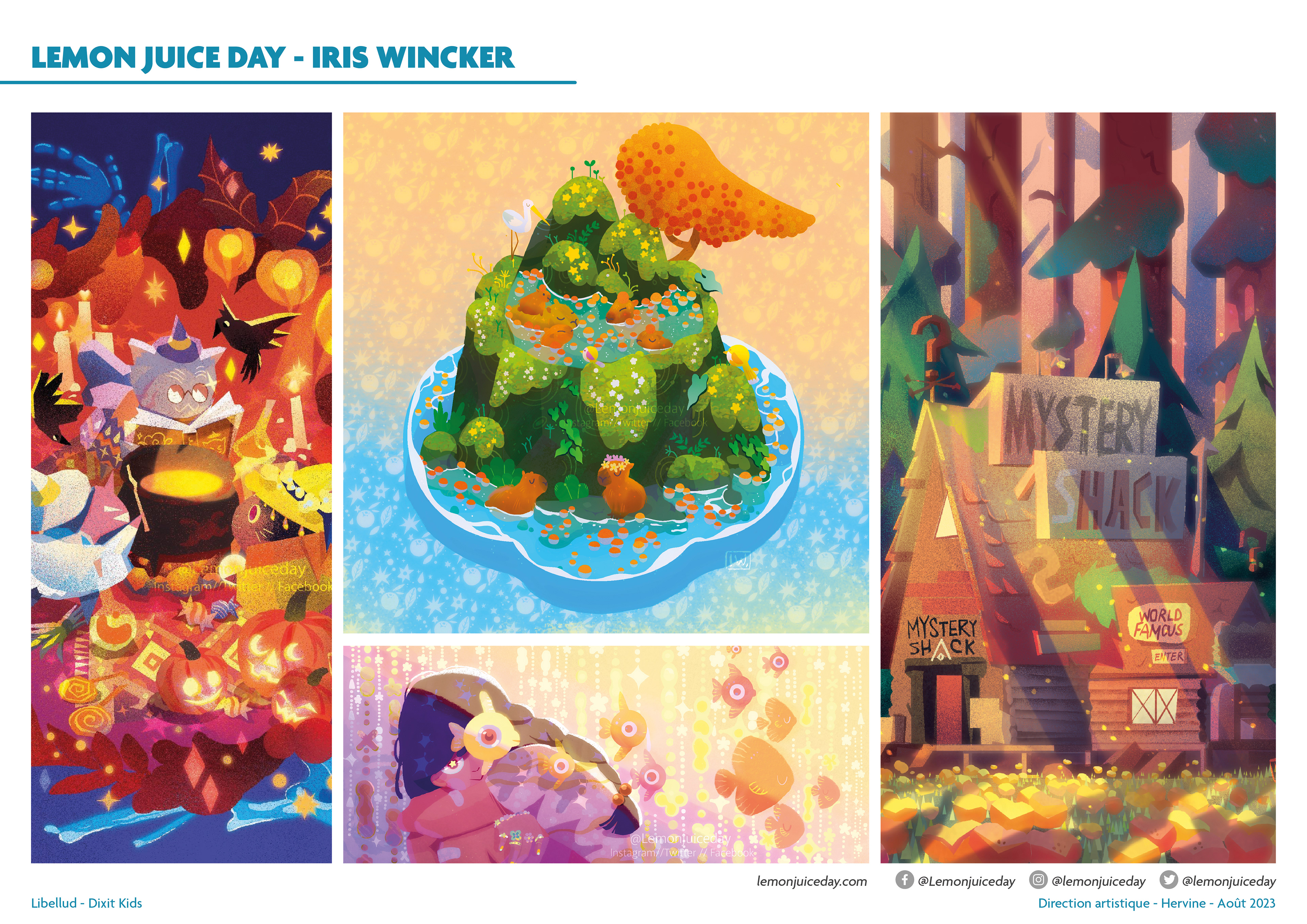
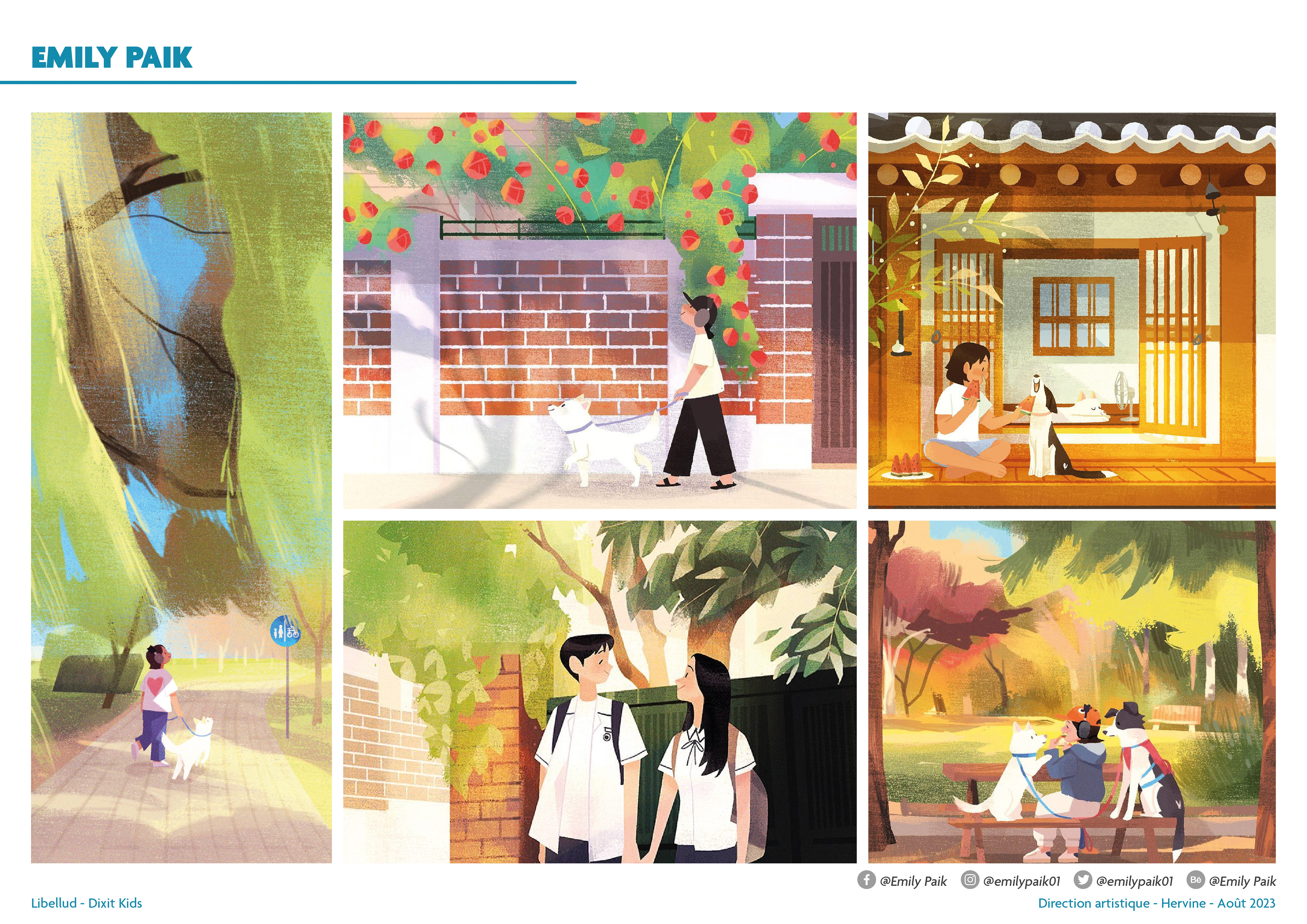
Card illustration
Once the illustrators were chosen, they each had to work on 21 cards... at the same time. I cannot reveal in detail the behind-the-scenes of the work on the cards, but I can tell you that the work took longer than it appears. Unlike a classic Dixit, which addresses very diverse and varied subjects, Dixit Kids cards must contain the 32 concepts... with fine-tuned balancing so that the game remains playable on each turn! True precision work... which required me to assemble and manage a large team that checked every aspect of the cards.
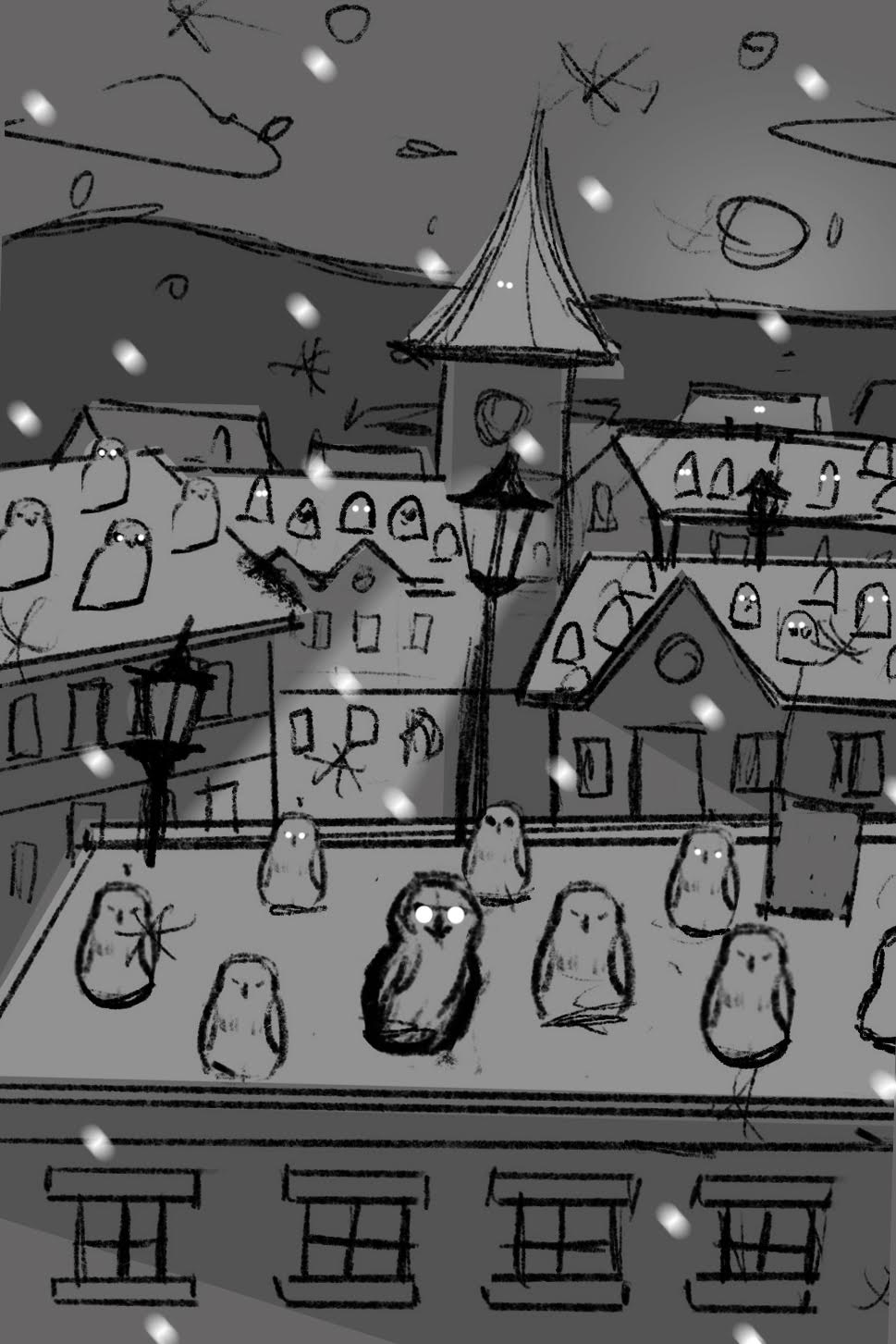
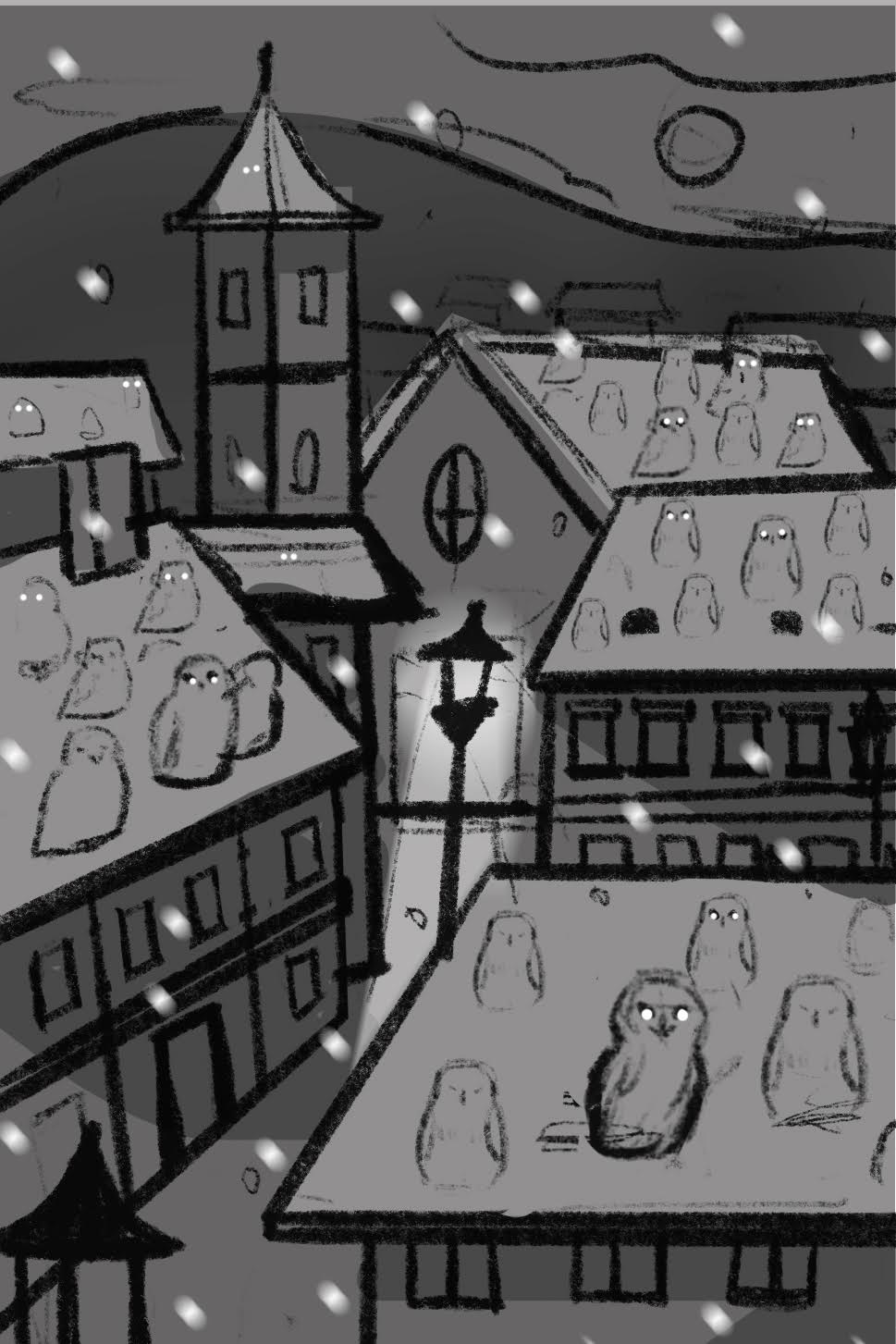
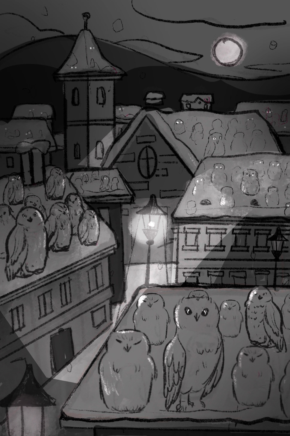
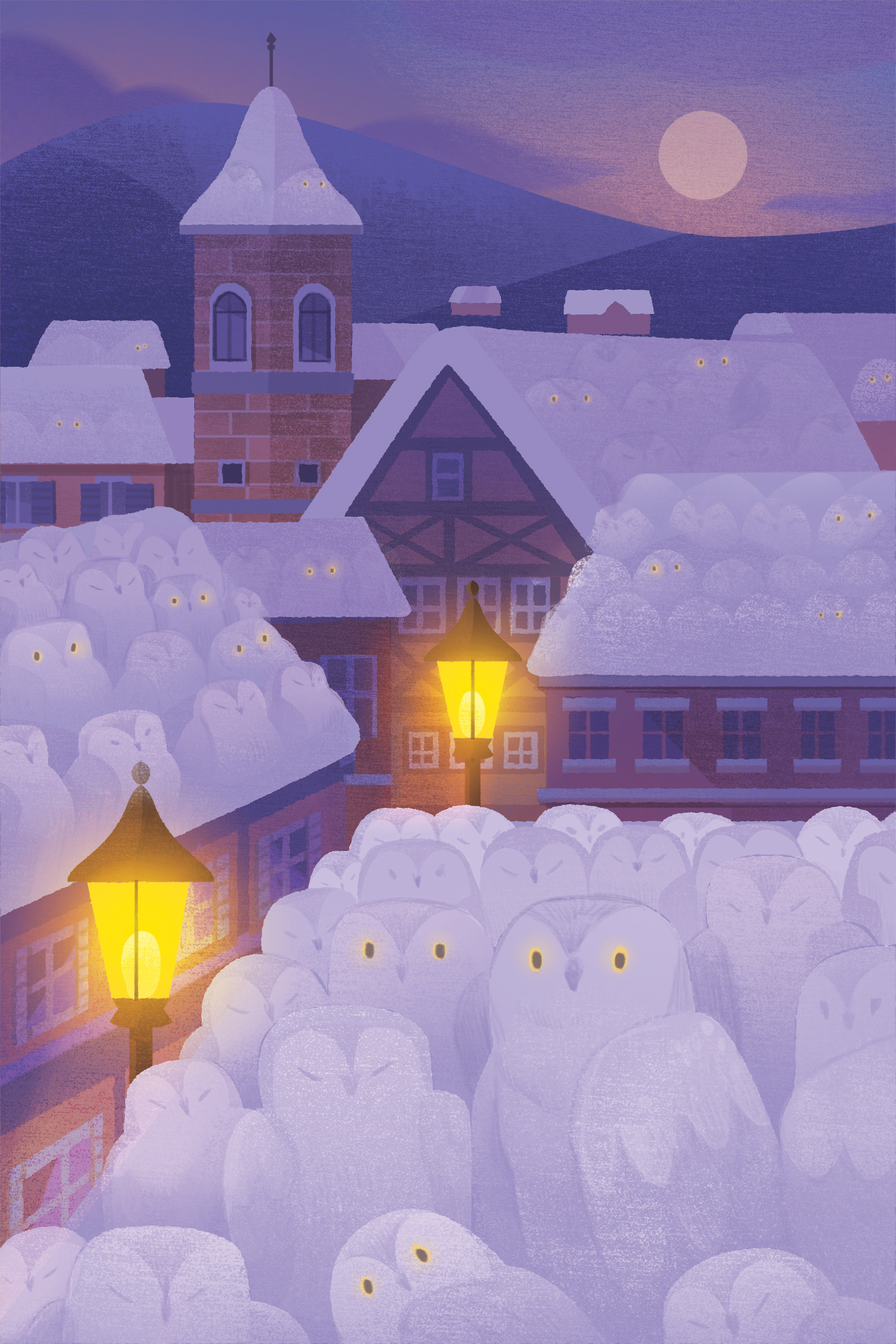
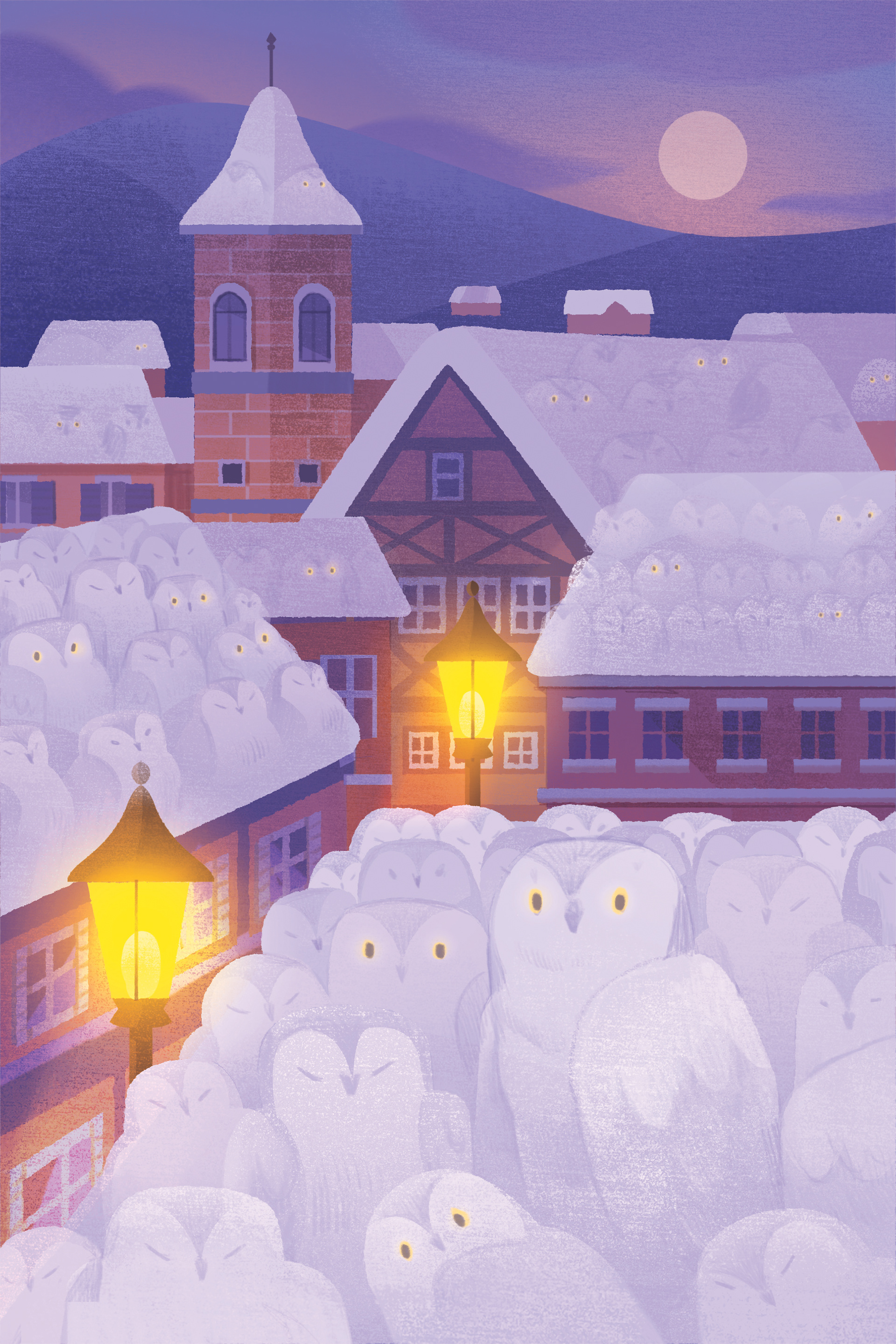
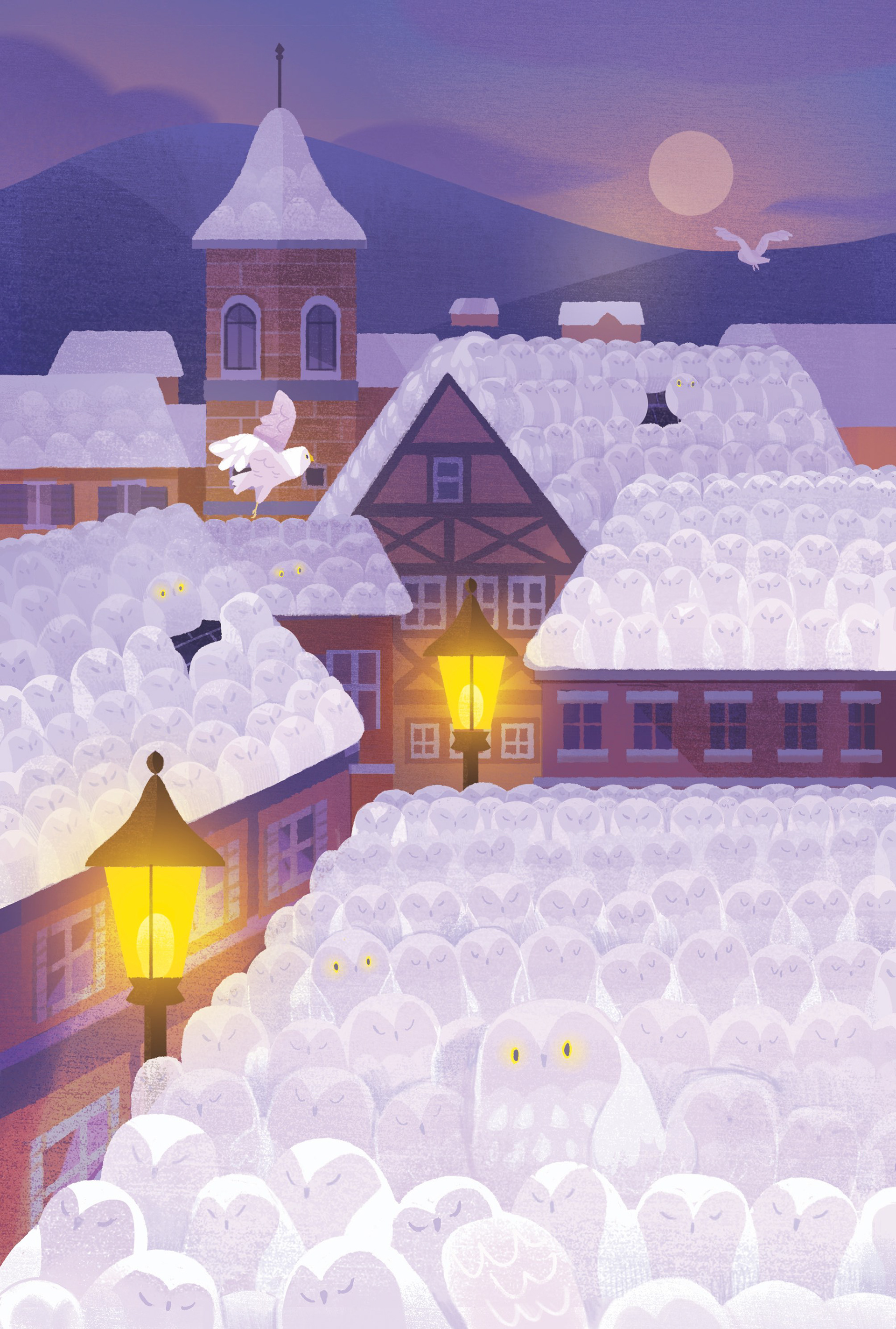
Here, for example, are the different stages of creating a card illustrated by Emily Paik: the entire subtlety of this card is to create both the sensation of snow and of owls! This is one of the first cards Emily illustrated, it allowed us both to learn how to communicate effectively, especially with two completely different cultures... because Emily is Korean!

Illustrating the game cover
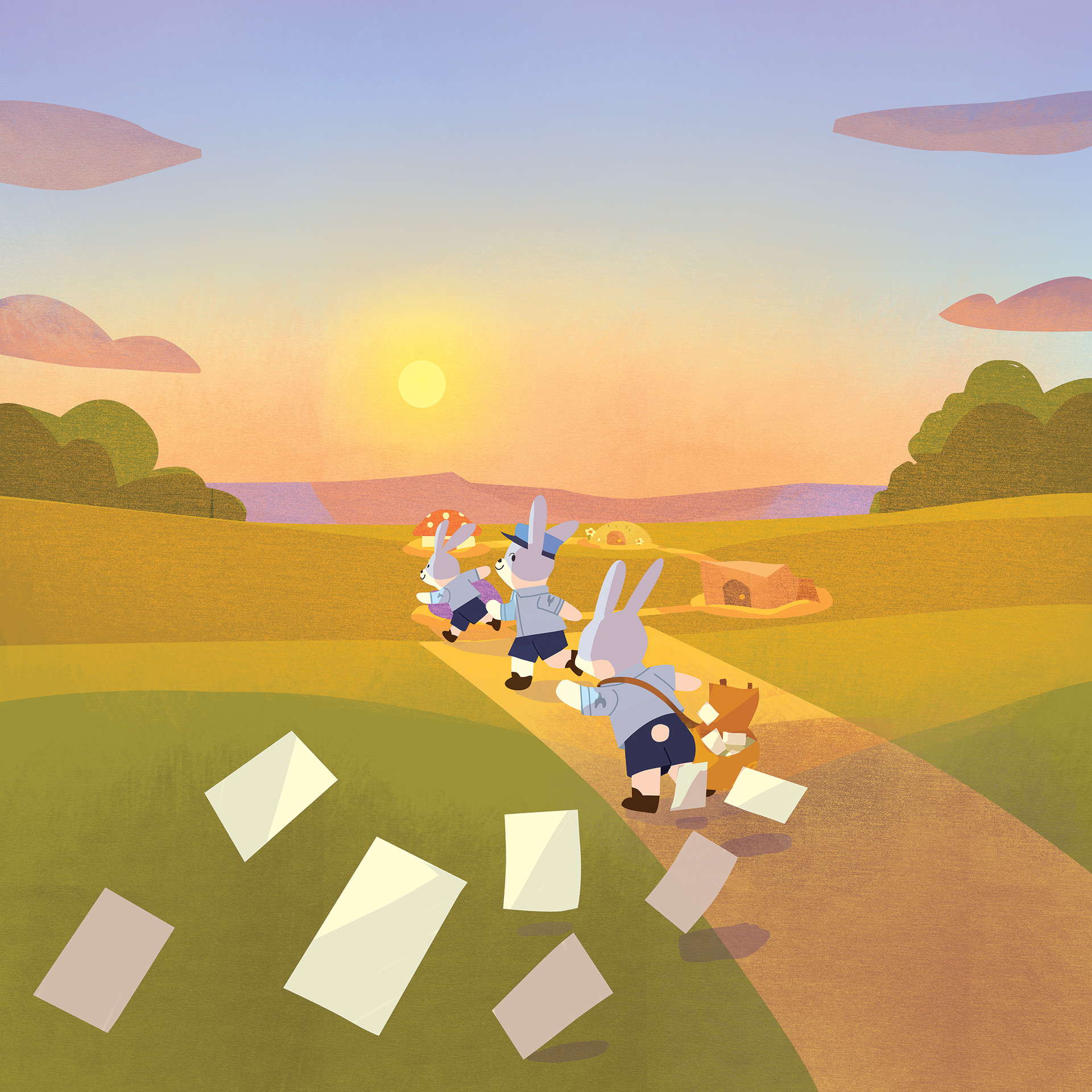
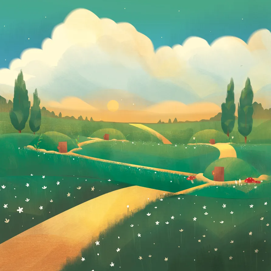
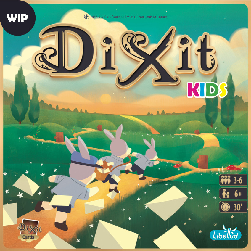
Without revealing all the stages and challenges of creating the game cover, know that it is the most important illustrated element of the game. It must meet several constraints: art direction, marketing, composition, consistency with the range, graphic charter... Each stage required validation from many people to meet these challenges.
My role was to apply the graphic charter of Dixit, Asmodee Kids and Dixit Kids, but also to keep the illustrations clear, evoking the feel of the game, appealing to children and parents alike, and expressing the story behind the game. As it makes you want to dive into this universe and open the box.
Over the 3 years I spent working on Dixit Kids, with many setbacks that created this long timeline, I learned enormously, gained confidence in myself, developed skills... To lead the art direction of a game in the Dixit Universe is an accomplishment of which I am deeply proud. Thank you Mathieu for trusting me from the very beginning.
- 2022 to 2025 -
Game: Dixit
Software: Procreate, Adobe Indesign, Adobe Photoshop, Adobe Illustrator
Game: Dixit
Software: Procreate, Adobe Indesign, Adobe Photoshop, Adobe Illustrator
